
包阅导读总结
1.
“`
Stack Overflow、Accessibility、WCAG、APCA、Opportunity Solution Tree
“`
2.
Stack Overflow 重视产品的可访问性,制定组织目标,采用 APCA 算法衡量颜色对比度,建立评分系统和仪表盘,组建冠军小组,优先改进设计系统,持续提升产品和网站的可访问性。
3.
– 重视可访问性
– 组织一直重视,受团队客户鼓励采取更系统可持续的方法
– 定义可访问性目标,创建 Architectural Decision Record
– 确定衡量标准
– 产品需符合 WCAG 2.2 AA 级别,部分例外
– 选择 APCA 测量颜色对比度,因其优势
– 建立评估体系
– 设立 0 到 100 的可访问性评分系统
– 包括自动、手动和总体得分,用 Axe 引擎自动化测试
– 定期手动审计,用 Jira 板记录问题
– 创建可访问性仪表盘并公开
– 采取行动
– 用 Opportunity Solution Tree 模型规划
– 组建可访问性冠军小组,两周一次会议
– 优先改进设计系统 Stacks,重新定义调色板等
– 进行组件的可访问性测试,创建 Axe 规则开源
– 未来展望
– 继续提升可访问性,让产品和网站更包容
思维导图: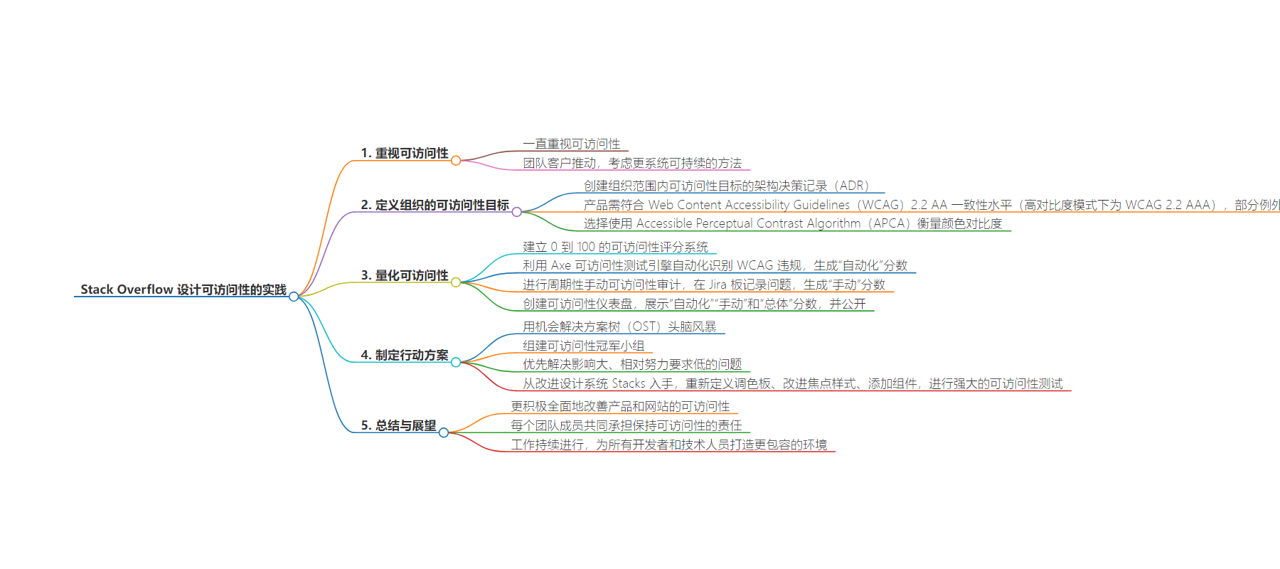
文章来源:stackoverflow.blog
作者:Dan Cormier
发布时间:2024/7/31 14:02
语言:英文
总字数:1334字
预计阅读时间:6分钟
评分:80分
标签:无障碍,WCAG,APCA,设计系统,自动化测试
以下为原文内容
本内容来源于用户推荐转载,旨在分享知识与观点,如有侵权请联系删除 联系邮箱 media@ilingban.com
Accessibility has always been important to our organization, and we’ve learned from community members and Stack Overflow for Teams customers that it’s important to them too. Encouraged by Stack Overflow for Teams customers, we started considering a more systematic and sustainable approach to improving the accessibility of our products. Here’s a behind-the-scenes look at how we established that system, and the work we continue to do to keep our products (Stack Overflow for Teams) and sites (Stack Overflow and the Stack Exchange network) inclusive of and accessible to as many technologists as possible.
In order to meaningfully improve the accessibility of our products, we needed to define the organization’s accessibility goals. We did this by creating an Architectural Decision Record (ADR) of org-wide accessibility targets to act as the source of truth for the accessibility expectations of our products. With input from design and engineering, we established that our products needed to conform to Web Content Accessibility Guidelines (WCAG) 2.2 AA conformance level (and WCAG 2.2 AAA in high-contrast modes), with a few exceptions.
Most notable among the exceptions was our choice to measure color contrast using the Accessible Perceptual Contrast Algorithm (APCA). We initially considered alternatives to WCAG’s color contrast algorithm since it struggles to accurately assess color contrasts when using orange, which is a significant issue for us since we use orange so often across our products. We investigated using APCA and found it had several advantages over WCAG’s color contrast algorithm. APCA is designed to more accurately measure perceived contrast by measuring contrast in terms of lightness contrast (Lc), considering aspects like polarity (dark text on a light background vs. light on dark), and taking into account contextual information like font size and weight. We landed on a target Lc value of 60 when the font size is below 32px and 45 when it’s 32px or larger (we plan to target the APCA-ARC bronze conformance level in the future).
People often consider screen readers first when considering accessibility, but low-contrast text is “the most commonly-detected accessibility issue” and is present on “81% of home pages” according to WebAIM’s report on the accessibility of the top 1,000,000 home pages. Plenty of people who don’t require a screen reader have difficulty reading certain color combinations. APCA’s more human-centric assessment of contrast gave us more confidence that we’re developing interfaces that are both aesthetically pleasing and readable to as many people as possible.
With our accessibility targets established, we’re in the perfect place to start measuring our accessibility.
Now that we had targets, we decided to quantify the accessibility of our products. We established an accessibility scoring system of 0 to 100 so we could easily understand how far we were from those targets and to measure the progress we were making. For each product, we generate an “automated” score, “manual” score, and an “overall” score.
As part of our efforts to increase our automated testing coverage, we decided to automate the identification of accessibility WCAG violations using the Axe accessibility testing engine. This engine is open-source and supported by Deque Systems, a respected accessibility company, so we felt confident relying on it. To generate an automated score, we run a daily cron job that runs our accessibility tests on our highest traffic pages in light, dark, and high-contrast modes (where supported) to generate a report of issues as a JSON file. We then take that JSON file and generate our automated score based on the number of successful tests versus test failures.
While the automated tests are helpful, they only catch an average 57% of WCAG violations. To account for this, we perform periodic manual accessibility audits and capture issues in a dedicated Jira board. This Jira board acts as a backlog of issues which is used to determine our manual accessibility scores. To create this score, we weigh the number of pages being assessed for a given product’s accessibility, the number of identified issues, and their relative severity as defined by Axe-core’s definitions of issue impacts.
We needed a way to display this information in a digestible format, so we created an accessibility dashboard. It shows the automated and manual scores, as well as an “overall” score which is an average of the automated and manual scores for each of these products: Stacks (Design System), PubPlat (Stack Overflow and all Stack Exchange sites), and Stack Overflow for Teams (including Stack Overflow for Teams Enterprise products). While we initially created this as an internal tool to track the accessibility of our products, we’ve made it public in the spirit of transparency.
With accessibility targets and scores in place, we now had to consider a broad course of action. A group of Stack Overflow engineers, designers, and product managers used a model called an Opportunity Solution Tree (OST) to brainstorm how we could reach a desired outcome for our accessibility concerns. This exercise showed us that we could improve accessibility by design, but we’d need people to advocate for those designs and provide resources so everyone else could upskill in accessibility.
We knew that we’d need accessibility advocates across our organization, so we assembled an accessibility champions group. This group, composed of developer representatives from several teams within Stack Overflow, has the mission of actively working towards ensuring that the digital products their team is building comply with our accessibility targets. They are dedicated to promoting awareness, understanding, and implementation of accessibility best practices throughout the development process. It was decided that they could achieve that mission by meeting every two weeks to triage issues, ensure that we continually improve accessibility across our products, and share knowledge by creating training materials, such as short-form tutorial videos, on how to resolve the most common accessibility issues.
We also understood that we needed to be wise with our resources and focus on the highest-priority issues.
We knew our efforts would only be valuable if we meaningfully improved the accessibility of our products and sites. We prioritized the issues that would have the greatest impact based on the severity of the issues as described by the Axe-core documentation and the relative effort required. We started by making improvements to our design system, Stacks.
Since our Stacks libraries provide components and atomic classes used across our products, any changes there would have wide-reaching benefits. We started with redefining our color palette with contrast in mind. The updated color palette, which shipped with Stacks v2.0 in October 2023, brought us to a much better standard for contrast. Once that was complete, we made significant improvements to our focus styles by ensuring that we clearly indicate focus and preserved the ability for assistive technology to apply custom outlines to focused elements. We also added components, such as a skip link, to make it easy for consumers of Stacks to help users navigate more easily using a keyboard.
While performing these changes, we implemented robust accessibility testing of our components by leveraging Axe-core, Web Test Runner, and Playwright. Today we have over 2,000 accessibility tests running in the continuous integration pipeline for our component library. Because we made the decision to use APCA as the color contrast algorithm to define our a11y targets, we had to create dedicated Axe rules to test against that algorithm instead of the WCAG one. Those rules are now open-source in a comprehensive package: GitHub: StackExchange/apca-check.
By taking a more proactive, holistic approach to improving accessibility across our products and our sites, we’re closer to our goal of serving every technologist, no matter how they use our site. We’ve also made it the shared responsibility of every Stack Overflow team member to keep accessibility top-of-mind, as our internal accessibility champions continue to spread awareness and education. Although our work is far from over—in fact, it’s continuous by nature—we’re proud to be building more accessible products and making Stack Overflow and the Stack Exchange network more inclusive for all developers and technologists.