
包阅导读总结
1.
关键词:GitHub、Kotlin DataFrame、Kandy、Star Growth、Analysis
2.
总结:本文介绍了使用 Kotlin DataFrame 和 Kandy 分析 GitHub 仓库星标增长情况,包括获取数据、处理数据、创建数据框、可视化分析等步骤,通过示例帮助读者理解并应用到自己的仓库分析中。
3.
主要内容:
– 介绍 Kotlin DataFrame 和 Kandy 是 Kotlin 中数据分析和可视化的强大工具
– 可在 Kotlin Notebook 中共同用于分析 GitHub 仓库星标历史
– 分析 GitHub 星标历史的意义和目标
– 了解仓库受欢迎程度和增长趋势
– 能对自己的仓库进行分析
– 获取 GitHub 仓库星标者数据
– 用 GitHub GraphQL API 和特定函数获取数据
– 需设置仓库所有者、名称和访问令牌
– 示例获取并处理单页数据
– 处理数据
– 将数据解析为数据框
– 提取所需列和页面元信息
– 创建迭代获取所有页面数据的函数
– 为累计星标计数分析创建数据框
– 转换和处理数据列
– 使用 Kandy 可视化星标历史
– 绘制折线图展示星标增长
思维导图: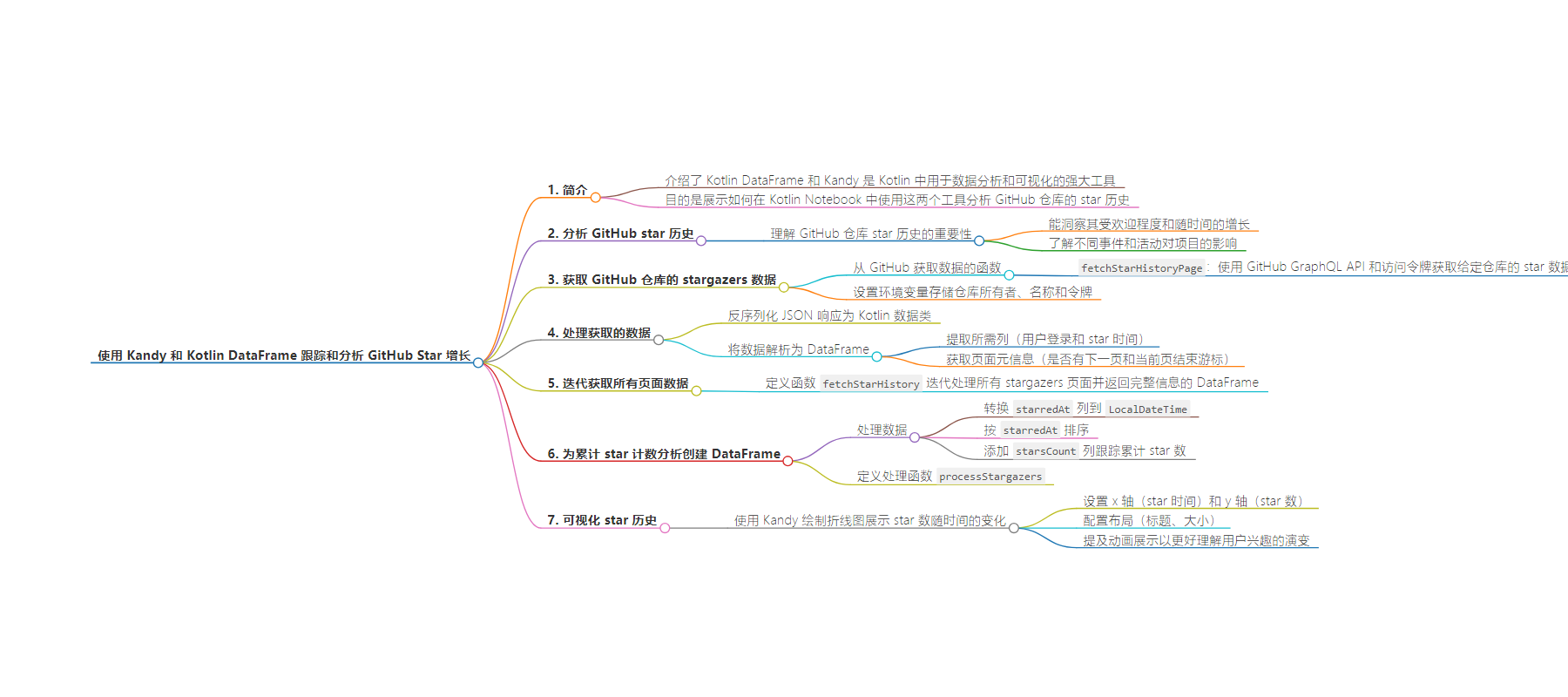
文章来源:blog.jetbrains.com
作者:Andrei Kislitsyn
发布时间:2024/8/26 14:37
语言:英文
总字数:3740字
预计阅读时间:15分钟
评分:85分
标签:Kotlin,数据分析,GitHub,可视化,Kotlin DataFrame
以下为原文内容
本内容来源于用户推荐转载,旨在分享知识与观点,如有侵权请联系删除 联系邮箱 media@ilingban.com
Track and Analyze GitHub Star Growth With Kandy and Kotlin DataFrame
Kotlin DataFrame and Kandy are two powerful tools for data analysis in Kotlin. Kotlin DataFrame simplifies data manipulation and processing, while Kandy allows you to create visualizations directly within your Kotlin projects.
In this post, we’ll show you how these tools can be used together within Kotlin Notebook to analyze the star history of GitHub repositories. This isn’t just a simple exercise for demonstration purposes – it’s a tutorial that can help you learn how to analyze your own repositories, understand their popularity trends, and visualize your data effectively. All examples from this post are available as a Kotlin Notebook on GitHub or a Notebook on Datalore, a data science platform by JetBrains.
Analyze your GitHub star history
Understanding the star history of a GitHub repository can provide insights into its popularity and growth over time. By analyzing this data, you can see how different events and activities impact the interest in your project. Our goal is to equip you with the knowledge and tools to perform this analysis on your own repositories.
Obtain repository stargazers data from GitHub
First, we need to gather data about the users who have starred a given repository. To achieve this, we’ll use the GitHub GraphQL API, which requires a GitHub access token. Here’s a simple function to request data about repo stars, including the starring time and user login:
import io.ktor.client.request.*import io.ktor.http.*/*** We need to specify the repository owner and name, as well as the access token.* There can be up to 100 results on one response page.* For this example, we'll take only the first 3 results.* `endCursor` points to the end of the previous page (`null` for the first one). */fun fetchStarHistoryPage(owner: String, name: String, token: String, first: Int = 100, endCursor: String? = null): NotebookHttpResponse { // GraphQL query val query = """ query { repository(owner: "$owner", name: "$name") { stargazers(first: $first, after: $endCursor) { edges { starredAt node { login } } pageInfo { endCursor hasNextPage } } } } """.trimIndent() // `http` is the default Ktor `HttpClient` for Notebook; // it has the same methods but without `suspend` modifiers, // allowing you to make HTTP requests quickly and easily. // Make a "post" request to the API with this query return http.post("https://api.github.com/graphql") { // Set authorization header with token bearerAuth(token) // Set content type header contentType(ContentType.Application.Json) // Set query as body setBody(buildJsonObject { put("query", query) }) }}
A convenient and easy way to set an environment variable is through the Kotlin Notebook settings:
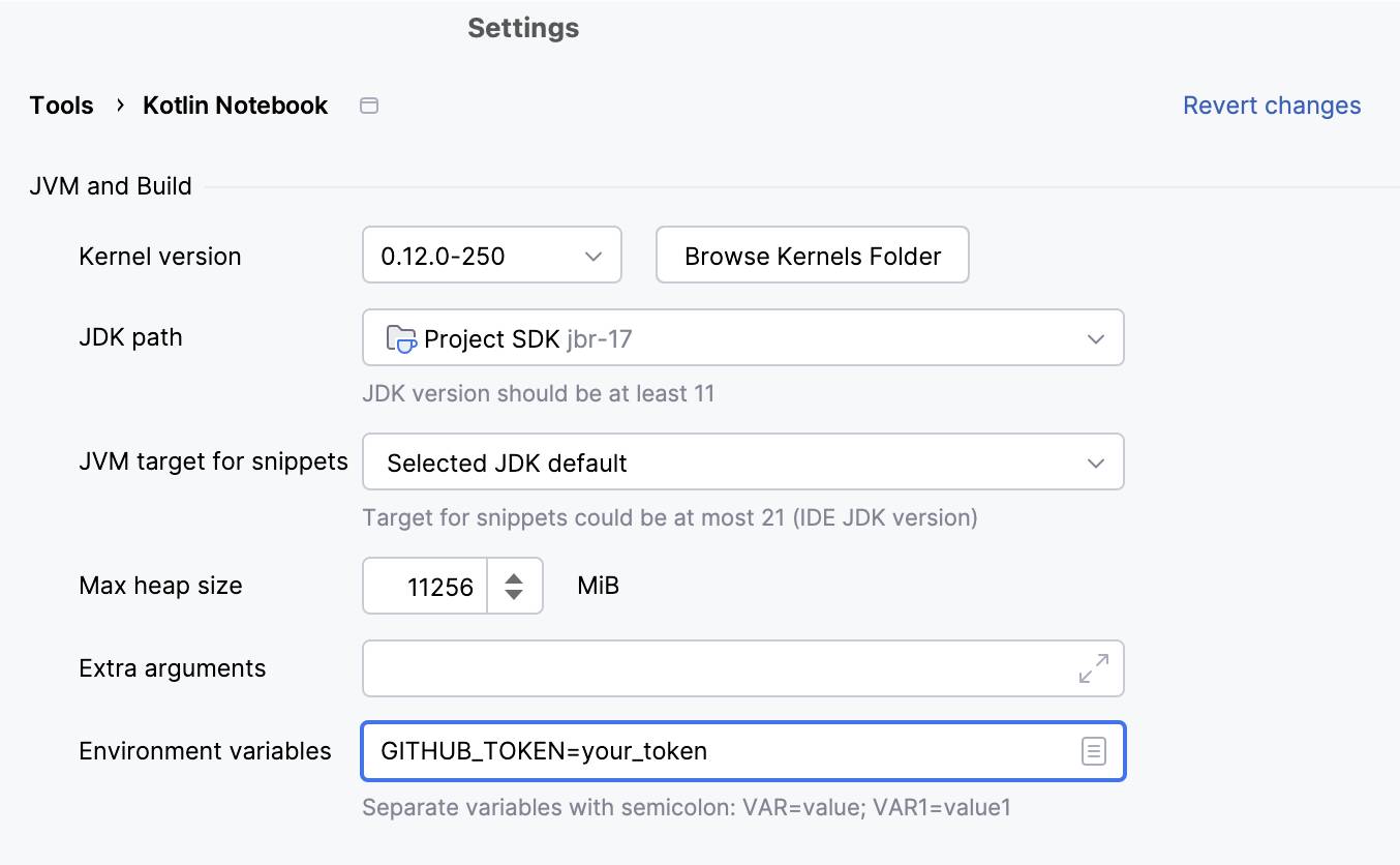
Next, specify the repository owner and name, and ensure your GitHub token is securely stored:
val ownerKotlin = "Kotlin"val repoKandy = "kandy"// Keep your token safe as an environment variable or a system property!// For example, you can place it in environment variables in Kotlin Notebook settings.val token = System.getenv("GITHUB_TOKEN")
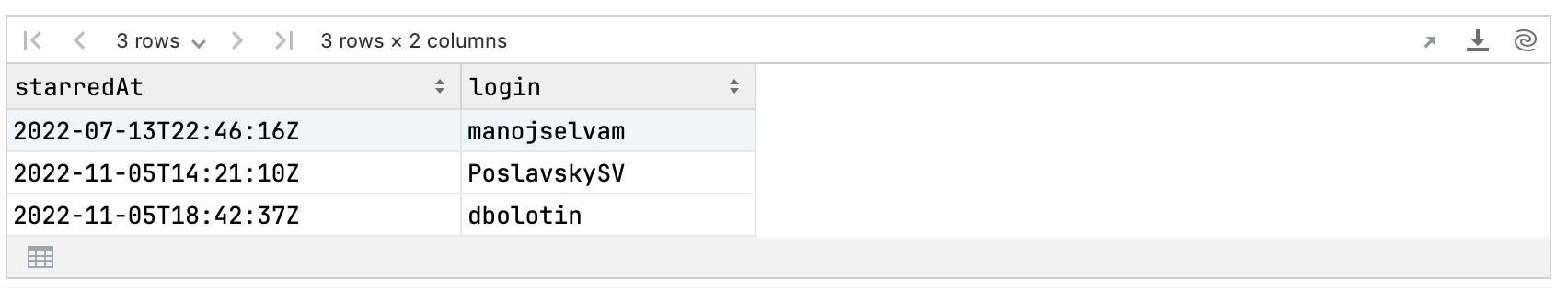
To start, let’s query a single page with a few users to examine the data.
val rawResponse = fetchStarHistoryPage(ownerKotlin, repoKandy, token, first = 3)rawResponse
The response from the API looks like this:
HttpResponse[https://api.github.com/graphql, 200 OK]
Next, we’ll deserialize the JSON response to a Kotlin data class using the .deserializeJson() extension provided by our Kotlin Notebook Ktor integration. This makes it easier to work with the response body data in Kotlin.
val starHistorySimplePage = rawResponse.deserializeJson()// Take the JSON string for further work with DataFrameval responseAsJson = starHistorySimplePage.jsonStringstarHistorySimplePage
The result is a structured object representing the data, which looks like this:
{ "data": { "repository": { "stargazers": { "edges": [ { "starredAt": "2022-07-13T22:46:16Z", "node": { "login": "manojselvam" } ...}
After executing the cell above, starHistorySimplePage is converted to a data class, allowing us to easily access those of its properties that correspond to JSON fields. This seamless integration with IntelliJ IDEA autocompletion makes working with the response straightforward.
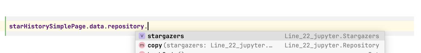
For example, we can extract all the starring times from the page:
starHistorySimplePage.data.repository.stargazers.edges.map { it.starredAt }
Output:
[2022-07-13T22:46:16Z, 2022-11-05T14:21:10Z, 2022-11-05T18:42:37Z]
Next, let’s parse the page data into a DataFrame.
val starHistoryPageDF = DataFrame.readJsonStr(responseAsJson)starHistoryPageDF
We need two columns: one showing the user logins and the other their starring times. We can retrieve these columns as follows:
starHistoryPageDF.data.repository.stargazers.edges.single() // the `edges` column contains a single DataFrame with current page stargazers.flatten() // `login` is a subcolumn of `node`, after `flatten()` it is a simple column
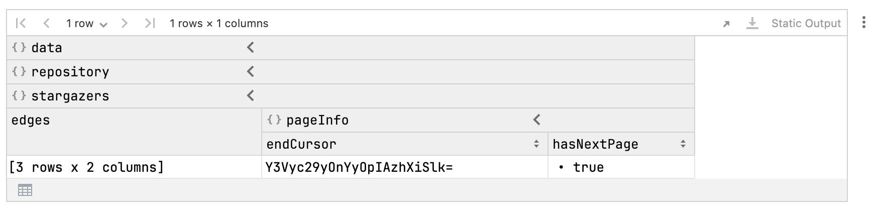
Additionally, we need page meta-information, including whether there is a next page and the current page end cursor.
with(starHistoryPageDF.data.repository.stargazers.pageInfo) {// Both are columns with a single valueprintln("end cursor: ${endCursor.single()}")println("has next page: ${hasNextPage.single()}")}
This code outputs the following:
end cursor: Y3Vyc29yOnYyOpIAzhXiSlk=has next page: true
Now, let’s create a function that iteratively processes all pages with stargazers and returns a DataFrame with complete information:
// Casts DataFrame to the type of a given DataFrame so we can use// extension columns that have already been generated.// Temporary workaround, will be available in future DataFrame releases// (https://github.com/Kotlin/dataframe/pull/747)inline fun <reified T> AnyFrame.castTo(df: DataFrame<T>): DataFrame<T> {return cast<T>(verify = true)}
import io.ktor.client.statement.*// Provide repo owner, name, and access tokenfun fetchStarHistory(owner: String, name: String, token: String): AnyFrame {var hasNextPage: Boolean = truevar endCursor: String? = nullvar buffer: DataFrame<*> = DataFrame.Emptywhile (hasNextPage) {val response = fetchStarHistoryPage(owner, name, token, 100, endCursor)// Cast type of DataFrame to the type of `starHistoryPageDF`,// so we can use its already-generated extensionsval responseDF = DataFrame.readJsonStr(response.bodyAsText()).castTo(starHistoryPageDF)val stargazers = responseDF.data.repository.stargazersbuffer = buffer.concat(stargazers.edges.first().flatten())val pageInfo = stargazers.pageInfoendCursor = "\"${pageInfo.endCursor.single()}\""hasNextPage = pageInfo.hasNextPage.single()}return buffer}
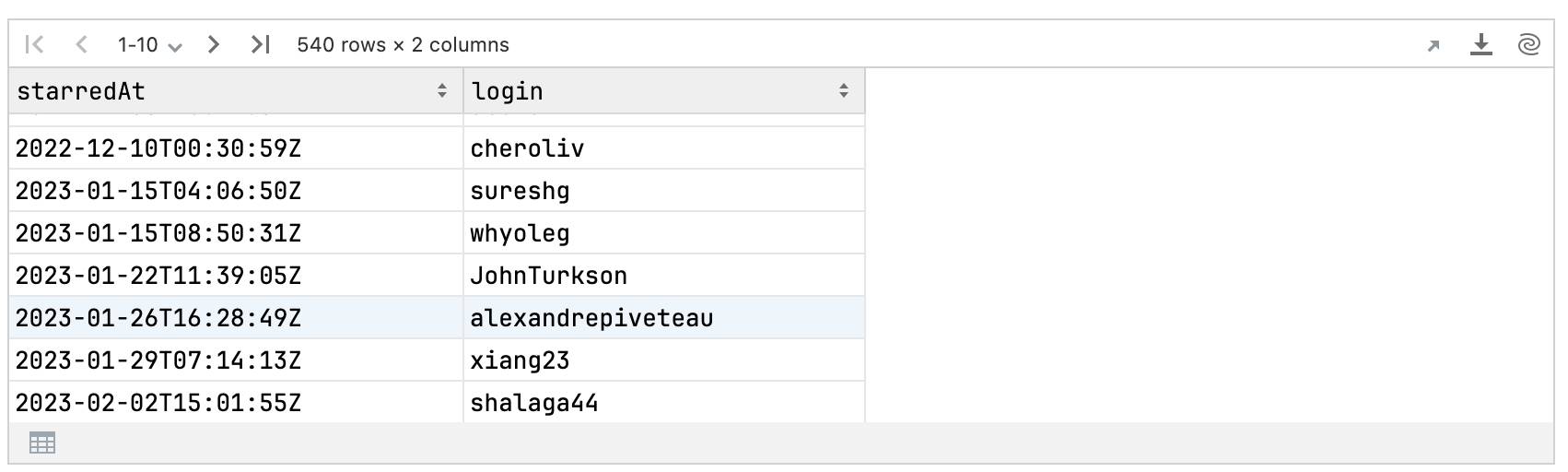
Using this function, we can now retrieve all the Kandy stargazers:
val kandyStargazers = fetchStarHistory(ownerKotlin, repoKandy, token)kandyStargazers
Look at the DataFrame summary using the .describe() method, which shows meta-information and accumulated statistics about DataFrame columns:
kandyStargazers.describe()
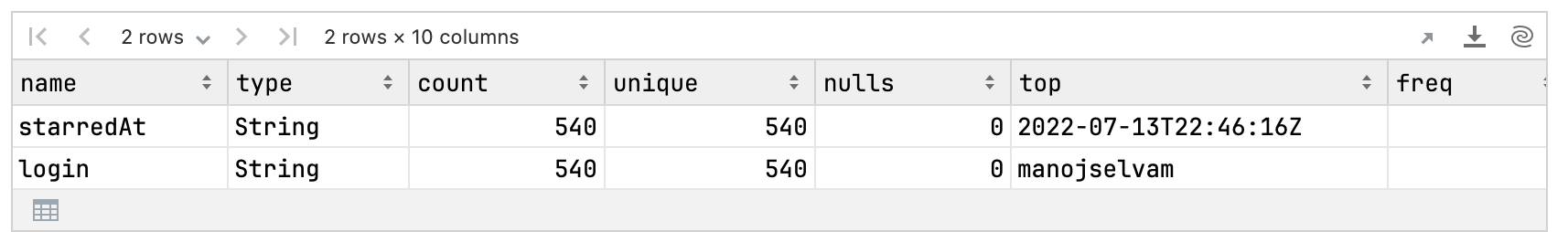
All login values are unique, indicating that the dataset is correct. Additionally, there are no null values, so no further processing is needed.
Create a DataFrame for cumulative star count analysis
We now have two key pieces of information: user logins and the times they award stars. Our next step is to perform an initial analysis.
We’ll create a visualization showing the cumulative number of stars received over time, illustrating how user interest in our library grows and changes.
This approach will help us understand the dynamics of user engagement and the popularity of our library.
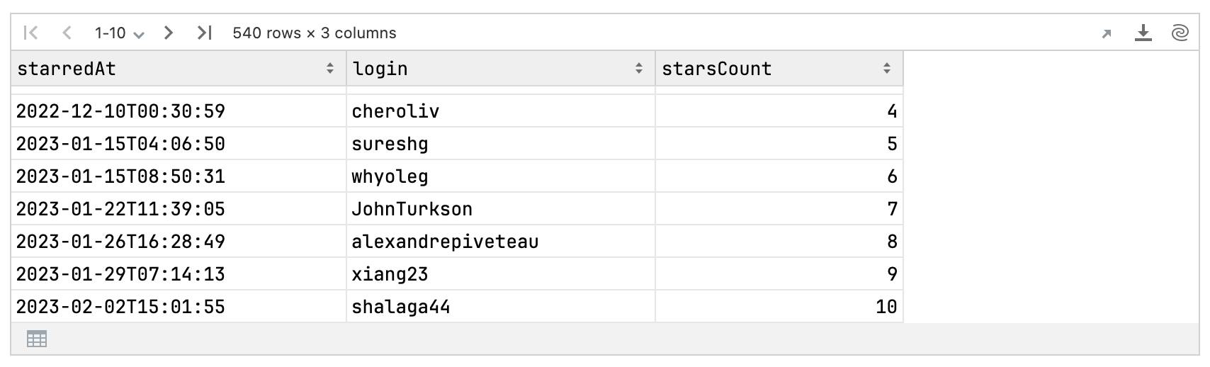
Here’s how to transform this data:
- Convert the
starredAtcolumn toLocalDateTime. - Sort the DataFrame by
starredAt, in ascending order. - Add a
starsCountcolumn to track the total number of stars over time.
Put the processing code into a function so that it can be reused later on.
fun AnyFrame.processStargazers(): AnyFrame {return castTo(kandyStargazers)// Convert `starredAt` column to `LocalDateTime`.convert { starredAt }.toLocalDateTime()// Sort rows by `starredAt`.sortBy { starredAt }// Add `starsCount` column with total stars count at each row.// The star count is simply the row index increased by 1.add("starsCount") { index() + 1 }}
val kandyStarHistory = kandyStargazers.processStargazers()kandyStarHistory
Visualize star history: plot with Kandy
With the data processed, we can now visualize the star history using Kandy. Here’s a simple line plot to show how the number of stars has changed over time.
kandyStarHistory.plot {line {// The starring time corresponds to the `x` axisx(starredAt) {axis {// Set the name for the `x` axisname = "date"// Set the format for axis breaksbreaks(format = "%b, %Y")}}// The stars count corresponds to the `y` axisy(starsCount) {// Set the name for the `y` axisaxis.name = "GitHub stars"}} layout {title = "Kandy GitHub star history"size = 800 to 500}}
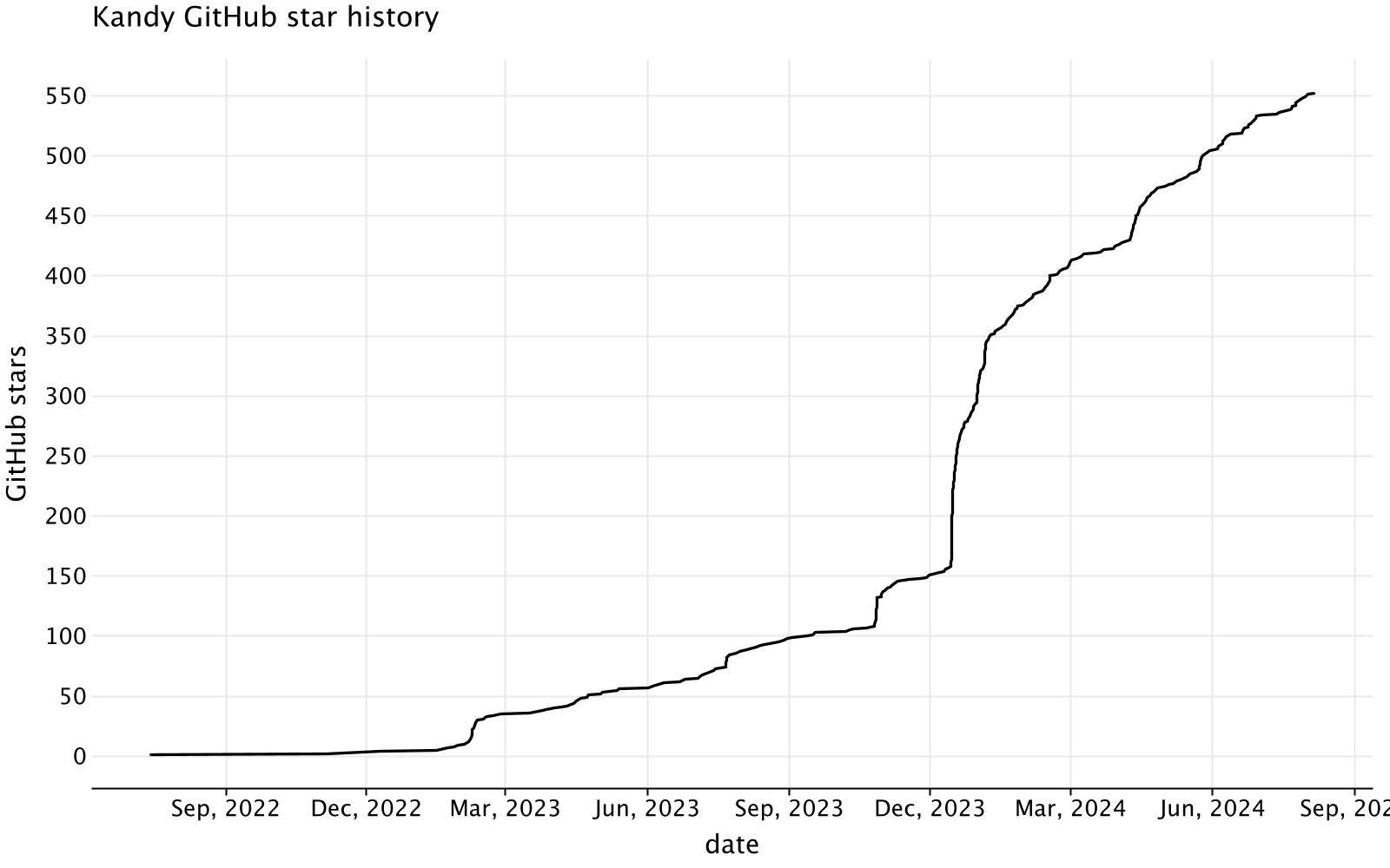
The plot displays the cumulative growth of stars, reflecting how interest in the Kandy library has evolved. Key points of significant increase can often be associated with major announcements or events related to the library.
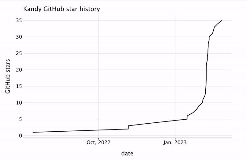
To better understand how user interest in our library evolves over time, we’ll animate this chart using the Kotlin Jupyter API. This dynamic visualization will help us see how engagement patterns shift and grow, providing deeper insights than a static chart could offer.
We’ll start by creating a function that builds a star history chart for the first n star(s).
fun kandyStarHistoryPlot(n: Int) = kandyStarHistory.plot {line {x(starredAt.take(n)) {axis {name = "date"breaks(format = "%b, %Y")}}y(starsCount.take(n)) {axis.name = "GitHub stars"}}layout {title = "Kandy GitHub star history"size = 800 to 500}}
Then, we’ll use the ANIMATE() function to update the cell output for a given set of frames. Each frame will be a star history plot, starting with one star and incrementing by one star each frame until we reach the maximum number of stars.
ANIMATE(50.milliseconds, kandyStarHistory.rowsCount()) { frameID ->// frame with `frameID` contsins plot with `frameID + 1` starskandyStarHistoryPlot(frameID + 1)}
Analyze key events
We’ll look at how different events influenced the growth of stars. We’ll add mark lines with the most important events related to Kandy, such as the Kotlin Notebook video, the Kandy introductory post, the Plotting Financial Data in Kotlin with Kandy post, and KotlinConf 2024. Such analysishelps to identify what drives interest and engagement with the project.
We’ll look at events starting from October 2023, which was when we initiated our marketing activities:
val starHistoryFiltered = kandyStarHistory.filter { starredAt >= LocalDateTime(2023, 10, 1, 0, 0, 0, 0) }
Then we’ll add mark lines with the events:
val ktnbYTVideodate = LocalDate(2023, 10, 25)val kandyIntroductoryPostDate = LocalDate(2023, 12, 14)val kandyFinancialPostDate = LocalDate(2024, 4, 9)val kotlinConf24Date = LocalDate(2024, 5, 22)val kandyEvents = listOf("Kotlin Notebook\nYouTube video","Kandy Introduction\nKotlin Blog post","Financial Plotting\nMedium post","KotlinConf 2024")val kandyEventsDates = listOf(ktnbYTVideodate, kandyIntroductoryPostDate, kandyFinancialPostDate, kotlinConf24Date)
To make the plot more visually engaging, we’ll create a custom color palette for these event markers.
val eventColors = listOf(Color.hex("#1f77b4"),Color.hex("#ff7f0e"),Color.hex("#d62728"),Color.hex("#2ca02c"),)
Finally, we’ll generate the plot with vertical lines representing these events, allowing us to see how each significant event influenced the star history.
starHistoryFiltered.plot {// add vertical marklines with event datesvLine {color(kandyEvents, "event") { scale = categorical(eventColors, kandyEvents) }xIntercept(kandyEventsDates)width = 1.5alpha = 0.9}line {x(starredAt) {axis.name = "date" }y(starsCount) { axis.name = "GitHub stars" }}layout {title = "Kandy GitHub star history & key events"size = 800 to 500style {legend.position = LegendPosition.Bottom}}}
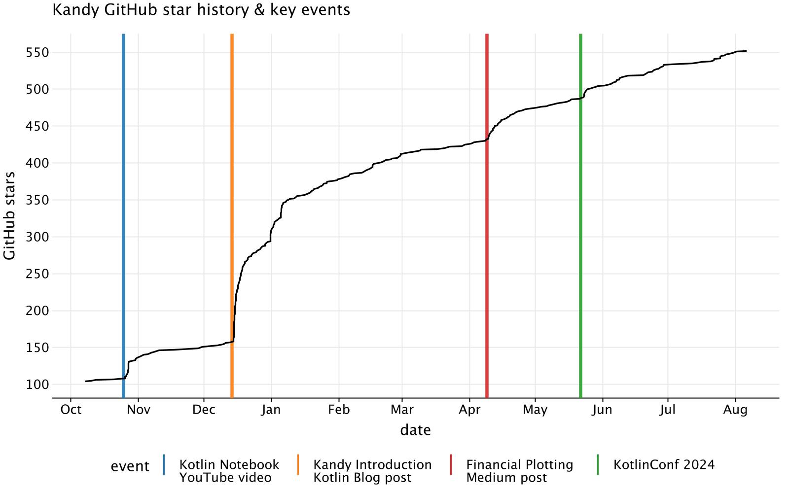
This plot shows the number of stars Kandy received each month, with different colors representing key events that influenced these numbers. For example, the introductory post and other significant updates coincide with noticeable increases in stars, highlighting the influence of these activities on community engagement.
Analyze monthly star growth
To analyze the monthly growth of stars, we will create a bar chart to visually display the changes in the number of stars received each month. This visualization will help us identify key growth periods and evaluate the effectiveness of our marketing strategies.
First, let’s define simple extension functions to convert the LocalDate/LocalDateTime to a month and four-figure year format.
fun LocalDate.toMonthOfYear(): String = "$month, $year"fun LocalDateTime.toMonthOfYear(): String = "$month, $year"
Now, we’ll add the “month” column to our DataFrame:
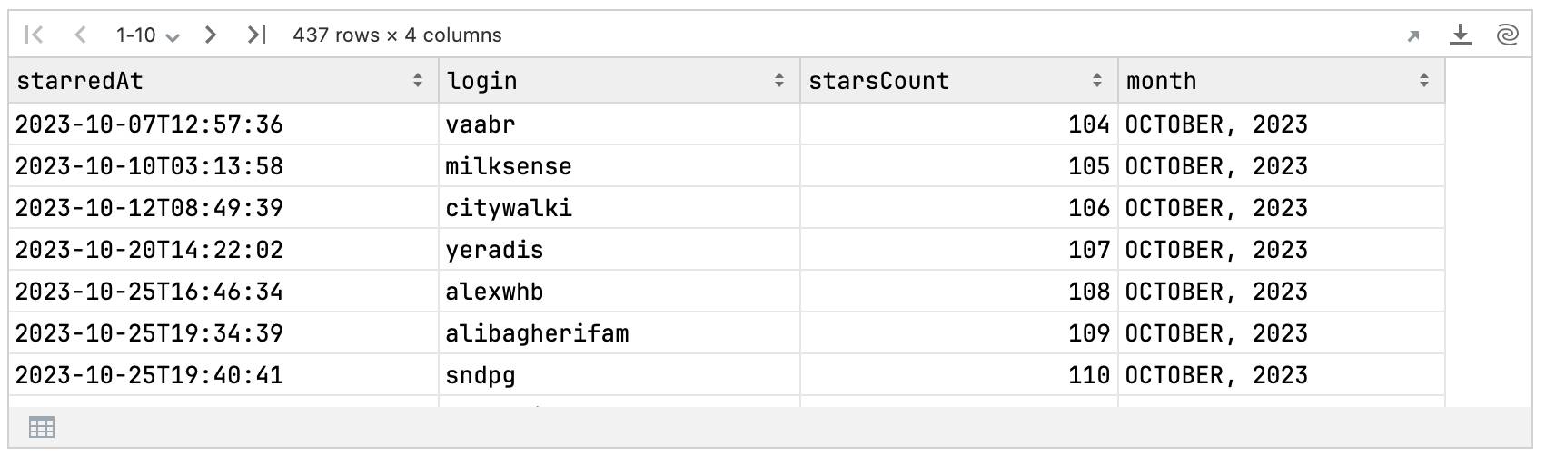
val starHistoryWithMonth = starHistoryFiltered.add("month") {starredAt.toMonthOfYear()}starHistoryWithMonth
Next, we’ll group the DataFrame by the “month” column and count the number of stars in each group.
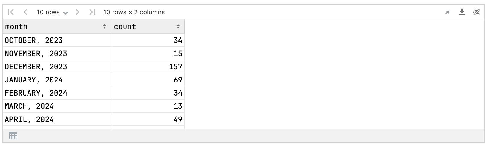
val starsCountMonthly = starHistoryWithMonth.groupBy { month }.count()starsCountMonthly
Next, we’ll add information about key events to the DataFrame. We’ll include the events in the corresponding months and set the value to null if there were no events.
First, create a DataFrame with events and their corresponding months:
val eventsDF = dataFrameOf("event" to kandyEvents, "month" to kandyEventsDates.map {it.toMonthOfYear()})
Then, perform a left join with our main DataFrame at the month column:
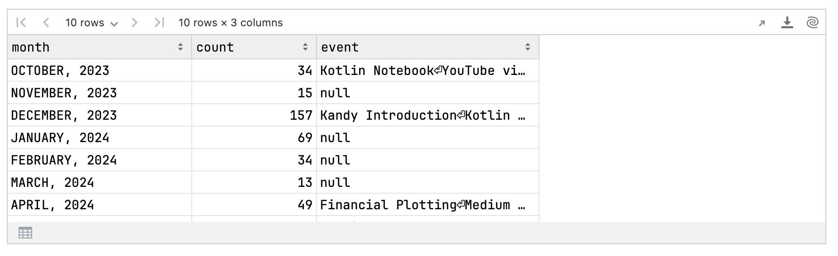
val starsMonthlyWithEvent = starsCountMonthly.leftJoin(eventsDF) { month }starsMonthlyWithEvent
Now, we can create a bar plot to visualize the distribution of new stars by month, along with the key events.
starsMonthlyWithEvent.plot {bars {x(month)y(count)alpha = 0.8fillColor(event) { scale = categorical(eventColors, kandyEvents) }}// add horizontal markline with median of monthly counthLine {val medianMonthly = count.median()yIntercept.constant(medianMonthly)type = LineType.DASHEDcolor = Color.hex("#4b0082")width = 2.0}layout {title = "Kandy GitHub star history (monthly count)"size = 800 to 500style {legend.position = LegendPosition.BottomxAxis.text { angle = 30.0 }}}}
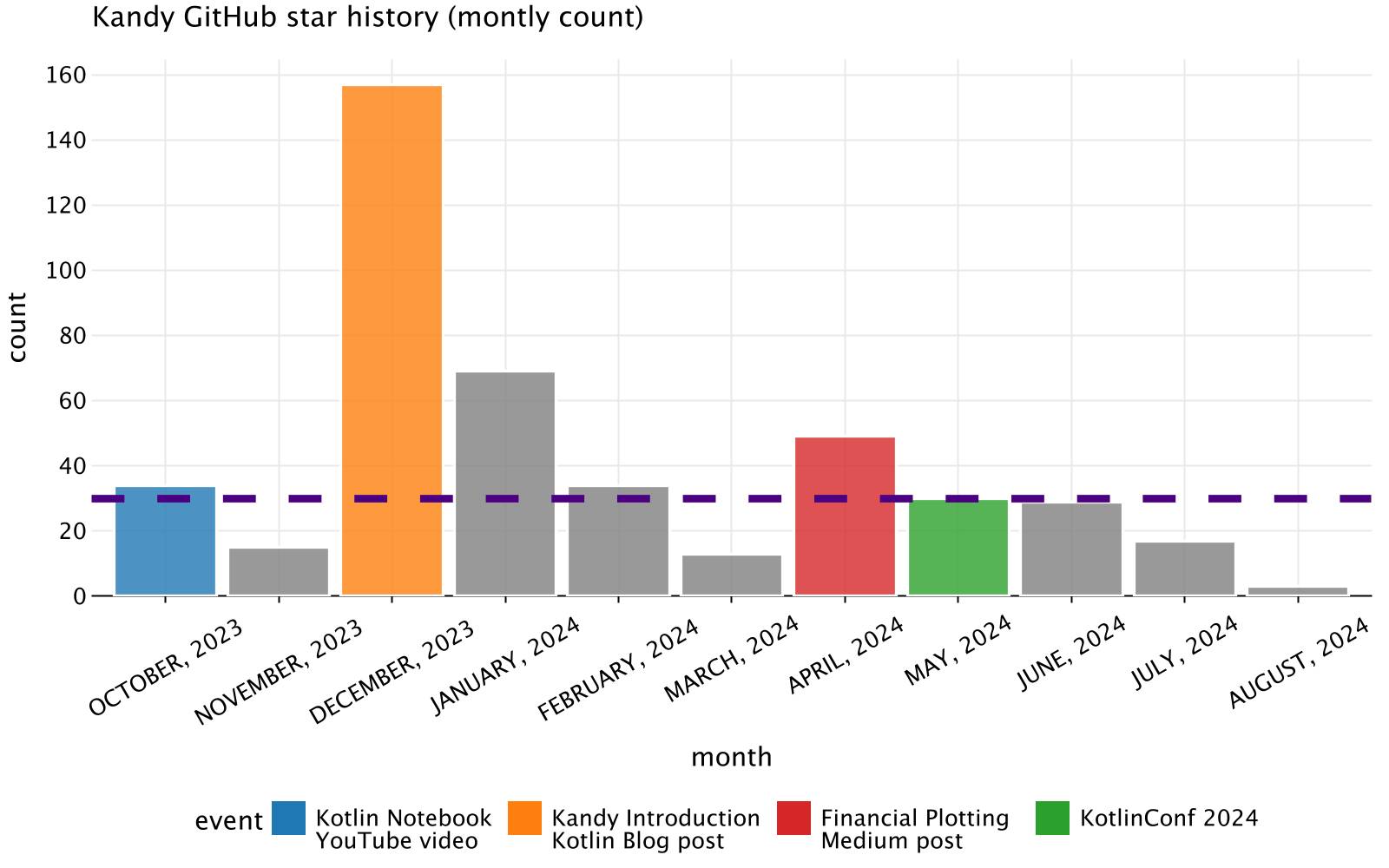
This plot shows the monthly distribution of stars, with bars representing the number of stars each month. The colors of the bars indicate key events, providing a clear visualization of how these events impacted the star counts. The dashed horizontal line represents the median star count per month.
Unlike the overall star history chart, which shows cumulative growth, the monthly statistics plot helps you pinpoint the exact timing and impact of key events. By creating similar plots for your own projects, you can better understand the effectiveness of your promotional efforts, identify seasonal patterns, and plan future activities more effectively.
Understand your audience
Understanding the top programming languages of your stargazers can provide insights into your audience. With this in mind, we’ll use the GitHub REST API to find out the most popular languages among Kandy stargazers and visualize this data as a pie chart.
Let’s write a function that requests user repositories:
import io.ktor.http.*fun getUserRepos(login: String): AnyFrame {return DataFrame.readJsonStr(http.get("https://api.github.com/users/$login/repos") {// Set authorization header with tokenbearerAuth(token)// Add GitHub API custom "accept" headerheader(HttpHeaders.Accept, "application/vnd.github.v3+json")}.deserializeJson().jsonString)}
Next, we’ll test this function on our sample repositories:
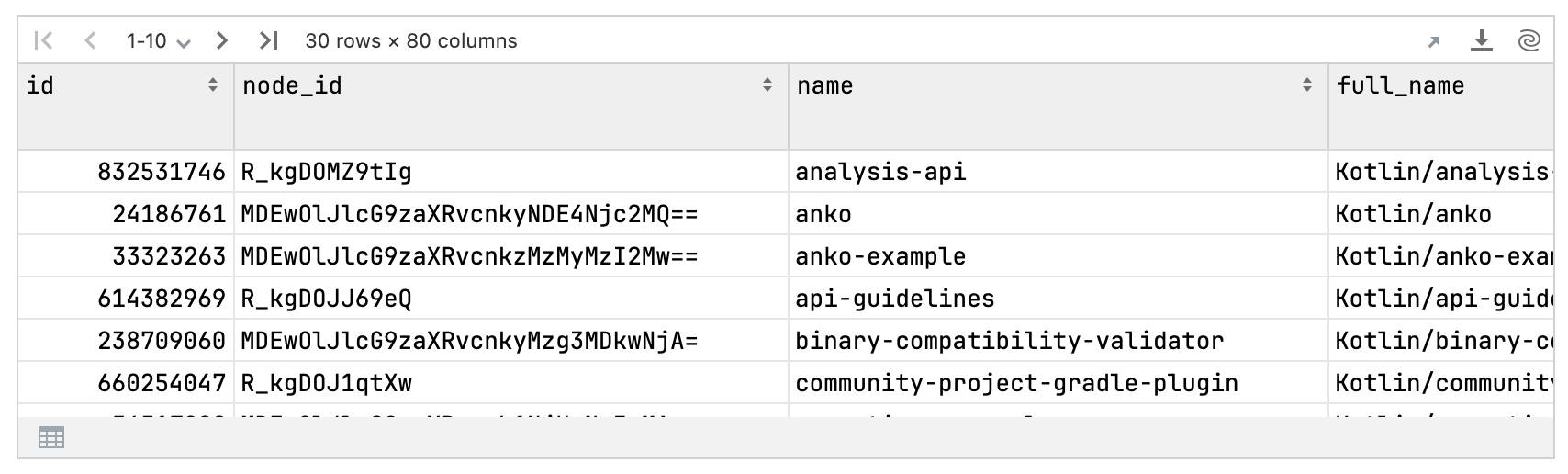
val myRepos = getUserRepos("Kotlin")myRepos
Each column in this DataFrame corresponds to a repository and contains different information about that repository. We are interested in the language column. We can count the most frequent language using the .valueCounts() method, where the first entry represents the most popular language:
val myLanguagesCounts = myRepos.language.valueCounts(dropNA = false) // Don't drop nullsmyLanguagesCounts
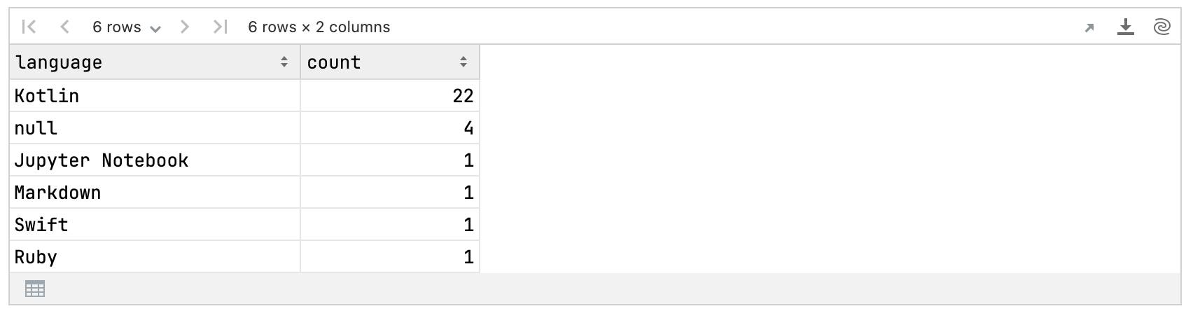
Because the rows are sorted by count by default, identifying the most popular language is straightforward – it’s the first one.
myLanguagesCounts.language.first()
Kotlin
To generalize this process, we’ll write an extension function for a DataFrame obtained from the user’s repositories. This extension function will retrieve the most popular language (returning null if the account is private, has no repositories, or lacks sufficient information).
fun AnyFrame.getTopLanguage(): String? {// Handle non-default response bodies (private account, no repositories, etc.)if (!containsColumn("language")) return nullreturn castTo(myRepos).language.valueCounts(dropNA = false).castTo(myLanguagesCounts).language.let { languages ->val first = languages.firstOrNull()// Try to pick the second value if the first one is nullif (first == null && languages.size() >= 2) {languages[1]} else first}}
Now, let’s retrieve the most popular languages for all stargazers. Note that this process might take some time to execute:
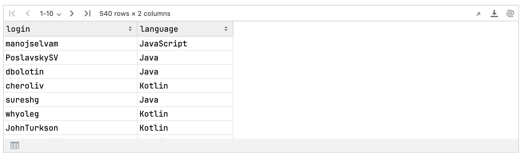
val stargazersLanguages = kandyStarHistory.select {login and login.map { login -> getUserRepos(login).getTopLanguage() }.named("language")}
stargazersLanguages
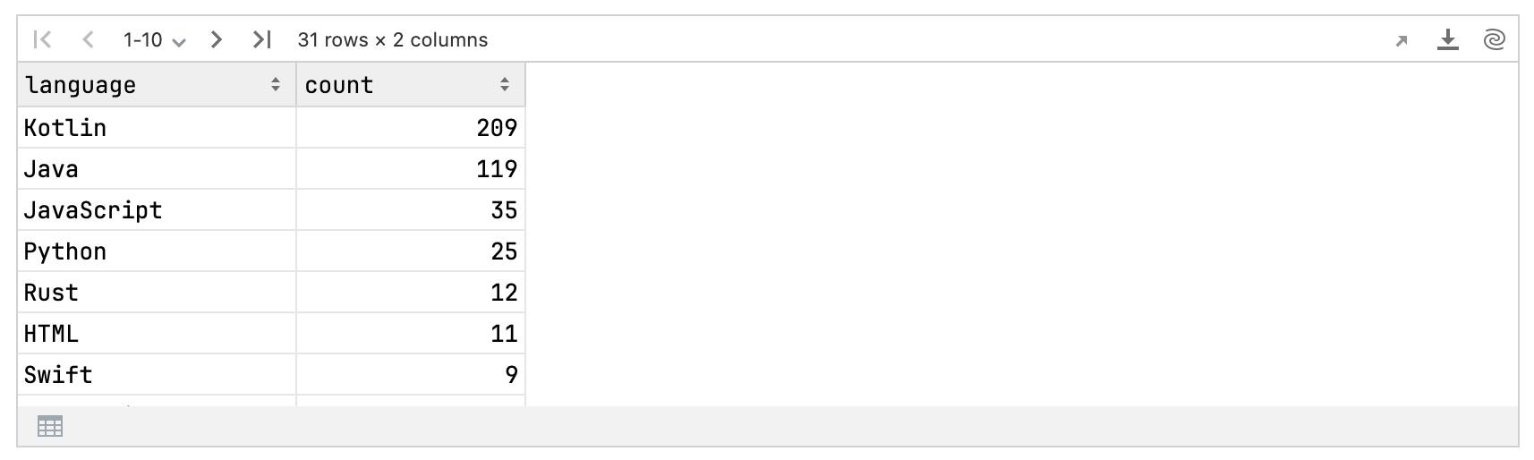
Next, we’ll count the occurrences of each language:
val languageCounts = stargazersLanguages.language.valueCounts() // Drops null by defaultlanguageCounts
Finally, let’s plot these counts as a pie chart. We’ll take the seven most popular languages and group the remaining ones into an “other” category:
languageCounts.let {val takeFirst = 7it.take(takeFirst).concat(dataFrameOf("language" to listOf("other"), "count" to listOf(it.drop(takeFirst).sum {count})))}.plot {pie {slice("count")fillColor("language")size = 25.0hole = 0.3}layout {title = "Kandy stargazers' most popular languages"style(Style.Void)}}
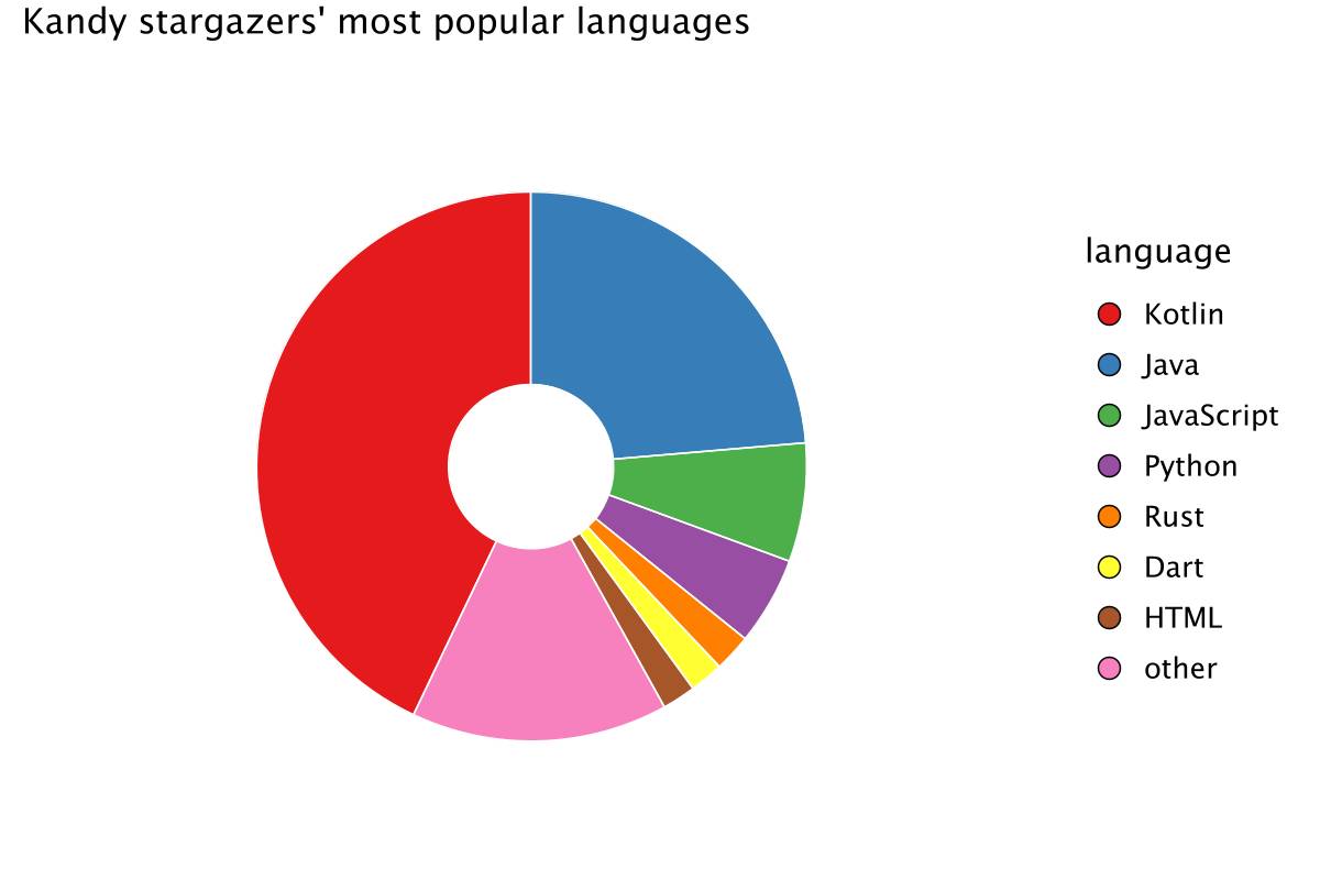
The pie chart shows that Kotlin is the most popular language among Kandy stargazers, confirming our primary audience as Kotlin developers. The presence of Java suggests potential for further engagement with related ecosystems. The inclusion of less-common languages highlights the diversity of our user base, which is important for understanding different use cases and potential feature requests.
These insights can help tailor your project’s documentation, tutorials, and marketing efforts to better serve and expand your audience.
Compare star growth: Kandy vs. Kotlin DataFrame
Comparing star data across different projects can provide valuable insights into their popularity and user engagement. Here, we’ll look at the growth of stars for Kandy alongside Kotlin DataFrame. These two projects, launched within a year of each other, target the same audience of Kotlin developers.
To ensure a fair comparison, we’ll use the introduction post date as the starting point for both libraries and examine the six months that followed. This way, we can see how each project grew over the same timeframe, giving us a clearer picture of their growth patterns.
val repoDataframe = "dataframe"// Use the already written methods to get star history for DataFrameval dataFrameStarHistory = fetchStarHistory(ownerKotlin, repoDataframe, token).processStargazers()
Defining the introductory post date for DataFrame:
val dataFrameIntroductoryPostDate = LocalDate(2022, 6, 30)
Next, we’ll define a function to process the star history for the six months following the introduction post:
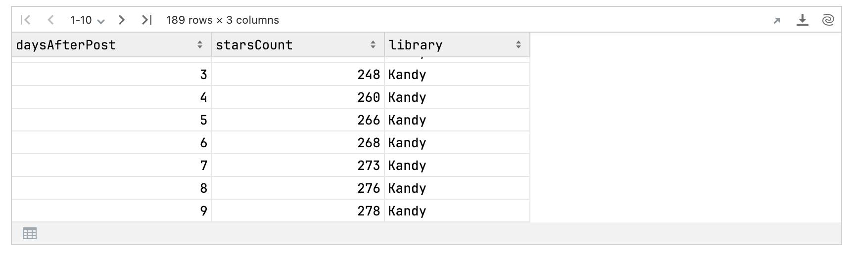
// Function that will slightly transform the dataframe with star history for a given library:// 1) Take a period of six months after the introduction post date;// 2) Add a column "daysAfterPost" with the number of days after the post date;// 3) Take the maximum number of stars for the day;// 4) Add a column "library" corresponding to the name of the library.fun AnyFrame.proccessAfterPostPeriod(introductionPostDate: LocalDate, library: String): AnyFrame {// Six-month period after `introductionPostDate`val period = (introductionPostDate - DatePeriod(days = 1))..(introductionPostDate + DatePeriod(months = 6))return castTo(kandyStarHistory)// Only take stars placed during that period.filter { starredAt.date in period }// Add daysAfterPost column with number of days after post.add("daysAfterPost") {introductionPostDate.daysUntil(starredAt.date)}// Group by number of days and take the max value of `starsCount` for each group.groupBy("daysAfterPost").max { starsCount }// Add a column with library name.add("library") { library }}
Finally, we’ll combine the star histories for Kandy and DataFrame into a single DataFrame for comparison:
// Count six-month history for both libraries and concatenate them into one DataFrameval kandyAndDataFrameStarHistory = kandyStarHistory.proccessAfterPostPeriod(kandyIntroductoryPostDate, "Kandy").concat(dataFrameStarHistory.proccessAfterPostPeriod(dataFrameIntroductoryPostDate, "DataFrame"))kandyAndDataFrameStarHistory
Next, we’ll visualize the comparison:
kandyAndDataFrameStarHistory.plot {line {x(daysAfterPost) {axis {name = "days after post"}}y(starsCount) {axis.name = "GitHub stars"}color(library)}layout {title = "Kandy vs. DataFrame GitHub stars history\nwithin 6 months after the introductory post"size = 800 to 500}}
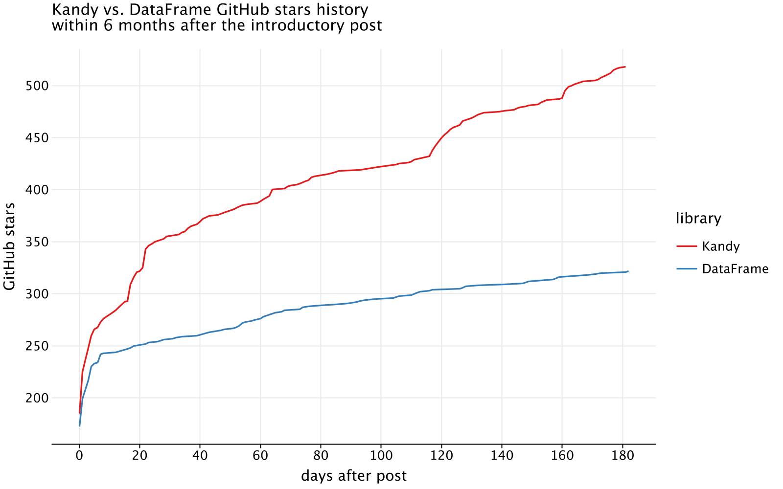
From the initial observation, we can see that before the introduction post, both Kandy and Kotlin DataFrame had similar star counts. However, immediately after the post, Kandy showed a significantly higher growth rate, achieving nearly twice as many stars as DataFrame within the first six months.
This difference suggests several things. Firstly, it shows the growing interest in Kotlin for data projects. The period of time that elapsed from the initial DataFrame post and the Kandy post was about a year and a half. While DataFrame helped establish a community of Kotlin data enthusiasts, Kandy attracted a new audience interested in visualization.
Additionally, Kandy had more intense promotional activities within the six months following its first post, which likely contributed to its rapid growth.
Shared stargazers
It’s also interesting to see how many users have starred both Kandy and DataFrame. We hypothesize that there will be a significant overlap, since both libraries serve the same community of Kotlin developers. Here’s how we can analyze this and get the relevant data:
// inner join star history dataframes of repositories by login,// getting a dataframe with all common stargazers, taking its size to get a number of themval commonStargazers = kandyStarHistory.innerJoin(dataFrameStarHistory) { login }.rowsCount()val kandyTotalStargazers = kandyStarHistory.rowsCount()val kandyOnlyStargazers = kandyTotalStargazers - commonStargazersval dataFrameTotalStargazers = dataFrameStarHistory.rowsCount()val dataFrameOnlyStargazers = dataFrameTotalStargazers - commonStargazers
Plot this data as a pie chart:
plot {pie {slice(listOf(commonStargazers, kandyOnlyStargazers, dataFrameOnlyStargazers))fillColor(listOf("Common", "Kandy only", "DataFrame only")) {scale = categorical("Common" to Color.hex("#4A90E2"),"Kandy only" to Color.hex("#F5A623"),"DataFrame only" to Color.hex("#7ED321"),)legend.name = ""}size = 25.0}layout {title = "Kandy & DataFrame stargazers ratio"style(Style.Void)}}
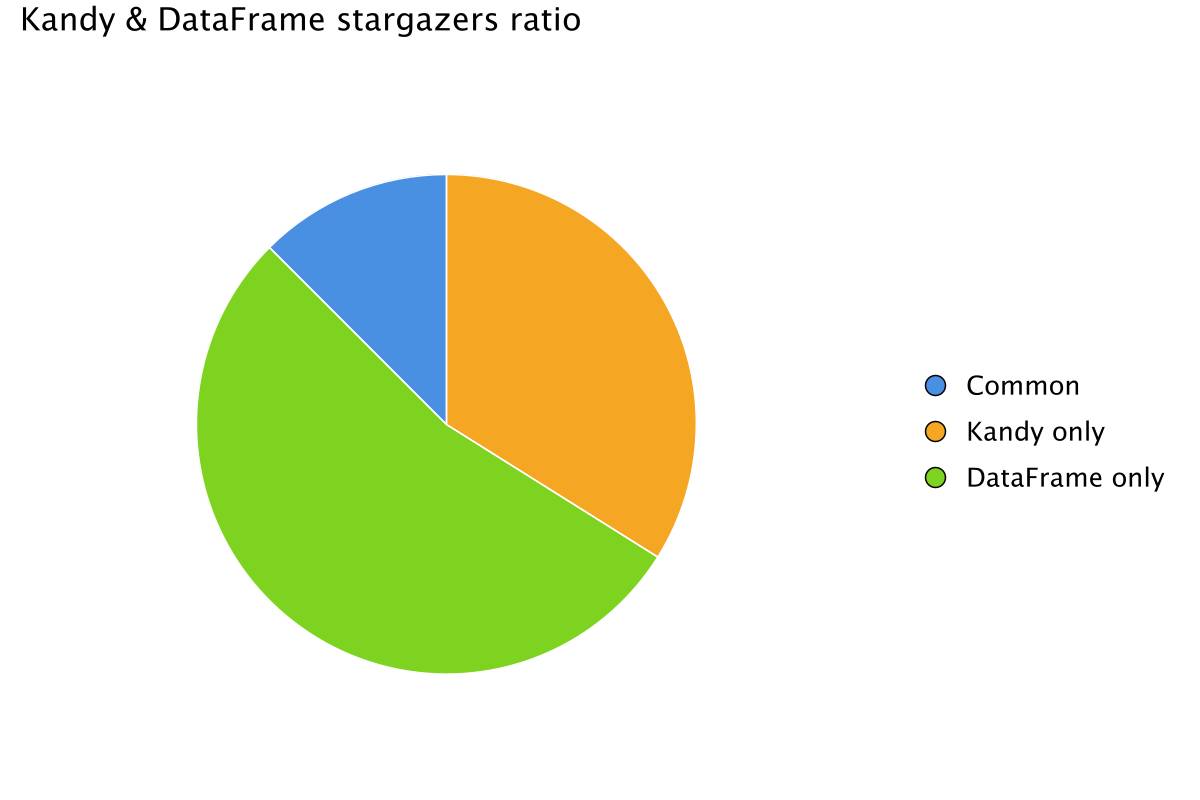
The analysis shows that the majority of stargazers are unique to DataFrame, with fewer users starring both DataFrame and Kandy. Specifically, the share of DataFrame stargazers who also starred Kandy is quite small. This is probably because many users use DataFrame for data tasks that don’t involve visualization, making Kandy less relevant to them.
Interestingly, only about a quarter of Kandy stargazers have also starred DataFrame. This suggests that Kandy has attracted a new audience mainly interested in plotting, rather than data processing. This reveals a great opportunity to promote how both libraries can work together.
Using Kandy for visualization and DataFrame for data processing allows users to benefit from the strengths of both libraries. This combination, as we’ve shown in this post, can help create powerful and comprehensive data analysis solutions. By highlighting this synergy, we can encourage more users to explore how these tools can complement each other and enhance their data projects.
Conclusion
In this post, we explored how to use Kotlin DataFrame and Kandy to dive into the star history of GitHub repositories. But it wasn’t just about looking at the numbers – it was about uncovering the stories those numbers tell.
One big takeaway is how quickly Kandy gained traction after its launch, highlighting a growing interest in visualization tools within the Kotlin community. Yet, we also found that many Kandy users haven’t tried DataFrame, and vice versa. This shows there’s an opportunity to help developers see how these tools can complement each other.
We also noticed that certain events, like blog posts and conferences, had a noticeable impact on star counts. This kind of insight can help you time your own announcements to get the most attention.
What’s next?
Now it’s your turn! Apply these techniques to your own repositories, analyze their star history, and create your own visualizations within Kotlin Notebook. All examples from this post are available as a Kotlin Notebook on GitHub or a Notebook on Datalore.
We’d love to see your results and hear your feedback. Join us in the #datascience channel on Kotlin Slack, or reach out via GitHub issues for Kandy or Kotlin DataFrame.
If you find our repositories useful, we’d really appreciate it if you starred them. Your support helps us improve and develop these tools further.
What else to read and watch
For more information, check out the following resources: