
包阅导读总结
1. 关键词:Media Queries、Container Queries、Responsive Web Design、Viewport、CSS
2. 总结:本文探讨了 Media Queries 和 Container Queries 的特点、应用场景及选择使用的因素。介绍了两者的定义和工作方式,对比了其基于视口或容器、模块化与灵活性、复杂度与维护等方面的差异,指出应根据理解、项目需求和未来趋势等因素决定使用。
3. 主要内容:
– Media Queries 和 Container Queries 的比较
– 定义和工作方式
– Media Queries 根据视口宽度应用样式,通过@media 规则实现。
– Container Queries 基于元素父容器大小应用样式。
– 特点对比
– 视口与容器:前者基于视口,后者基于容器元素。
– 模块化和灵活性:前者对创建模块化组件效果欠佳,后者促进模块化和灵活性。
– 复杂度和维护:前者在大型项目中管理繁琐,后者简化维护。
– 选择使用的因素
– 理解和舒适度:取决于对概念的理解和熟悉程度。
– 项目要求和复杂度:设计方法和项目复杂度决定选择。
– 未来趋势和协作:未来更倾向组件响应,两者可结合使用。
– 结论
– 容器查询潜力大,但未完全取代媒体查询,目前可结合使用。
思维导图: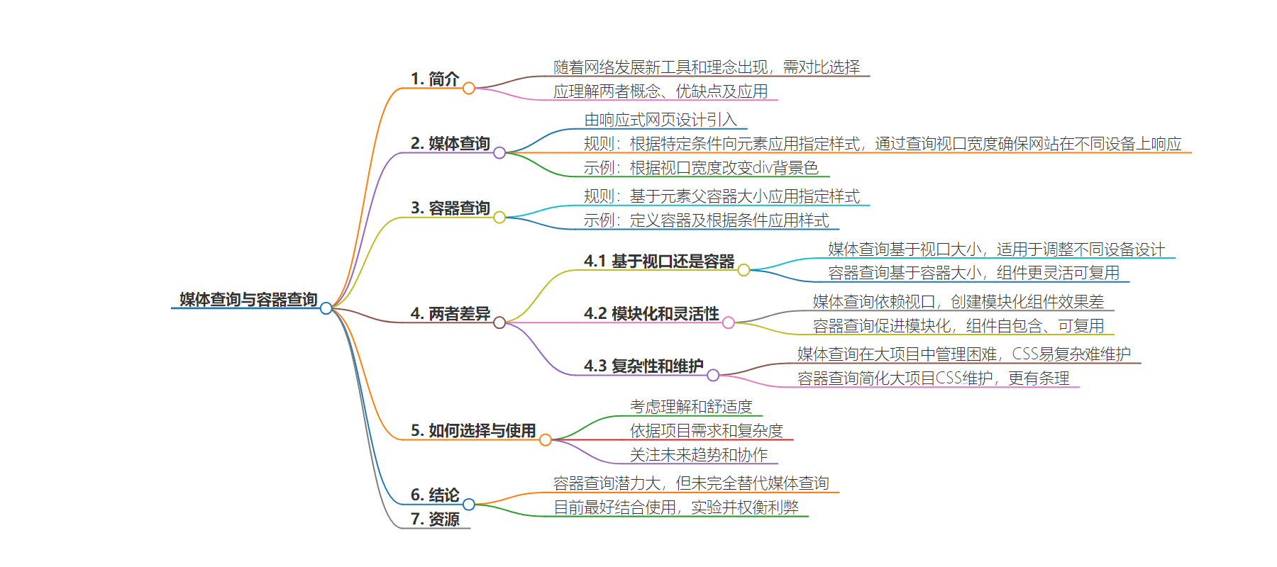
文章地址:https://www.freecodecamp.org/news/media-queries-vs-container-queries/
文章来源:freecodecamp.org
作者:Ophy Boamah
发布时间:2024/6/29 20:13
语言:英文
总字数:1306字
预计阅读时间:6分钟
评分:85分
标签:CSS,响应式设计
以下为原文内容
本内容来源于用户推荐转载,旨在分享知识与观点,如有侵权请联系删除 联系邮箱 media@ilingban.com
As the web evolves, new tools and ideas are released with the goal of making our lives as web developers easier. This means we have to choose whether to stick with the old ways or discard them entirely for the shiny new stuff. But does this always demand an either-or solution?
When in situations like these, the ideal approach is to understand both concepts – compare and contrast their strengths and weaknesses and then decide their most appropriate applications. This is exactly what this article will do with CSS media queries and container queries.
Before 2010, web developers could get away with creating websites that worked mainly on desktop. This was until Ethan Marcotte introduced the concept of Responsive Web Design (RWD). It’s defined by MDN as a way to design for a multi-device web. This lead to the adoption of media queries as a component of RWD.
But lately there’s been a shift towards what Jen Simmons defined as Intrinsic Web Design – the need for creating context-aware components. And container queries are making this possible.
Media queries are rules for applying specified styles to an element if certain conditions are met. They’re popularly used to ensure that websites are responsive on various devices by querying the viewport width.
Media queries are characterized by an @media rule followed by a condition in parentheses and an expression within brackets that will be applied if the indicated condition is met. So, if we wanted to change the background color of a div based on the viewport width of a device, this is how we might do that:
with class of mysite to be given a background-color of red if the viewport reaches a maximum width of 480px.
Tip: Max-width is used to assume a desktop-first design and targeting smaller as we go down. If it were a mobile-first design, we’d use min-width to target bigger screens as we go up.
What Are Container Queries?
Container queries are rules for applying specified styles to an element based on the size of that element’s parent container. They’re an answer to a long-standing question by web developers who wanted the ability to respond to changes within an individual container on the page rather than the whole viewport.
.header { container: mysite / inline-size;}@container mysite (min-width: 600px) { .maincard { grid-template-column: 1fr 1fr; } .item { background-color: green; }}As you can see in the code above, we first define a container whose children we want to make changes to. In our case, we’d like to make changes to the element with class of item, within the header container. You can do this by giving the container a name (optional) and type.
Next, using the @container rule, we check for condition(s) and apply some styles if met. For a minimum width of 600px, we want green as the background-color and two grid columns.
Tip: You don’t define a container to make changes directly to that container – but to it’s children. This means that if we wanted to make changes to the header container itself, we would have to nest it within another container: for instance container A and query A to affect it’s child – header.
Now, with an understanding of how both work, let’s see them in real-life. The CodePen below shows four elements in a layout. The first two are styled with container queries while the bottom two are styled with media queries. You can resize the viewport to see how the elements respond.
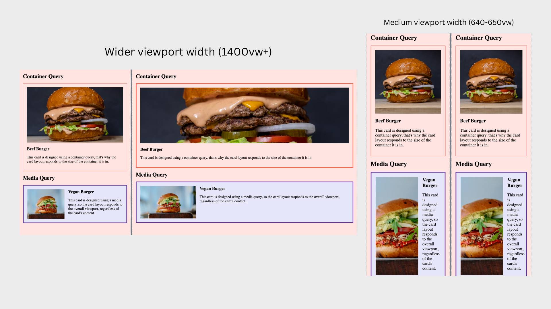 Media and container queries CodePen demo: project inspired by Miriam Suzanne.
See the Pen MQ vs CQ (from MS) by Ophy Boamah (@ophyboamah) on CodePen.
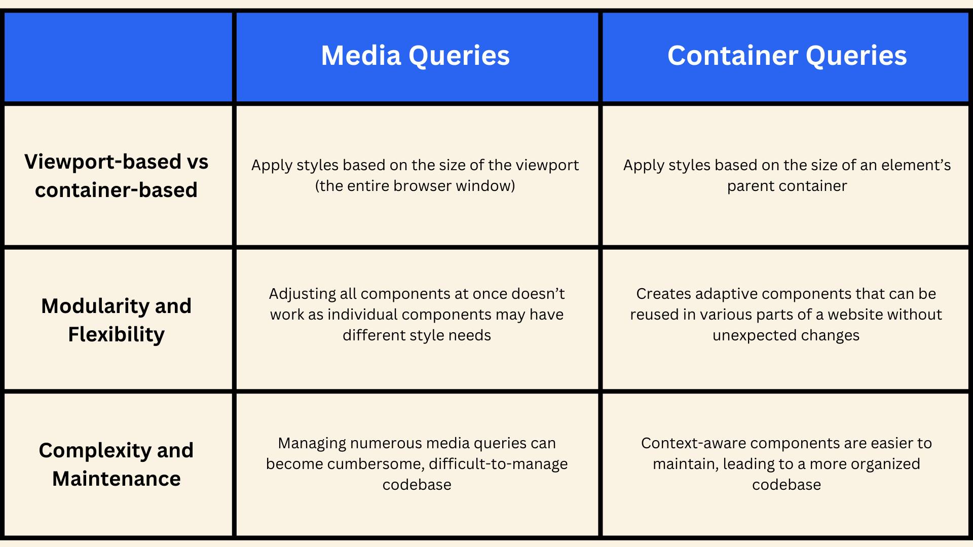 Summary of main differences, explained in detail below
Viewport-based vs. Container-based
Media queries apply styles based on the size of the viewport (the entire browser window). This means that the layout changes according to the overall screen size, making it suitable for adjusting designs for different devices like mobile phones, tablets, and desktops.
Container queries, on the other hand, apply styles based on the size of the container element in which they are placed. This allows individual components to adapt their appearance based on their own size rather than the viewport size, making them highly flexible and reusable across different parts of a web page.
Modularity and Flexibility
Since media queries depend on the viewport size, they can be less effective for creating truly modular components. Adjusting styles for one part of a page may unintentionally affect others, especially in complex layouts. Plus, they may fall short in scenarios where components need to adapt independently within a larger layout. This can lead to less maintainable CSS.
In contrast, container queries promote modularity and flexibility by allowing styles to be defined based on the container’s size. This means you can create components that are self-contained, adaptable, and that can be reused in various parts of a website without unexpected changes, enhancing their reusability.
This results in more adaptive designs where components can adjust their own layout and appearance, which is useful in modern, component-based design systems.
Complexity and Maintenance
In large projects, managing numerous media queries can become cumbersome. As the number of breakpoints and special cases grows, the CSS can become complex and harder to maintain. Over time, this can lead to a bloated and difficult-to-manage codebase.
Container queries can simplify the maintenance of CSS in large projects. By keeping styles component-specific and context-aware, the CSS remains more organized and modular. This reduces the complexity of managing global breakpoints and makes it easier to maintain, leading to a more organized codebase.
Which Should You Use and When?
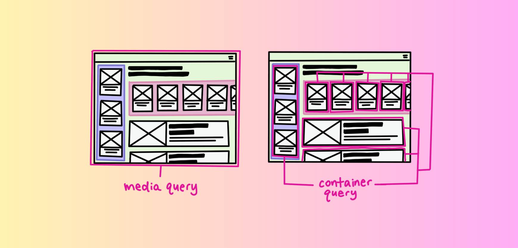 Media query vs container query (image credit: web.dev)
Everything we discussed in the previous sections is meant to help you make an informed decision. Having seen how these two concepts compare and contrast, now consider the following factors:
Understanding and Comfort
How well do you understand each concept? Container queries are relatively new but if you spend time studying and experimenting with them, just like media queries, the learning curve isn’t intimidating. So use in production the one you understand and are more comfortable with, to make your life easier.
Project Requirements and Complexity
What’s the design approach you’re using and how complex is your project? Because sometimes the design approach for your project will determine which of these will best suit your needs. Also, the more complex, the harder it’ll get to maintain your code and you want to use something you can manage.
Future Trends and Collaboration
The future of responsive design is looking more and more intrinsic. We’re gradually making a shift towards component responsiveness based on changes to their individual content, and container queries shine best here.
But media queries don’t seem to be going anywhere anytime soon, so you can use them together to achieve perfect responsiveness across many different devices.
Conclusion
The potential for container queries to allow creating reusable components in CSS is exciting – but it may not be ready to fully replace media queries for making web pages responsive just yet.
For now, our best bet is using them together, and where each makes the most sense. And you can be sure to make the right call by experimenting further to internalize the pros and cons of each.
Here are some helpful resources: