
包阅导读总结
1. 关键词:
– Plotly Dash
– Python
– 数据应用
– 低代码框架
– 数据分析
2. 总结:
本文介绍了最受欢迎的 AI 数据工具 Plotly Dash,它是 Python 中的低代码框架,用于构建数据应用。作者安装并试用了 Dash,通过示例讲解其工作原理,还尝试添加了表格,认为 Dash 易用但不够标准化,推荐用于展示数据。
3. 主要内容:
– 介绍 Plotly Dash 是支持数据应用的展示图形工具,在 Databricks 报告中排名第一
– 作者安装 Dash 所需环境,使用 Python 安装依赖模块
– 通过示例代码讲解 Dash 的布局、回调及组件使用,如下拉菜单和图表
– 尝试添加表格并配置相关属性
– 得出 Dash 易于使用但不够标准化,建议用于展示数据的结论
思维导图:
文章地址:https://thenewstack.io/introduction-to-plotly-dash-the-most-popular-ai-data-tool/
文章来源:thenewstack.io
作者:David Eastman
发布时间:2024/8/30 14:38
语言:英文
总字数:1278字
预计阅读时间:6分钟
评分:83分
标签:Plotly Dash,数据可视化,Python,AI 工程,低代码开发框架
以下为原文内容
本内容来源于用户推荐转载,旨在分享知识与观点,如有侵权请联系删除 联系邮箱 media@ilingban.com
The go-to language for data analysis, and to some extent AI development, is Python. Plotly Dash is a presentation graphing tool for supporting data apps. Or in their words, “Dash is the original low-code framework for rapidly building data apps in Python.” But as usual, low code still requires a reasonable grasp of programming.
Earlier this month, Plotly Dash was named the number one most popular tool in Databricks’ State of Data + AI report — even above Langchain! So it’s clearly a trendy tool in the AI engineering ecosystem. “For more than 2 years, Dash has held its position as No. 1, which speaks to the growing pressure on data scientists to develop production-grade data and AI applications,” wrote Databricks.
In this post, I’ll install and play around with Dash, and maybe in a future post, we can build something with it. I’ve used Jupyter notebooks before, but here we’ll just use a classic web server to host the outcome.
So in my trusty Warp shell, we’ll install the two requirements. As I’m not a regular Python guy, I didn’t have the recommended Python version in my .zshrc shell configuration file, so I added that:
|
#python export PATH=“$HOME/Library/Python/3.9/bin:$PATH” |
Then I used pip to install the dependent modules:
|
pip install dash pip install panadas |
Dash will effectively match HTML references into its own component base, and has some specially written interactive graphs and tables too.
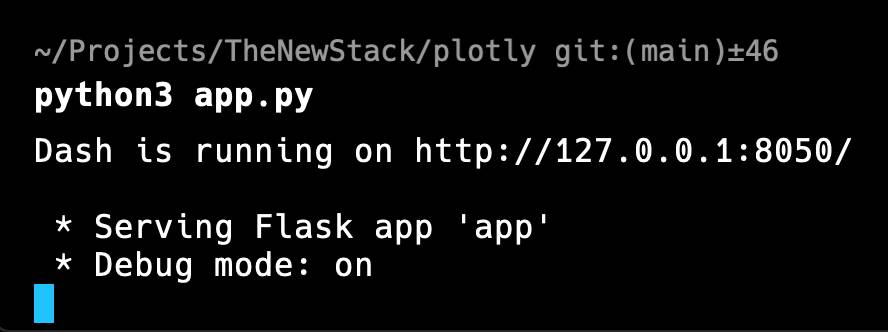
To test that things are working, we’ll just try the “minimal” app.py, and run it.
|
1 2 3 4 5 6 7 8 9 10 11 12 13 14 15 16 17 18 19 20 21 22 23 24 25 |
from dash import Dash, html, dcc, callback, Output, Input import plotly.express as px import pandas as pd
df = pd.read_csv(‘https://raw.githubusercontent.com/plotly/datasets/master/gapminder_unfiltered.csv’)
app = Dash()
app.layout = [ html.H1(children=‘Title of Dash App’, style={‘textAlign’:‘center’}), dcc.Dropdown(df.country.unique(), ‘Canada’, id=‘dropdown-selection’), dcc.Graph(id=‘graph-content’) ]
@callback( Output(component_id=‘graph-content’, component_property=‘figure’), Input(component_id=‘dropdown-selection’, component_property=‘value’) )
def update_graph(value): dff = df[df.country==value] return px.line(dff, x=‘year’, y=‘pop’)
if __name__ == ‘__main__’: app.run(debug=True) |
We can see that a layout is established, and a couple of callbacks. So we’ll have to figure out what they are doing later. I’m guessing from the update_graph method that this is a population growth graph, even though the CSV link name gives us no clue.
After making the app.py file and running it, eventually, I get a response:
So looking at the local site at the local address stated, I have:
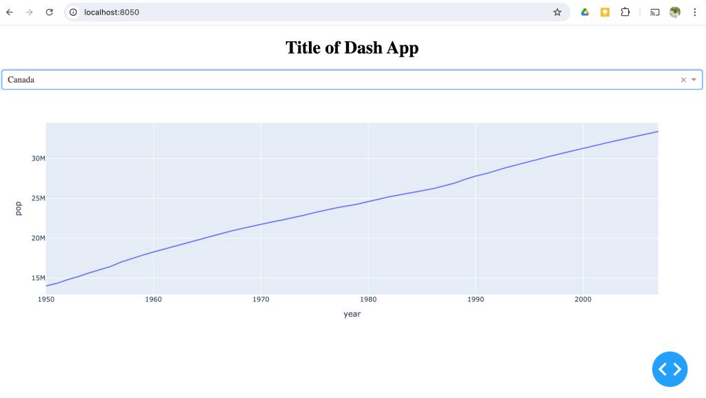 Note that “Canada” is the set choice in the dropdown, and that the graph changes immediately if I select another nation. So this gives us a bit of a clue as to what the callbacks are doing.
As expected, if I look at the CSV file contents, it has a bunch of data points:
|
country,continent,year,lifeExp,pop,gdpPercap Afghanistan,Asia,1952,28.801,8425333,779.4453145 Afghanistan,Asia,1957,30.332,9240934,820.8530296 … Canada,Americas,1950,68.28,14011422,10581.26552 Canada,Americas,1951,68.55,14330675,10932.46678 Canada,Americas,1952,68.75,14785584,11367.16112 … |
This means we can see what the x and y-axis labels refer to. We can also see the other data we could choose to graph.
Let’s analyze the code until we have figured the rest out. The pandas module read_csv results into a dataframe (hence “df”). This is just the structure for later work. You can read from an Excel data sheet directly too.
The dcc module (Dash Core Components) gives us both the dropdown and the graph. Altogether, the layout is just a list of components: in our case a title, a dropdown and the graph.
At this point, it is interesting to note that neither the Graph nor the Dropdown components are ever referred to directly again. Indeed, the Graph does not even take in the DataFrame. Clearly, there is some studied decoupling going on.
Now, we use the IDs “dropdown-selection” and “graph-content”.
|
… @callback( Output(component_id=‘graph-content’, component_property=‘figure’), Input(component_id=‘dropdown-selection’, component_property=‘value’) ) … |
We have an Output callback that refers to the “graph-content” ID first defined for the Graph component and uses the “figure” property of the component. Here, I think “figure” just means the diagram to display. The Input refers to the Dropdown component via the “dropdown-selection” ID, and reads the “value” property.
|
… def update_graph(value): dff = df[df.country==value] return px.line(dff, x=‘year’, y=‘pop’) … |
As there is only one method mentioned, update_graph, and we don’t use that in the code, it is clearly used by the graph component to, er, update the graph. This just takes the country value from the dropdown. In other words, I could replace dff = df[df.country==value] with dff = df[df.country==’Canada’] to see Canada’s stats from the DataFrame. You can go ahead and change the code with the live page — it hot reloads.
So when we change country, the graph is rebuilt, with each line of the csv feeding into the update_graph method; and in this case, making a line from point to point.
Let’s experiment. If we have understood this correctly, we should be able to add, say, a table using the same data. Now, assuming we get hold of the table constructor, what would we need?
- We will need the import line.
- Add it as a line to the layout.
We won’t need anything else if the table doesn’t interact — the data table is already a fully interactive component.
Next, I’ll add the table import to the end of existing imports:
|
from dash import Dash, html, dcc, callback, Output, Input, dash_table |
I’ll also add the table constructor to the existing layout. We know it is a big table, so I’ll use a page size:
|
app.layout = [ html.H1(children=‘Title of Dash App’, style={‘textAlign’:‘center’}), dcc.Dropdown(df.country.unique(), ‘Canada’, id=‘dropdown-selection’), dcc.Graph(id=‘graph-content’), dash_table.DataTable(data=df.to_dict(‘records’), page_size=10) ] |
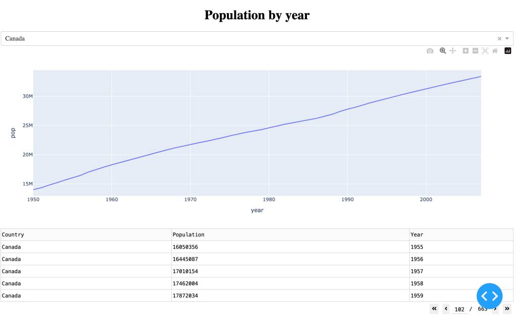
That already works, but we need to limit the columns to Country, Population and Year:
|
app.layout = [ html.H1(children=‘Population by year’, style={‘textAlign’:‘center’}), dcc.Dropdown(df.country.unique(), ‘Canada’, id=‘dropdown-selection’), dcc.Graph(id=‘graph-content’), dash_table.DataTable(data=df.to_dict(‘records’), columns=[ {‘name’: ‘Country’, ‘id’: ‘country’, ‘type’: ‘text’}, {‘name’: ‘Population’, ‘id’: ‘pop’, ‘type’: ‘numeric’}, {‘name’: ‘Year’, ‘id’: ‘year’, ‘type’: ‘numeric’} ], page_size=5, style_cell={‘textAlign’: ‘left’} ) ] |
Notice that I added left alignment, a smaller page size and a nicer title. This gives us:
The Verdict
Dash was pretty straightforward to work with, even though my Python is very much at a basic level. I was looking at controlling the data into the data_table, and that was a bit trickier.
It doesn’t feel entirely standardized, however, so you will need to read the notes for every component you want to try out. But I recommend you try it out the next time you want to show off some data.
YOUTUBE.COM/THENEWSTACK
Tech moves fast, don’t miss an episode. Subscribe to our YouTubechannel to stream all our podcasts, interviews, demos, and more.