
包阅导读总结
1. 关键词:小红书、瀑布流、虚拟列表、布局实现、前端技术
2. 总结:
作者因小红书 PC 端的瀑布流布局被吸引,研究其实现原理。文中先介绍基础瀑布流的思路,包括准备数据、组件结构搭建、初始化操作等,还提到计算最小列高度和卡片位置,最后实现了触底加载更多的效果,未做 loading 蒙层和图片懒加载效果,留给读者拓展。
3. 主要内容:
– 背景与引入
– 作者因女友分享的小红书超链接,被其 PC 端的瀑布流布局吸引,决定研究实现原理
– 基础瀑布流实现
– 实现思路
– 常规布局的不足,瀑布流布局的核心思想是控制列宽,按贪心思想摆放卡片
– 准备数据
– 讨论后端返回图片尺寸信息的情况,介绍图片预加载技术
– 组件结构搭建及样式
– 定义 DOM 结构和样式
– Props 和初始化状态
– 定义相关属性和组件内部状态
– 初始化操作
– 计算卡片宽度,发送请求获取数据
– 计算最小列高度和卡片位置
– 实现计算最小列高度的方法,根据请求数据计算卡片位置
– 对接数据展示效果
– 在父组件中使用,展示效果
– 触底加载更多
– 给 container 添加滚动事件,解决触底频繁请求和数据添加位置问题
思维导图:
文章地址:https://mp.weixin.qq.com/s/j_LFZz1aiY4X8WABqPa1KA
文章来源:mp.weixin.qq.com
作者:討厭吃香菜
发布时间:2024/8/8 8:38
语言:中文
总字数:6372字
预计阅读时间:26分钟
评分:80分
标签:前端开发,瀑布流布局,虚拟列表,响应式设计,Vue.js
以下为原文内容
本内容来源于用户推荐转载,旨在分享知识与观点,如有侵权请联系删除 联系邮箱 media@ilingban.com
点击公众关注号,“技术干货”及时达!
扯皮
还记得那是周五的一个晚上,那天正在寝室用笔记本玩赛博朋克2077 happy 中🥰,突然女朋友给我发了一个小红书的超链接,我像往常一样无视发送的内容直奔链接准备看完赶紧应付几句话继续游戏🤣
打开链接以为跟其他类似产品一样都会让你直接选择下载 App,没想到小红书的 PC 端惊到我了,首页出乎意料的好看
那时候年轻的我还不知道瀑布流是什么,只是觉得这个布局配合卡片的一些点击交互很有感觉,啧啧啧,我一个大男的看一些女性的推荐都被吸引到了,不过吸引我的不是内容,而是它的布局和交互🤩🤩🤩
这段时间全在忙学校实训不写文章手都痒了,今天就来研究一下小红书的瀑布流布局🧐
正文
其实掘金上已经有很多篇文章都讲过小红书瀑布流的实现,但是如果仔细观察小红书使用的是瀑布流虚拟列表,关于这一点我几乎没有见到一篇文章有着重讲解的,都是简单讲讲瀑布流实现了事
但我认为小红书首页布局最大的亮点就在瀑布流和虚拟列表的结合,所以这段时间就来深入讲解一下这块实现的原理
之前已经讲解过虚拟列表的实现👇:
定高的虚拟列表会了,那不定高的…… 哈,我也会!看我详解一波!🤪🤪🤪 – 掘金 (juejin.cn)
面试官:能否用原生JS手写一个虚拟列表…啊?你还真能写啊? – 掘金 (juejin.cn)
本文属于瀑布流虚拟列表的前置篇 ,因为瀑布流虚拟列表牵扯的概念比较多所以需要拆分讲解,这次就先科普一下基础瀑布流的实现,用 Vue3 + TS 封装一个瀑布流组件
瀑布流虚拟列表文章已更新!!!👇:
瀑布流优化:历经一周的时间,我终于把小红书的瀑布流虚拟列表撕出来了🧐! – 掘金 (juejin.cn)
实现思路
上手写代码之前我们简单介绍一下瀑布流布局的实现思路
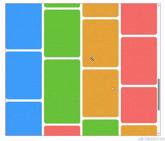
瀑布流布局的应用场景主要在于图片或再搭配一点文字形成单独的一张卡片,由于图片尺寸不同会造成卡片大小不一,按照常规的盒子布局思路无外乎只有两种:
独占一行不用讲肯定不符合我们想要实现的效果,而紧挨着排列由于卡片大小问题会出现这样的情况:
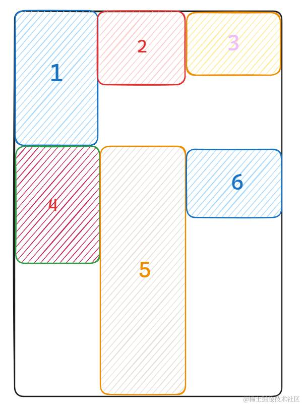
当前行高度最大的盒子决定了下一行盒子摆布的起始位置,如果卡片之间高度差距过大就会出现大量的留白
很显然常规布局并不能很好的利用空间,给人带来的视觉效果也较为混乱
而使用瀑布流布局很好的解决了这一点,我们打破常规布局的方案,使用定位或者位移来控制每张卡片的位置,最大化弥补卡片之间的留白情况
所以瀑布流布局的核心实现思想:
-
控制容器内每一列卡片的宽度相同(不同图片尺寸等比例缩放) -
第一行卡片紧挨着排列,第二行开始采取贪心思想,每张卡片摆放到当前所有列中高度最小的一列下面
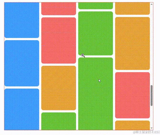
如果按照这样的思想我们改造上面图中卡片摆放的顺序:
①②③ 按照顺序紧挨着排布
④ 准备排布时找到最小高度列是第三列,所以会排布在 ③ 下面
⑤ 准备排布时找到最小高度列是第二列,所以会排布在 ② 下面
⑥ 准备排布时找到最小高度列是第一列,所以会排布在 ① 下面
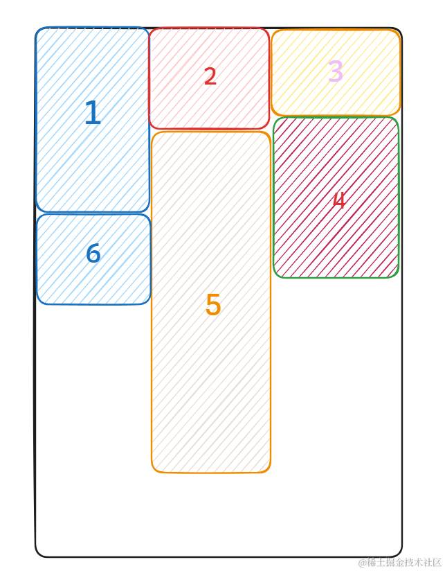
可以看到这种布局方式解决了第一行和第二行中间留白的情况,布局时卡片再带一点间距视觉效果会更好,同理剩下图片卡片摆放也是按照这样的思路
准备数据
关于图片相关的数据我就不自己准备了,有现成的数据接口那当然拿来用啦🤣
我们直接使用小红书的数据接口把数据粘下来保存到本地即可:
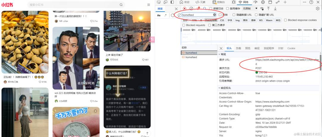
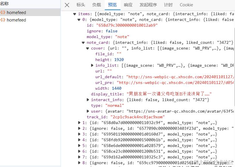
不过稍微动点脑子就知道像这样的网站针对于图片一定会加上防盗链的,所以我也就不费劲绕开处理了,主要是要提取它的尺寸信息,至于图片就先随便给个颜色占位了
后端返回图片尺寸信息问题
在开始写代码之前还有这一个问题需要讨论:一般情况下瀑布流布局后端返回的数据不止有图片的链接还有图片的宽高信息(比如小红书中针对于单个卡片就有 width 和 height 字段)
有了这些信息前端使用时无需再单独获取 img DOM 就能够快速计算卡片缩放后的宽高以及后续的位置信息
但如果后端没有返回这些信息只给了图片链接那就只能全部交给前端来处理,因为图片尺寸信息在瀑布流实现中是必须要获取到的,这里就需要用到图片预加载技术
简单描述一下就先提前访问图片链接进行加载操作但不展示在视图上,后续使用该链接后图片会从缓存中加载而不是向服务器请求,因此被称之为预加载
而在瀑布流当中我们就是提前访问图片链接来获取其尺寸信息,我们封装为一个工具函数:
functionpreLoadImage(link){
returnnewPromise((resolve,reject)=>{
constimg=newImage();
img.src=link;
img.onload=()=>{
//load事件代表图片已经加载完毕,通过该回调才访问到图片真正的尺寸信息
resolve({width:img.width,height:img.height});
};
img.onerror=(err)=>{
reject(err);
};
});
}
所以假设如果有很多图片,那么就必须要保证所有图片全部加载完毕获取到尺寸信息后才能开始瀑布流布局流程,如果一旦有一张图片加载失败就会导致瀑布流布局出现问题😑😑😑
好处就是用户看到的图片是直接从缓存进行加载的速度很快,坏处就是刚开始等待所有图片加载会很慢
而如果后端返回图片尺寸信息我们就无需考虑图片是否加载完成,直接根据其尺寸信息先进行布局,之后利用图片懒加载技术即可,所以真实业务场景肯定还是后端携带信息更好😜
组件结构搭建及样式
前面铺垫了这么多终于要开始写代码了,我们还是按照以前的老规矩,先看看整个 DOM 结构是什么样:
其实和虚拟列表差不多,只需要一个容器 container、列表 list 以及数据项 item
只不过封装组件后 item 后续会使用 v-for 遍历出来,同时可以定义插槽让父组件展示图片,这些后续再说
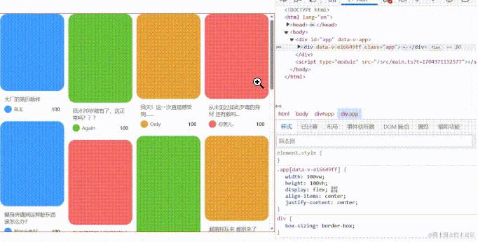
<divclass="fs-waterfall-container">
<divclass="fs-waterfall-list">
<divclass="fs-waterfall-item"></div>
</div>
</div>
container 作为整个瀑布流的容器它是需要展示滚动条的, list 作为 item 的容器可以开启相对定位,而 item 开启绝对定位,由于我会通过 translate 来控制每张卡片的位置,所以每张卡片定位统一放到左上角即可:
.fs-waterfall {
  &-container {
    width: 100%;
    height: 100%;
    overflow-y: scroll; // 注意需要提前设置展示滚动条,如果等数据展示再出现滚动造成计算偏差
    overflow-x: hidden;
  }

  &-list {
    width: 100%;
    position: relative;
  }
  &-item {
    position: absolute;
    left: 0;
    top: 0;
    box-sizing: border-box;
  }
}
Props 和初始化状态
既然封装成组件必然少不了 props 传递来进行配置,针对于瀑布流其实只需要这几个属性
而对于单个数据项我们只需要图片的信息,其他的信息都不重要
小红书的瀑布流还有 title 以及 author 信息影响整个卡片的高度,这块放到最后实现,我们先只展示图片
exportinterfaceIWaterFallProps{
gap:number;//卡片间隔
column:number;//瀑布流列数
bottom:number;//距底距离(触底加载更多)
pageSize:number;
request:(page:number,pageSize:number)=>Promise<ICardItem[]>;
}

exportinterfaceICardItem{
id:string|number;
url:string;
width:number;
height:number;
[key:string]:any;
}

//单个卡片计算的位置信息,设置样式
exportinterfaceICardPos{
width:number;
height:number;
x:number;
y:number;
}
接下来我们定义组件内部状态:
constcontainerRef=ref<HTMLDivElement|null>(null);//绑定template上的container,需要容器宽度
conststate=reactive({
isFinish:false,//判断是否已经没有数据,后续不再发送请求
page:1,
cardWidth:0,////容器内卡片宽度
cardList:[]asICardItem[],//卡片数据源
cardPos:[]asICardPos[],//卡片摆放位置信息
columnHeight:newArray(props.column).fill(0)asnumber[],//存储每列的高度,进行初始化操作
});
初始化操作
初始化操作只有两个工作:计算卡片宽度 、发送请求获取数据
初始化时最重要的就是先计算出该瀑布流布局中卡片的宽度是多少,即 state.cardWidth,每列的宽度都是固定的
其实计算方法很简单,直接来看下图就知道怎么计算了:
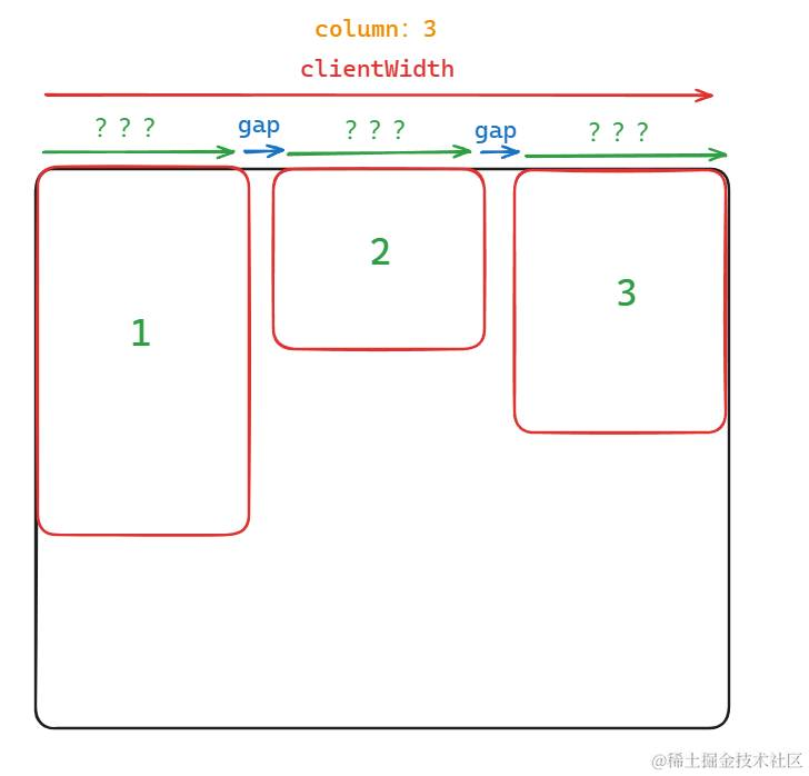
constcontainerWidth=containerRef.value.clientWidth;
state.cardWidth=(containerWidth-props.gap*(props.column-1))/props.column;
注意使用 clientWidth 作为容器的宽度(clientWidth 不会计算滚动条的宽度)
之后就需要封装一个发送请求获取数据的函数了,需要注意的就是获取数据后要判断是否为空来决定后续是否还发送请求:
constgetCardList=async(page:number,pageSize:number)=>{
if(state.isFinish)return;
constlist=awaitprops.request(page,pageSize);
state.page++;
if(!list.length){
state.isFinish=true;
return;
}
state.cardList=[...state.cardList,...list];
computedCardPos(list);//key:根据请求的数据计算卡片位置
};
我们整合到 init 方法中,在 onMounted 里进行调用:
constinit=()=>{
if(containerRef.value){
constcontainerWidth=containerRef.value.clientWidth;
state.cardWidth=(containerWidth-props.gap*(props.column-1))/props.column;
getCardList(state.page,props.pageSize);
}
};

onMounted(()=>{
init();
});
计算最小列高度和卡片位置
下面就到瀑布流核心实现环节了,我们在实现思路中谈到每当后续卡片进行布局时都需要计算最小列高度将其摆放至下面,很显然计算最小列高度方法是被频繁使用的,关键在于获取最小列以及最小列高度,这里可以直接使用计算属性实现:
因为还要获取下标,所以没法直接 Math.min 了,直接遍历比较出最小值即可:
constminColumn=computed(()=>{
letminIndex=-1,
minHeight=Infinity;

state.columnHeight.forEach((item,index)=>{
if(item<minHeight){
minHeight=item;
minIndex=index;
}
});

return{
minIndex,
minHeight,
};
});
在上面一小节的发送请求函数中的末尾有一个 computedCardPos 方法我们没有实现,它就是每当获取到新的数据后计算新数据卡片的位置信息,将其保存至 state.cardPos 中
我们来看它的实现步骤:
-
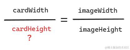
遍历数据项,计算当前数据项缩放后的卡片高度(根据后端返回的宽高信息以及 state.cardWidth计算) -
第一行卡片位置信息紧挨排布,高度更新至对应列的 state.columnHeight中 -
其余行需要先获得最小高度列信息再计算其卡片位置,最终将高度累加到对应列的 state.columnHeight中
下面就直接粘代码了:
constcomputedCardPos=(list:ICardItem[])=>{
list.forEach((item,index)=>{
constcardHeight=Math.floor((item.height*state.cardWidth)/item.width);
if(index<props.column){
state.cardPos.push({
width:state.cardWidth,
height:cardHeight,
x:index?index*(state.cardWidth+props.gap):0,
y:0,
});
state.columnHeight[index]=cardHeight+props.gap;
}else{
const{minIndex,minHeight}=minColumn.value;
state.cardPos.push({
width:state.cardWidth,
height:cardHeight,
x:minIndex?minIndex*(state.cardWidth+props.gap):0,
y:minHeight,
});
state.columnHeight[minIndex]+=cardHeight+props.gap;
}
});
};
这里的计算可能会有一些疑问,简单做下解答吧:
-
关于 x 偏移量计算,需要注意第一列时它的偏移量为 0,而其他列除了加上前面几列对应的宽度还要加上水平间隔
有了 state.cardPos 位置信息就可以修改 template 模板了,我们遍历数据设置位置样式即可:
<template>
<divclass="fs-waterfall-container"ref="containerRef">
<divclass="fs-waterfall-list">
<div
class="fs-waterfall-item"
v-for="(item,index)instate.cardList"
:key="item.id"
:style="{
width:`${state.cardPos[index].width}px`,
height:`${state.cardPos[index].height}px`,
transform:`translate3d(${state.cardPos[index].x}px,${state.cardPos[index].y}px,0)`,
}"
>
<slotname="item":item="item":index="index"></slot>
</div>
</div>
</div>
</template>
对接数据展示效果
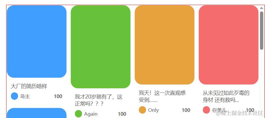
到此我们的瀑布流已经可以看到效果了,我们在父组件里使用一下看看
这里就不再解释了,稍微写点结构和样式,导入最早扒来的小红书数据,按照规定属性传入即可,只不过我们不能使用图片链接(防盗链问题),就稍微写一个带颜色的盒子吧:
<template>
<divclass="app">
<divclass="container">
<fs-waterfall:bottom="20":column="4":gap="10":page-size="20":request="getData">
<template#item="{item,index}">
<div
class="card-box"
:style="{
background:colorArr[index%(colorArr.length-1)],
}"
>
<!--<img:src="item.url"/>-->
</div>
</template>
</fs-waterfall>
</div>
</div>
</template>
<scriptsetuplang="ts">
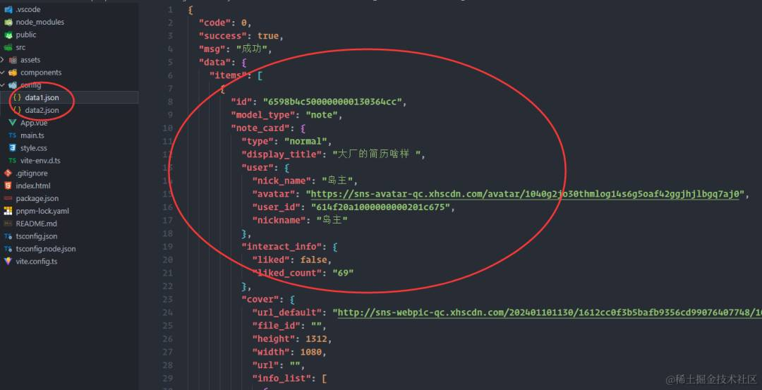
importdata1from"./config/data1.json";
importdata2from"./config/data2.json";
importFsWaterfallfrom"./components/FsWaterfall.vue";
import{ICardItem}from"./components/type";
constcolorArr=["#409eff","#67c23a","#e6a23c","#f56c6c","#909399"];
constlist1:ICardItem[]=data1.data.items.map((i)=>({
id:i.id,
url:i.note_card.cover.url_pre,
width:i.note_card.cover.width,
height:i.note_card.cover.height,
}));
constlist2:ICardItem[]=data2.data.items.map((i)=>({
id:i.id,
url:i.note_card.cover.url_pre,
width:i.note_card.cover.width,
height:i.note_card.cover.height,
}));
constlist=[...list1,...list2];
constgetData=(page:number,pageSize:number)=>{
returnnewPromise<ICardItem[]>((resolve)=>{
setTimeout(()=>{
resolve(list.slice((page-1)*pageSize,(page-1)*pageSize+pageSize));
},1000);
});
};
</script>
<stylescopedlang="scss">
.app{
width:100vw;
height:100vh;
display:flex;
align-items:center;
justify-content:center;
.container{
width:700px;
height:600px;
border:1pxsolidred;
}
.card-box{
position:relative;
width:100%;
height:100%;
border-radius:10px;
}
}
</style>
效果还是不错的,但是触底加载更多我们还没有实现,下一步就来实现它😎
触底加载更多
这其实也很好实现,我们只需给 container 添加滚动事件即可,按照以往的判断触底套路,再用上我们前面封装的获取数据函数即可
不过需要注意两个问题:
-
触底频繁请求,我们可以在原来状态里加一个 loading 控制 -
滚动加载更多数据是添加到原有瀑布流布局的后面,因此需要修改之前计算卡片位置区分第一行和其余行的条件
conststate=reactive({
//...
loading:false,
});

constgetCardList=async(page:number,pageSize:number)=>{
//...
state.loading=true;
constlist=awaitprops.request(page,pageSize);
//...
state.loading=false;
};

constcomputedCardPos=(list:ICardItem[])=>{
list.forEach((item,index)=>{
//增加另外条件,cardList<=pageSize说明是第一次获取数据,第一行紧挨排布
if(index<props.column&&state.cardList.length<=props.pageSize){
//...
}else{
//...
}
});
};

consthandleScroll=rafThrottle(()=>{
const{scrollTop,clientHeight,scrollHeight}=containerRef.value!;
constbottom=scrollHeight-clientHeight-scrollTop;
if(bottom<=props.bottom){
!state.loading&&getCardList(state.page,props.pageSize);
}
});
<template>
<!--绑定scroll事件-->
<divclass="fs-waterfall-container"ref="containerRef"@scroll="handleScroll">
<!--...-->
</div>
</template>
嗯,效果不错,至于 loading 蒙层以及图片的懒加载效果我就不做了🧐,留给大伙自行拓展吧
到此一个基础的图片瀑布流组件已经封装完成了,接下来我们来深入研究一下小红书的瀑布流😏
小红书瀑布流分析与实现
分析问题
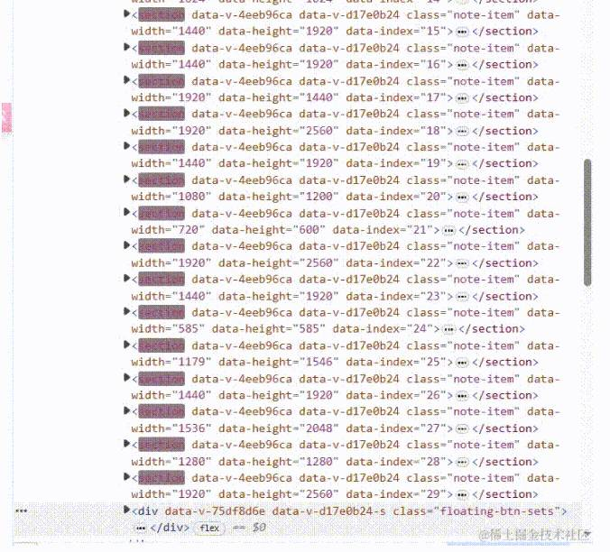
抛开小红书中虚拟列表的实现先不谈,还有一点就是展示的卡片不仅有图片信息,还有文字信息:
这些文字信息你会发现它还是不定高的,这就比较麻烦了,无法确定单个卡片的高度会导致瀑布流布局计算出现问题
不过如果仔细分析的话,你会发现它只有两种情况: title 文本是单行或者双行,这点直接从 css 就可以看得出来:
后来发现还有一种情况是连 title 都没有😑,但是出现的情况比较少,这点先不考虑了
不仅如此,小红书的瀑布流还是响应式的,如果你去改变视口宽度,可能会出现一种情况:单行文本由于卡片宽度的压缩变成了双行
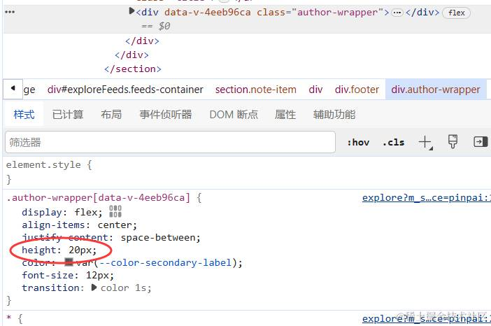
而关于 author 我发现它的高度是定死的 20px:
所以总结下来最大的两个问题:
-
卡片实现了响应式,相当于你每次改变视口宽度都会全部重新计算布局:
小红书卡片样式
废话不多说,我们先封装一个小红书卡片组件出来,当然只实现最基本的样式效果,图片依旧直接纯色占位:
<template>
<divclass="fs-book-card-container">
<divclass="fs-book-card-image">
<!--<img:src="props.detail.url"/>-->
</div>
<divclass="fs-book-card-footer">
<divclass="title">{{props.detail.title}}</div>
<divclass="author">
<divclass="author-info">
<divclass="avatar"/>
<!--<img:src="props.detail.avatar"class="avatar"/>-->
<spanclass="name">{{props.detail.author}}</span>
</div>
<divclass="like">100</div>
</div>
</div>
</div>
</template>

<scriptsetuplang="ts">
interfaceICardDetail{
bgColor:string;
title:string;
author:string;
imageHeight:number;
[key:string]:any;
}
constprops=defineProps<{
detail:ICardDetail;
}>();
</script>

<stylescopedlang="scss">
.fs-book-card{
&-container{
width:100%;
height:100%;
background-color:#fff;
}
&-image{
width:100%;
height:v-bind("`${props.detail.imageHeight}px`");
border:1pxsolid#eee;
border-radius:20px;
background-color:v-bind("props.detail.bgColor");
}
&-footer{
padding:12px;
font-size:14px;
.title{
margin-bottom:8px;
word-break:break-all;
display:-webkit-box;
-webkit-box-orient:vertical;
-webkit-line-clamp:2;
overflow:hidden;
color:rgba(51,51,51,0.8);
}
.author{
font-size:13px;
display:flex;
align-items:center;
justify-content:space-between;
gap:5px;
.author-info{
flex:1;
display:flex;
align-items:center;
overflow:hidden;
text-overflow:ellipsis;
white-space:nowrap;
.avatar{
margin-right:6px;
width:20px;
height:20px;
border-radius:20px;
border:1pxsolidrgba(0,0,0,0.08);
background-color:v-bind("props.detail.bgColor");
}
.name{
width:80%;
overflow:hidden;
text-overflow:ellipsis;
white-space:nowrap;
color:rgba(51,51,51,0.8);
}
}
}
}
}
</style>

</style>
emm 🤔,大差不差吧~ 无非是没有图片罢了
改造瀑布流实现
下面就要大改之前实现的瀑布流组件了,思路很简单,现在最大的问题就是卡片的高度不固定了,我们需要自己获取 DOM 来计算
也就是说之前我们实现 computedCardPos 方法要分两步了:
-
等 DOM 更新后(nextTick 中)获取单个卡片 DOM 拿到高度再计算位置信息
首先我们改造之前存储卡片位置信息的数据结构,现在高度分为:卡片高度、卡片内图片高度:
exportinterfaceIBookCardPos{
width:number;
imageHeight:number;//图片高度
cardHeight:number;//卡片高度
x:number;
y:number;
}
在获取到数据信息后我们增加一个计算卡片图片高度的方法,并将其添加到记录卡片位置信息的数组中,而卡片高度和位置信息统一为 0,等下一步 DOM 更新后获取计算:
constcomputedImageHeight=(list:ICardItem[])=>{
list.forEach((item)=>{
constimageHeight=Math.floor((item.height*state.cardWidth)/item.width);
state.cardPos.push({
width:state.cardWidth,
imageHeight:imageHeight,
cardHeight:0,
x:0,
y:0,
});
});
};
添加完成之后我们需要等待一次 nextTick,保证上面的位置信息 DOM 已经进行了挂载(但是还没有渲染到界面上)
nextTick 之后我们就需要计算真正卡片的高度以及其位置了,我们获取 list DOM 并在内部获取其 children 遍历获取其高度,位置计算和之前一样:
constlistRef=ref<HTMLDivElement|null>(null);

constgetCardList=async(page:number,pageSize:number)=>{
//...
computedCardPos(list);
//...
};

constcomputedCardPos=async(list:ICardItem[])=>{
computedImageHeight(list);
awaitnextTick();
computedRealDomPos(list);
};

constcomputedRealDomPos=(list:ICardItem[])=>{
constchildren=listRef.value!.children;
list.forEach((_,index)=>{
constnextIndex=state.preLen+index;
constcardHeight=children[nextIndex].getBoundingClientRect().height;
if(index<props.column&&state.cardList.length<=props.pageSize){
state.cardPos[nextIndex]={
...state.cardPos[nextIndex],
cardHeight:cardHeight,
x:nextIndex%props.column!==0?nextIndex*(state.cardWidth+props.gap):0,
y:0,
};
state.columnHeight[nextIndex]=cardHeight+props.gap;
}else{
const{minIndex,minHeight}=minColumn.value;
state.cardPos[nextIndex]={
...state.cardPos[nextIndex],
cardHeight:cardHeight,
x:minIndex?minIndex*(state.cardWidth+props.gap):0,
y:minHeight,
};
state.columnHeight[minIndex]+=cardHeight+props.gap;
}
});
state.preLen=state.cardPos.length;
};
注意这里的 nextIndex 计算,这是因为要考虑到触底加载更多的情况,我们在状态中增加了 preLen 属性用来保存当前已经计算过的卡片位置数组长度,等触底加载更多数据再重复走计算逻辑时它的索引就应该从 preLen 开始往后计算
同样在 template 模板中,我们使用插槽把卡片里图片高度抛出,正好可以让我们封装的小红书卡片使用:
<template>
<divclass="fs-book-waterfall-container"ref="containerRef"@scroll="handleScroll">
<!--获取listDOMref-->
<divclass="fs-book-waterfall-list"ref="listRef">
<div
class="fs-book-waterfall-item"
v-for="(item,index)instate.cardList"
:key="item.id"
:style="{
width:`${state.cardWidth}px`,
transform:`translate3d(${state.cardPos[index].x}px,${state.cardPos[index].y}px,0)`,
}"
>
<!--传递imageHeight给小红书卡片组件-->
<slotname="item":item="item":index="index":imageHeight="state.cardPos[index].imageHeight"></slot>
</div>
</div>
</div>
</template>
这时候父组件使用瀑布流组件时就可以这样用了:
<template>
<divclass="app">
<divclass="container">
<fs-book-waterfall:bottom="20":column="4":gap="10":page-size="20":request="getData">
<template#item="{item,index,imageHeight}">
<fs-book-card
:detail="{
imageHeight,
title:item.title,
author:item.author,
bgColor:colorArr[index%(colorArr.length-1)],
}"
/>
</template>
</fs-book-waterfall>
</div>
</div>
</template>

<scriptsetuplang="ts">
importdata1from"./config/data1.json";
importdata2from"./config/data2.json";
importFsBookWaterfallfrom"./components/FsBookWaterfall.vue";
importFsBookCardfrom"./components/FsBookCard.vue";
import{ICardItem}from"./components/type";
constcolorArr=["#409eff","#67c23a","#e6a23c","#f56c6c","#909399"];

constlist1:ICardItem[]=data1.data.items.map((i)=>({
id:i.id,
url:i.note_card.cover.url_pre,
width:i.note_card.cover.width,
height:i.note_card.cover.height,
title:i.note_card.display_title,
author:i.note_card.user.nickname,
}));
constlist2:ICardItem[]=data2.data.items.map((i)=>({
id:i.id,
url:i.note_card.cover.url_pre,
width:i.note_card.cover.width,
height:i.note_card.cover.height,
title:i.note_card.display_title,
author:i.note_card.user.nickname,
}));

constlist=[...list1,...list2];

constgetData=(page:number,pageSize:number)=>{
returnnewPromise<ICardItem[]>((resolve)=>{
setTimeout(()=>{
resolve(list.slice((page-1)*pageSize,(page-1)*pageSize+pageSize));
},1000);
});
};
</script>

<stylescopedlang="scss">
.app{
width:100vw;
height:100vh;
display:flex;
align-items:center;
justify-content:center;
.container{
width:700px;
height:600px;
border:1pxsolidred;
}
.box{
width:250px;
}
}
</style>
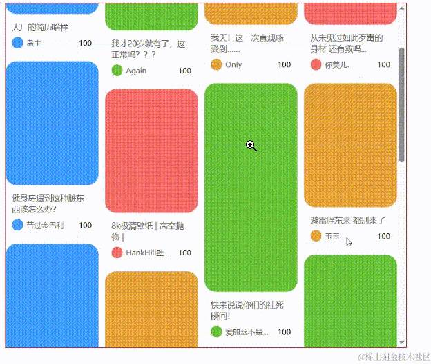
效果还不错🤩,就是这样做性能就比不上定高的实现了,毕竟现在计算位置信息都需要进行 DOM 操作
响应式实现
小红书的瀑布流响应式一共实现了两点:
第一点很好实现,我们可以监听容器 DOM 尺寸改变后重置数据并走一遍所有的计算逻辑即可,只不过这是一个频繁回流的过程,建议上个防抖更好:
这里监听 DOM 尺寸变化推荐使用 ResizeObserver,我就不再封装直接使用了,至于怎么使用看 MDN 文档 👇
ResizeObserver – Web API 接口参考 | MDN (mozilla.org)
//创建监听对象
constresizeObserver=newResizeObserver(()=>{
handleResize();
});

//重置计算卡片宽度以及之前所有的位置信息
consthandleResize=debounce(()=>{
constcontainerWidth=containerRef.value!.clientWidth;
state.cardWidth=(containerWidth-props.gap*(props.column-1))/props.column;
state.columnHeight=newArray(props.column).fill(0);
state.cardPos=[];
state.preLen=0;
computedCardPos(state.cardList);
});

constinit=()=>{
if(containerRef.value){
//...
resizeObserver.observe(containerRef.value);
}
};

//挂载时监听container尺寸变化
onMounted(()=>{
init();
});


//卸载取消监听
onUnmounted(()=>{
containerRef.value&&resizeObserver.unobserve(containerRef.value);
});
可以再给 item 上添加一个过渡,显得更自然一些:
.fs-book-waterfall {
  &-item {
    // ...
    transition: all 0.3s;
  }
}
可以可以,这样就好看多了😍😍😍
接下来我们看断点响应式的实现,它的实现其实有两种:
-
瀑布流组件内部进行实现,删除 column props,由组件内部设置对应的断点值修改 column 进行回流重新排布 -
让其父组件决定,动态改变 column props,而瀑布流组件内部监听 column 变化进行回流重新排布
为了兼容我们之前的实现就使用第二种方式,我们随便在父组件设几个断点然后监听外部 container 元素的宽度修改 column 即可:
constfContainerRef=ref<HTMLDivElement|null>(null);
constcolumn=ref(5);
constfContainerObserver=newResizeObserver((entries)=>{
changeColumn(entries[0].target.clientWidth);
});


constchangeColumn=(width:number)=>{
if(width>960){
column.value=5;
}elseif(width>=690&&width<960){
column.value=4;
}elseif(width>=500&&width<690){
column.value=3;
}else{
column.value=2;
}
};

onMounted(()=>{
fContainerRef.value&&fContainerObserver.observe(fContainerRef.value);
});

onUnmounted(()=>{
fContainerRef.value&&fContainerObserver.unobserve(fContainerRef.value);
});
而在瀑布流组件中我们使用 watch 监听 column 变化,发生变化就进行回流重新计算布局:
watch(
()=>props.column,
()=>{
handleResize();
}
);
完美!这才是完整的瀑布流!😎😎😎
End
最后源码奉上,有图片版的瀑布流以及小红书版的瀑布流,没有怎么组织,但功能反正实现了👇:
DrssXpro/waterfall-demo: Vue3 + TS:模仿小红书封装瀑布流组件 (github.com)
终于把瀑布流基础篇讲完了😌,下一篇就直接来瀑布流虚拟列表组件了,这次实现一个完完整整的小红书版瀑布流!😁😁😁