
包阅导读总结
1. 鸿蒙、ArkTs、原生应用开发、记事本功能、页面跳转
2. 本文是鸿蒙原生 ArkTs 应用开发的教程,包括鸿蒙开发的基础知识回顾,如 SDK、原生应用等,介绍了项目创建、目录结构、代码简析,还详细阐述了构建页面、实现页面跳转、添加和删除功能等记事本开发的过程。
3.
– 鸿蒙原生 ArkTs 应用开发教程
– 知识回顾
– HarmonyOS SDK 介绍
– 鸿蒙原生应用开发基础
– 构建第一个应用
– 官方 API 及创建工程
– 项目预览
– 工程目录结构
– 代码简析
– 构建第一个页面
– 页面简述
– 页面布局
– 实现页面间的跳转
– 构建第二个页面
– 创建第二个页面
– 配置第二个页面的路由
– 页面简述
– 页面基本布局实现
– 实现添加功能
– 实现删除功能
思维导图:
文章地址:https://juejin.cn/post/7397639310722531362
文章来源:juejin.cn
作者:石小石Orz
发布时间:2024/8/1 2:50
语言:中文
总字数:5196字
预计阅读时间:21分钟
评分:84分
标签:鸿蒙,ArkTs,ArkUI,应用开发,页面布局
以下为原文内容
本内容来源于用户推荐转载,旨在分享知识与观点,如有侵权请联系删除 联系邮箱 media@ilingban.com
上一篇文章: 鸿蒙入门极速版:超简洁保姆级教程!纯干货,快收藏!
欢迎关注本专栏:鸿蒙开发实践-基础入门

简介
大家好,我是石小石!在上一节教程中,我们使用类js的web开发范式实现了一个模拟表盘的效果:
本教程,我们将使用鸿蒙原生ArkTs语言实现一个记事本功能开发,帮助大家迅速上手、入门鸿蒙应用开发。
通过本教程您将学习到以下知识点:
- 快速构建项目应用
- 了解鸿蒙项目框架
- 学会使用ArkUI组件实现页面布局
- 学会使用路由实现页面跳转
- 学会使用函数实现记事本的增删
- …….

知识回顾
HarmonyOS SDK
HarmonyOS SDK是一个开放能力合集,提供应用框架、应用服务、系统、媒体、AI、图形在内的六大领域丰富完备的能力。

简单来说,借助它我们可以实现元服务开发、鸿蒙原生应用开发!
鸿蒙原生应用开发
通俗的来水,鸿蒙的原生应用包含手机、Pad、TV、车载智慧屏和穿戴设备。理论上,开发一个应用,在这些不同的终端都是可以运行的。
要开发原生应用,我们还需要知道三个基础的东西:

简单来说,就是像IDEA的代码编译器
ArkTS是鸿蒙生态的应用开发语言,它在保持TypeScript(前端狂喜,哈哈哈)基本语法风格的基础上,进一步通过规范强化静态检查和分析…..
ArkTs由 Ark和 TypeScript两个单词组成。Ark 英[ɑːk] ,译文方舟。所以,我们可以叫ArkTs为方舟编程语言。
ArkUI是一套构建分布式应用界面的声明式UI开发框架。简单来说,ArkUI是基于ArkTS的声明式的UI开发范式, 是ArkTS语言的一个具体应用或扩展,用于构建用户界面。ArkTs和ArkUI前端同学可以简单理解为js和element UI的关系。
构建第一个应用
官方api:文档中心
前言
Arkts的基本语法与前端得Typescript风格非常相似,本文默认大家掌握基本的Typescript语法,因此,不会对Arkts的基本语法过多阐述。下一文章,我们将详细介绍Arkts语言特性。
- 点击Create Project创建工程
- 选择Application应用(tomic Service为元服务开发)
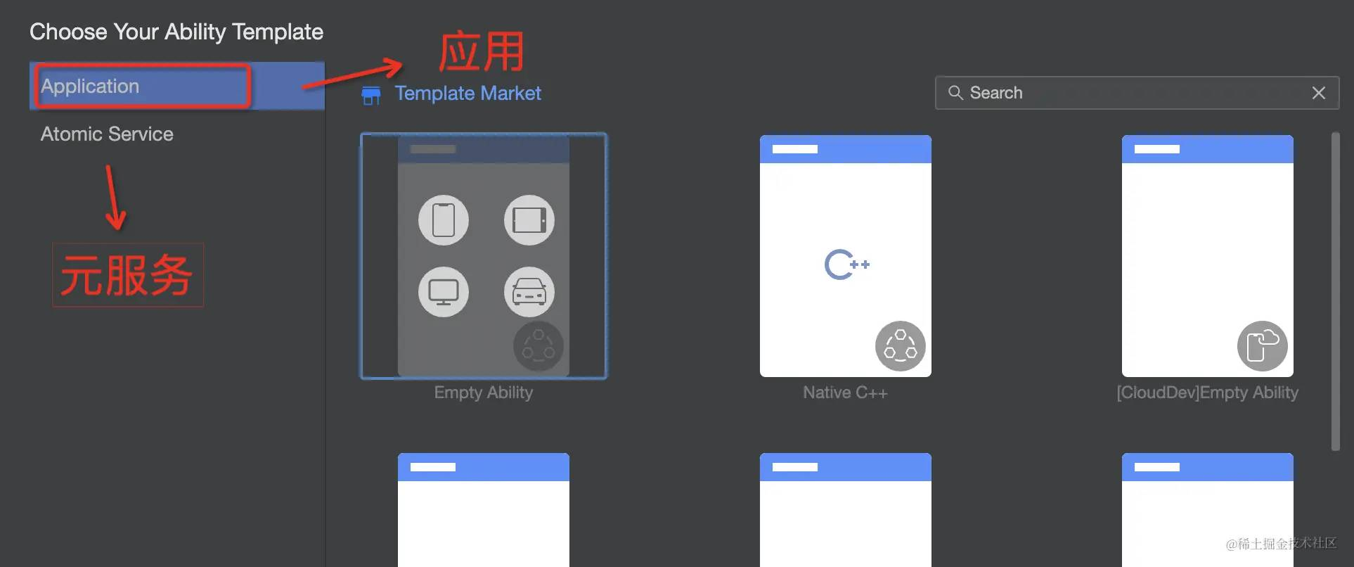
注意,后面有很多模板,模板上的图标代表这个应用可以在哪些终端运行
注:mac软件默认是英文,可以设置为中文:developer.huawei.com/consumer/cn…
项目预览
要预览默认的项目,我们点击右侧的【预览器】按钮即可。
工程目录结构
我们采用默认模板创建的项目,它的项目结构如下
├── .hvigor # 存放编译构建相关的临时文件或配置 ├── .idea # IDE(如IntelliJ IDEA)的配置目录 ├── AppScope │ └── entry # HarmonyOS工程模块,编译构建生成一个HAP包 │ ├── src │ │ ├── main │ │ │ └── ets │ │ │ ├── entryability # 应用/服务的入口 │ │ │ │ └── [ArkTS源码文件] │ │ │ └── entrybackupability # 应用提供扩展的备份恢复能力 │ │ │ └── [ArkTS源码文件] │ │ ├── pages # 应用/服务包含的页面 │ │ │ └── Index.ets # 页面源码文件 │ │ └── resources # 存放应用/服务所用到的资源文件 │ │ └── mock │ │ └── ohosTest │ │ ├── test │ │ │ └── .gitignore │ │ ├── build-profile.json5 # 模块信息、编译信息配置项 │ │ ├── hvigorfile.ts # 模块级编译构建任务脚本 │ │ ├── obfuscation-rules.txt # 混淆规则文件 │ │ └── oh-package.json5 # 描述包名、版本、入口文件和依赖项等信息 │ └── module.json5 # 模块配置文件 ├── .gitignore # Git忽略文件配置 ├── build-profile.json5 # 工程级配置信息 ├── hvigorfile.ts # 工程级编译构建任务脚本 ├── obfuscation-rules.txt # 混淆规则文件 ├── oh-package.json5 # 描述全局配置,如依赖覆盖、依赖关系重写和参数化配置 └── oh_modules # 存放三方库依赖信息 ├── .gitignore ├── build-profile.json5 # 三方库编译信息配置 ├── hvigorfile.ts # 三方库编译构建任务脚本 ├── local.properties # 本地属性配置(如SDK路径) └── oh-package-lock.json5 # 锁定依赖版本,确保项目依赖的一致性对于我们初学者,它的目录可以简化如下
├── AppScope │ └── entry # HarmonyOS工程模块,编译构建生成一个HAP包 │ ├── src │ │ ├── main # 应用/服务的入口 │ │ ├── pages # 应用/服务包含的页面(写页面逻辑的地方) │ │ │ └── Index.ets # 页面源码文件 │ │ └── resources # 存放应用/服务所用到的资源文件 │ └── module.json5 # 模块配置文件 我们只需要关注在pages下进行多页面开发,在module.json5中进行页面配置即可。
代码简析
在正式开发前,我们先简单学习一下默认模板的代码,熟悉一下Artks的UI范式语法
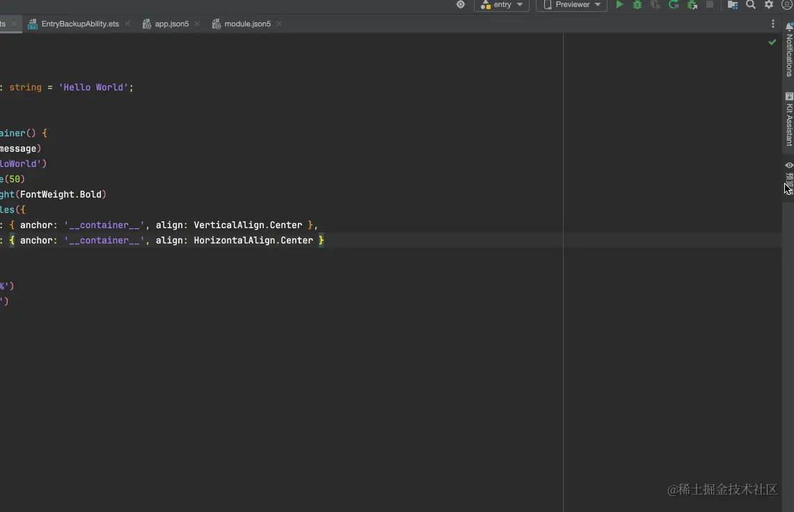
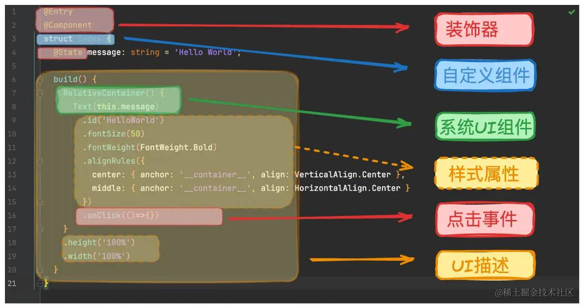
@Entry@Componentstruct Index { @State message: string = 'Hello World'; build() { RelativeContainer() { Text(this.message) .id('HelloWorld') .fontSize(50) .fontWeight(FontWeight.Bold) .alignRules({ center: { anchor: '__container__', align: VerticalAlign.Center }, middle: { anchor: '__container__', align: HorizontalAlign.Center } }) } .height('100%') .width('100%') }}默认的代码很少,效果也很简单,但是对于只写js和不写样式的后端来说可能都有些陌生。
没关系,我们看一个代码结构图
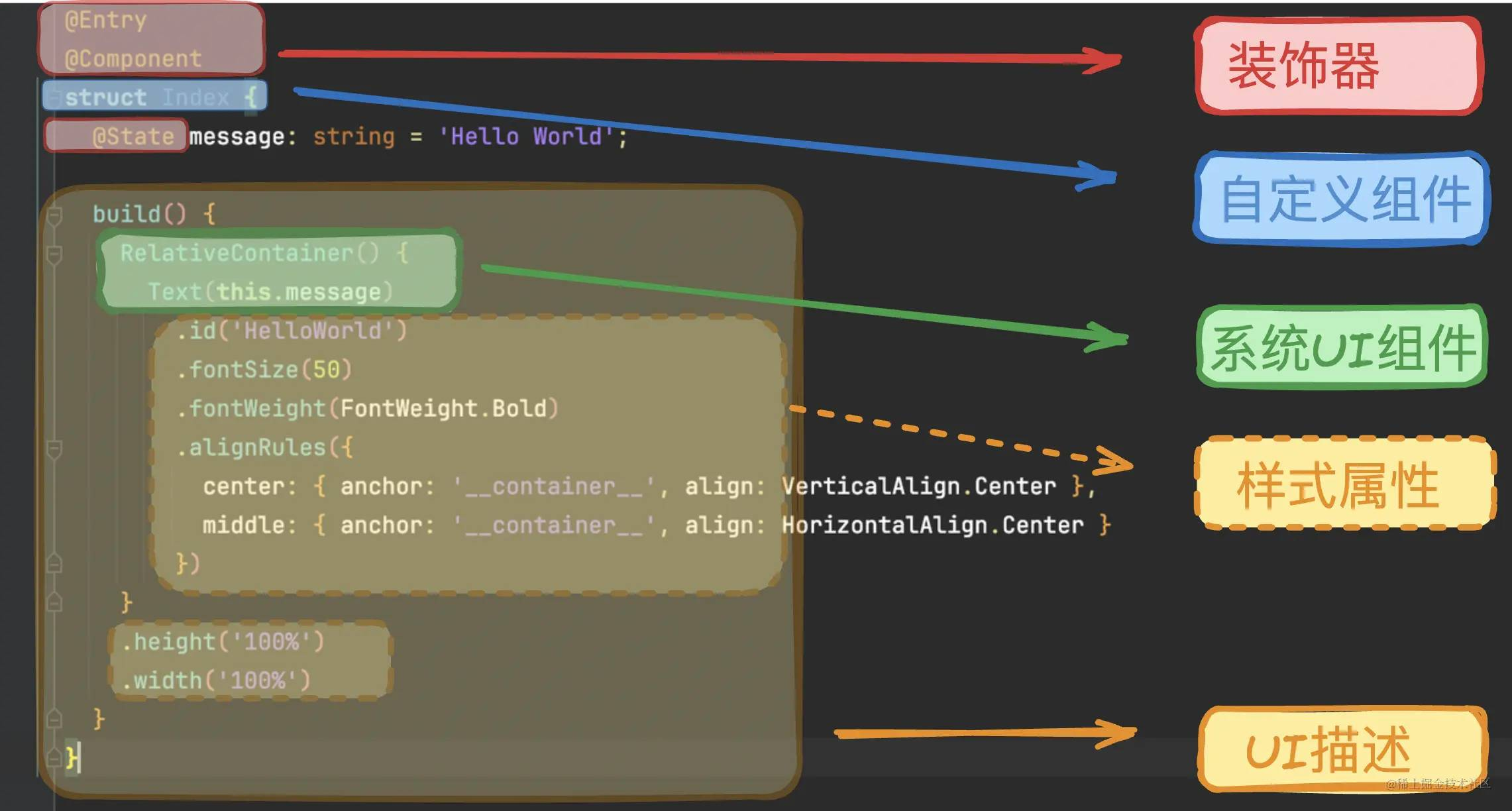
- 装饰器: 对后端来说装饰器在简单不过了,对于前端来说,我们可以理解为它用于装饰类、结构、方法以及变量,并赋予他们特殊的含义。如上述示例中@Entry、@Component和@State都是装饰器,@Component表示自定义组件,@Entry表示该自定义组件为入口组件,@State表示组件中的状态变量,状态变量变化会触发UI刷新。
- UI描述:以声明式的方式来描述UI的结构,例如build()方法中的代码块。
- 自定义组件:可复用的UI单元,可组合其他组件,如上述被@Component装饰的struct Index。
- 系统组件:ArkUI框架中默认内置的基础和容器组件,可直接被开发者调用,比如示例中的Column、Text、Divider、Button。
- 属性方法:组件可以通过链式调用配置多项属性,如fontSize()、width()、height()、backgroundColor()等。
- 系统组件、属性方法、事件方法具体使用可参考基于ArkTS的声明式开发范式。
构建第一个页面
页面简述
我们的第一个页面很简单,就是一个按钮,点击可以进行跳转。所以我们只需要实现两个核心功能
在开发第一个页面前,我们先删除默认的模板代码,让框架更加清晰
@Entry@Componentstruct Index { build() { }}页面布局
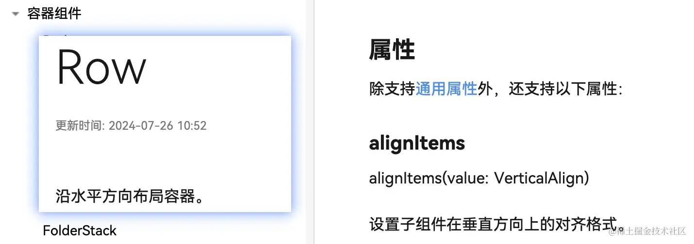
我们的按钮应该显示页面正中间,我们可以借助ArkUI的Row容器组件进行页面的布局
@Entry@Componentstruct Index { build() { Row() { }.width('100%').height('100%').backgroundColor('#1677ff').alignItems(VerticalAlign.Center).justifyContent(FlexAlign.Center) }}width、height、backgroundColor、alignItems等等这些属性对前端来说应该是非常熟悉的。上述代码中,我们使用alignItems的VerticalAlign.Cente属性和justifyContent的FlexAlign.Center保证按钮能垂直居中展示在页面。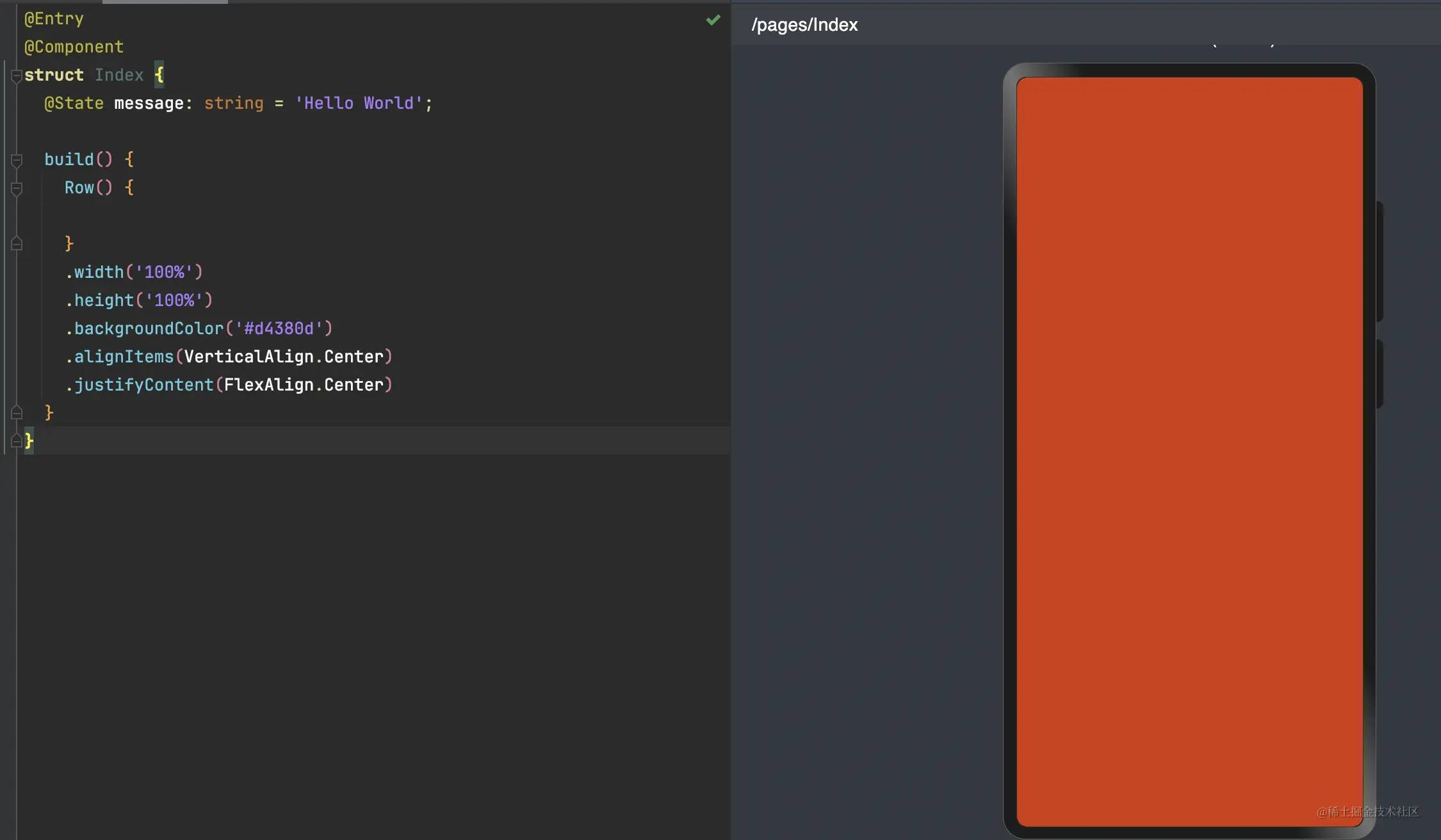
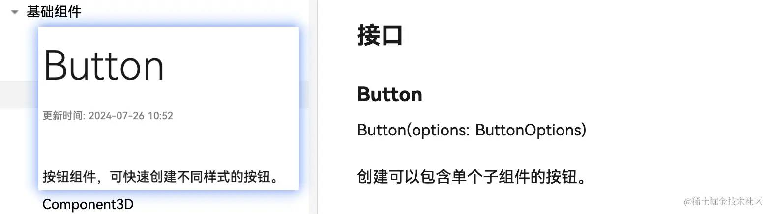
现在,我们参考ArkUI的button组件,给页面添加一个按钮。
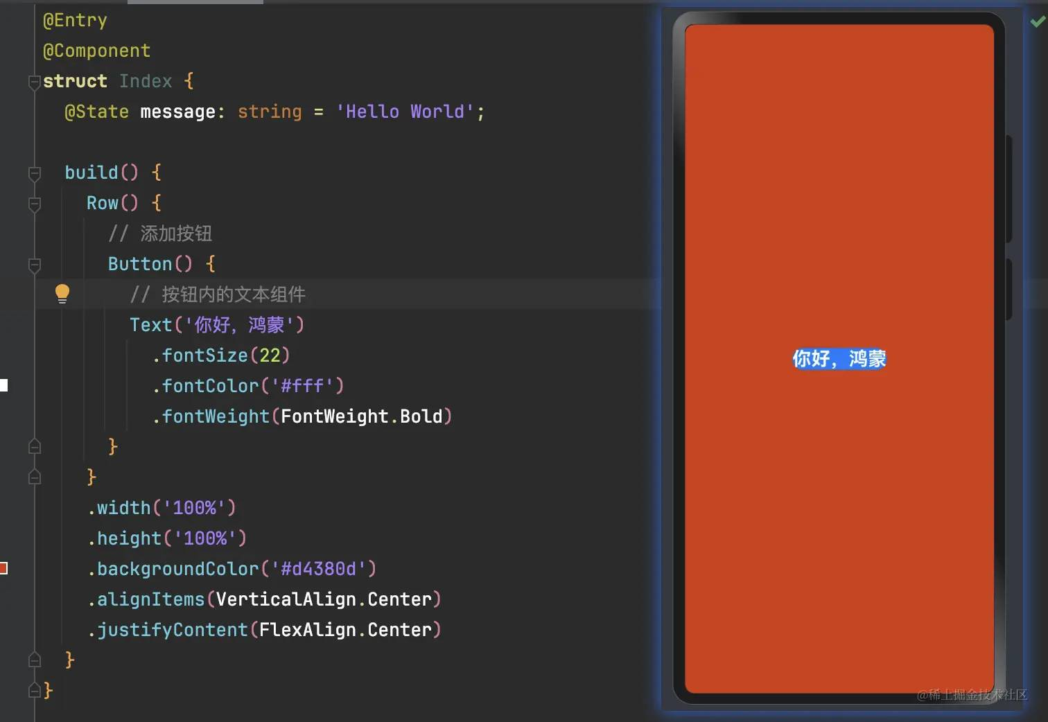
注意,我们在Button内部使用了Text组件,用于展示文字。
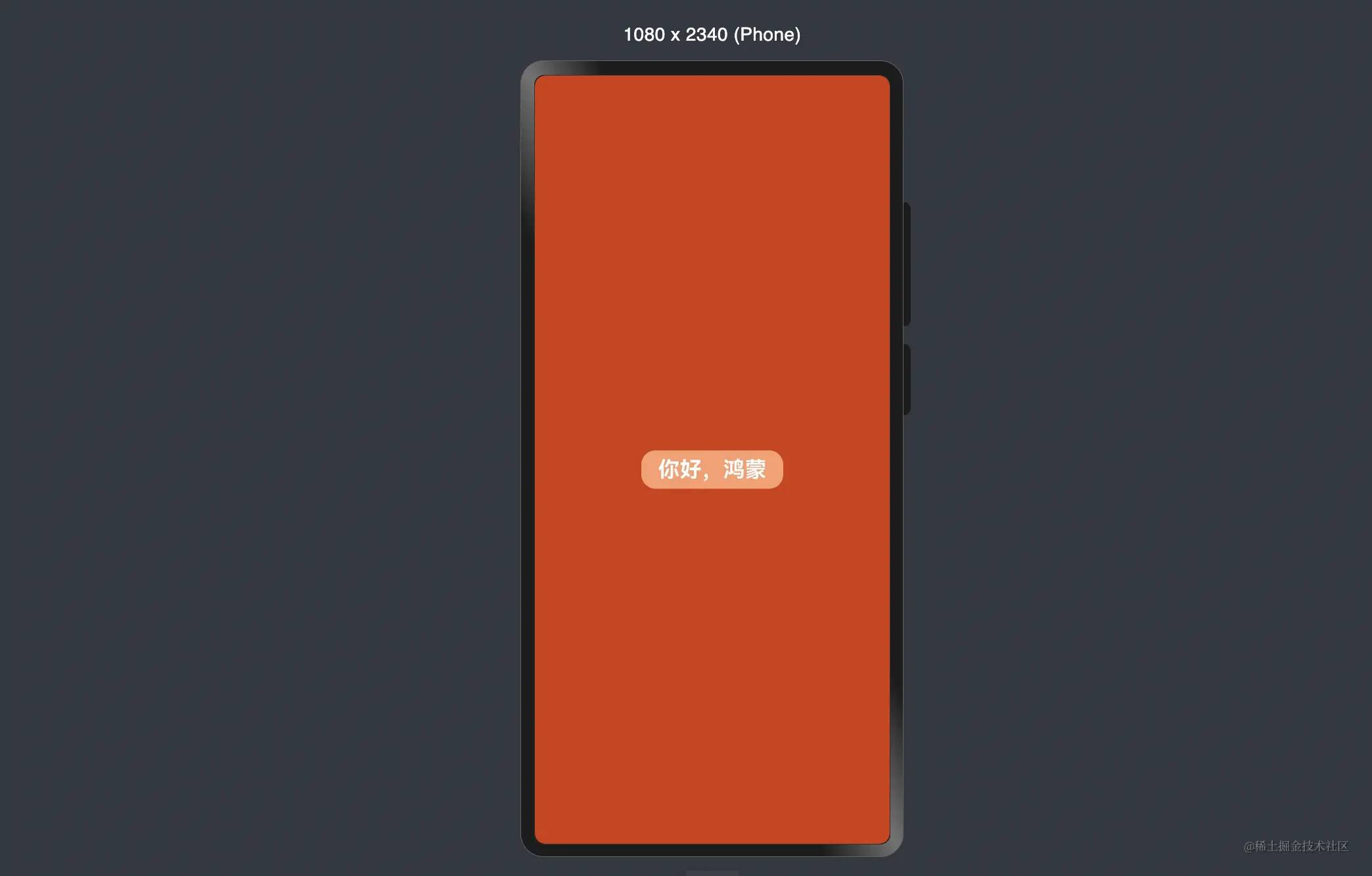
看起来,按钮样式有点丑,我们给Button组件美化一下,加点样式
@Entry @Component struct Index { build() { Row() { Button() { Text('你好,鸿蒙') .fontSize(22) .fontColor('#fff') .fontWeight(FontWeight.Bold) } .type(ButtonType.Normal) .borderRadius('10%') .margin({ top: 20 }) .backgroundColor('#ff9c6e') .width('40%') .height('5%') } .width('100%') .height('100%') .backgroundColor('#d4380d') .alignItems(VerticalAlign.Center) .justifyContent(FlexAlign.Center) } }现在看起来,样式好看很多

实现页面间的跳转
页面间的导航可以通过页面路由router来实现。页面路由router根据页面url找到目标页面,从而实现跳转。使用页面路由请导入router模块。
路由的概念和vue、react的路由十分接近,因此,前端只需要了解写法即可
假设我们第二个页面的路由是pages/Second,那我们只需给代码添加如下的点击事件
import { router } from '@kit.ArkUI';@Entry@Componentstruct Index { build() { Row() { Button() { Text('你好,鸿蒙') .fontSize(22) .fontColor('#fff') .fontWeight(FontWeight.Bold) } .onClick(() => { router.pushUrl({ url: 'pages/Second' }) }) } .width('100%') .height('100%') .backgroundColor('#d4380d') .alignItems(VerticalAlign.Center) .justifyContent(FlexAlign.Center) }}OK,现在我们去实现第二个页面。
构建第二个页面
创建第二个页面
新在“Project”窗口,右键点击“pages”文件夹,选择“New > ArkTS File”,命名为“Second”,点击回车键。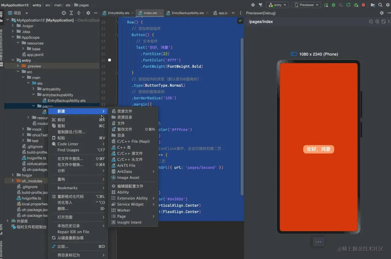
创建好后,我们给第二个页面先简单写个内容
@Entry@Componentstruct Second { @State message: string = '这是第二个页面' build() { Row() { Column() { Text(this.message) } .width('100%') } .height('100%') }}配置第二个页面的路由
在“entry > src > main > resources > base > profile”路径下,我们可以在main_pages.json文件中的“src”下配置第二个页面的路由“pages/Second”。
{ "src": [ "pages/Index", "pages/Second" ]}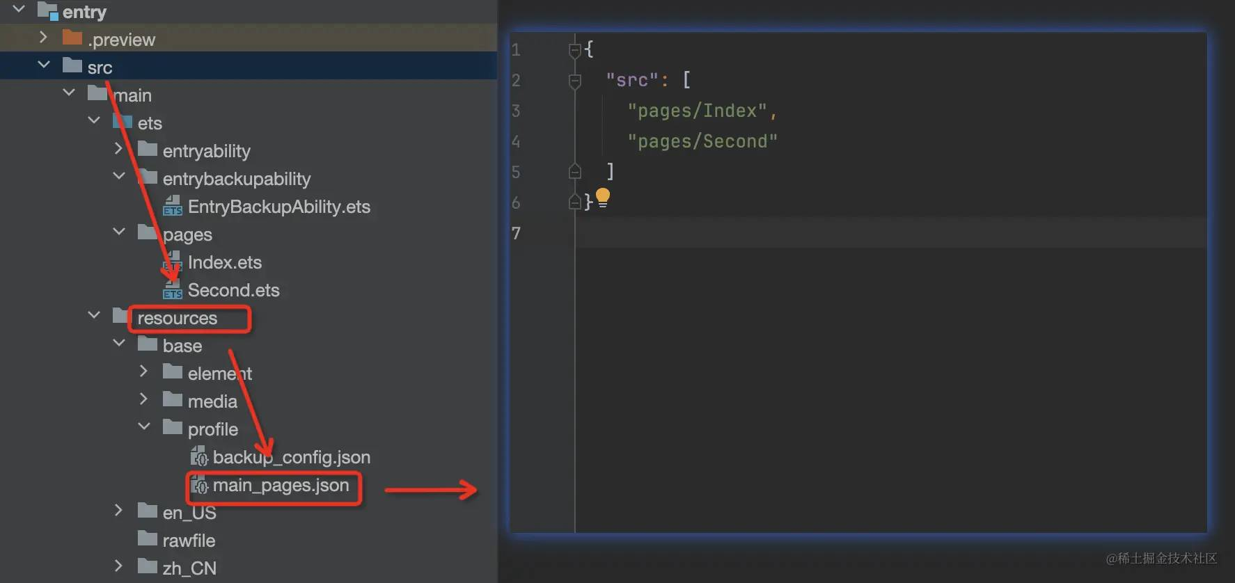
路由配置好后,我们就可以试一试页面的跳转功能了。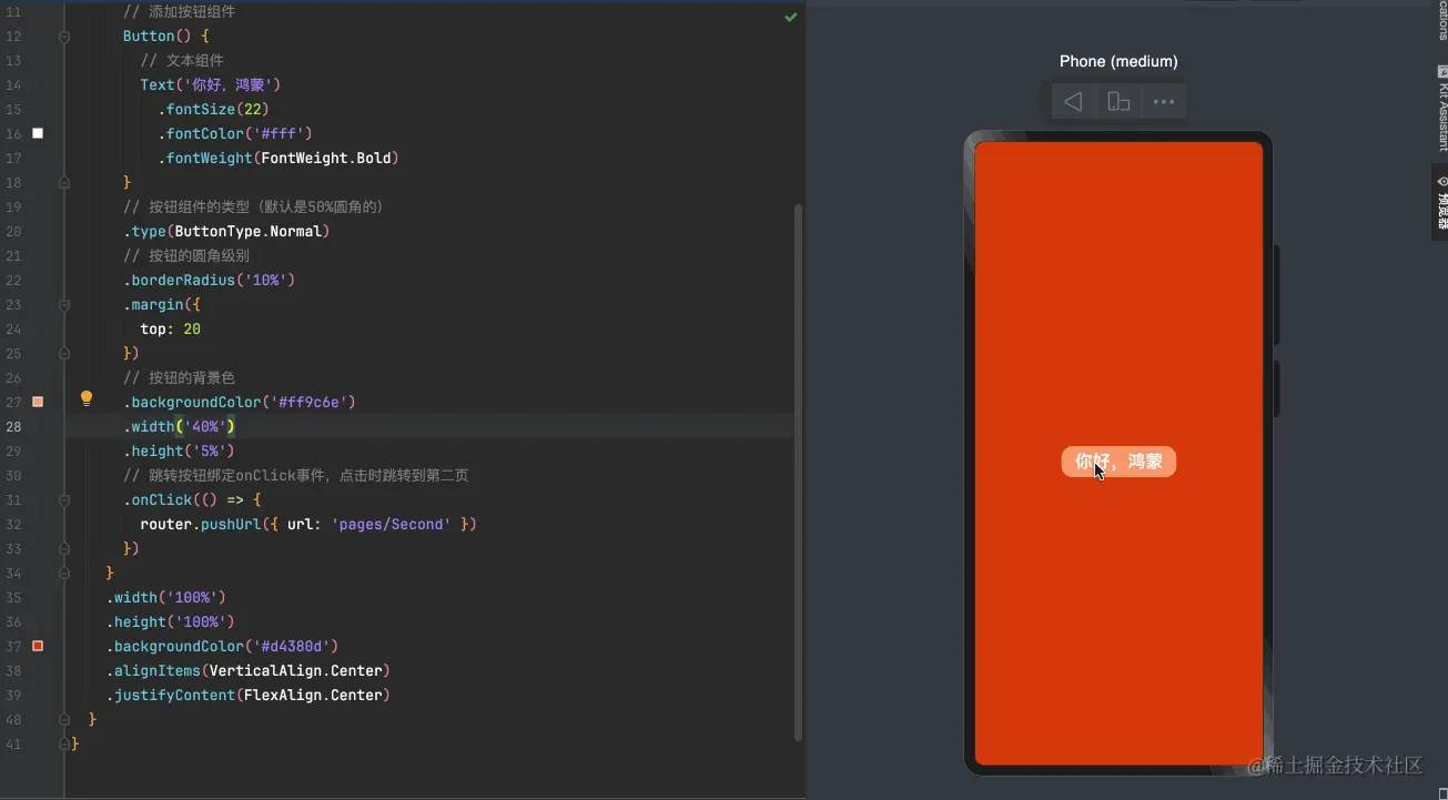
页面简述
根据我们的需求
页面应该有一个输入框、一个添加按钮、一个同于展示数据的列表。
输入框我们可以使用ArkUI的TextInput组件,添加按钮使用Button组件、列表使用List及ListItem组件
页面基本布局实现
按照需求,我们先实现基本的页面布局及样式的编写
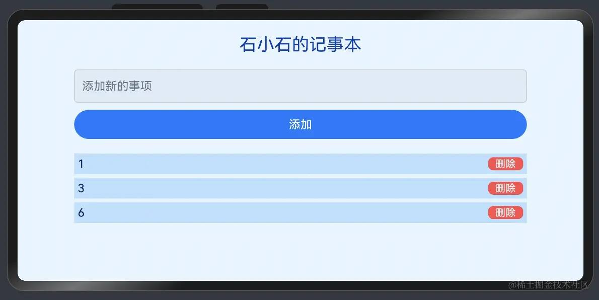
@Entry@Componentstruct NotesPage { @State notes: string[] = ['事项1','事项2','事项3']; @State newNote: string = ''; build() { Column() { Text('石小石的记事本') .fontSize(24) .fontColor('#003eb3') .margin({ top: 20, bottom: 20 }); TextInput({ text: this.newNote, placeholder: '添加新的事项', }).width('80%').margin({ bottom: 10 }).padding(10).fontSize(16).borderColor('#ccc').borderWidth(1).borderRadius(5) Button('添加').width('80%').padding(10).fontSize(16).backgroundColor('#007AFF').fontColor('#FFF').borderRadius(5) List() { ForEach(this.notes,(item:string,index:number)=>{ ListItem(){ Row(){ Text(item).fontColor('#001d66') Button('删除').fontSize(14).height(18).backgroundColor('#ff4d4f').type(ButtonType.Normal).borderRadius('15%').padding({left:10,right:10}) }.width("100%").justifyContent(FlexAlign.SpaceBetween).backgroundColor('#bae0ff').margin({bottom:5}).padding(5) } }) }.width('80%').margin({ top: 20 }) }.width('100%').backgroundColor('#e6f4ff').height("100%") }}样式效果
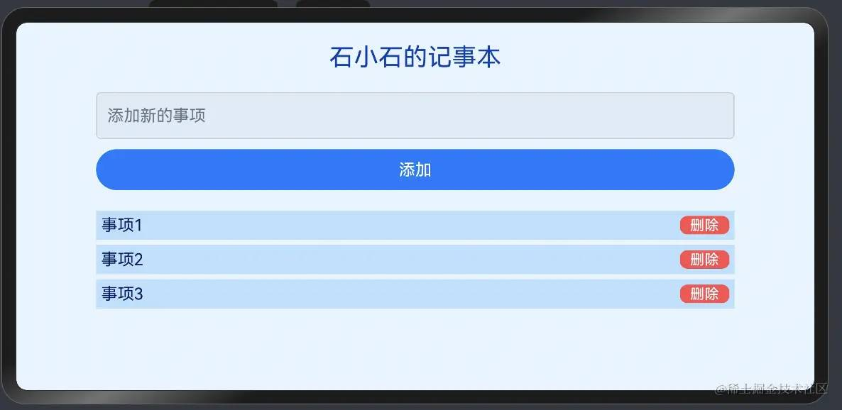
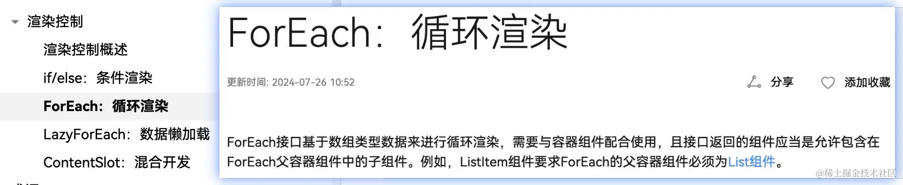
上述代码中,我们使用notes定义了一个初始化列表,使用List组件 和 ForEach方法 用于渲染事项列表。
forEach的渲染方法可以参考官方文档:ForEach:循环渲染
实现添加功能
实现添加功能,核心有两点:
- input输入框监听输入的值覆给newNote
- 点击button将输入框的值newNote添加到notes
同属性的写法一样,按钮的点击事件可以直接采用链式调用写在Button组件后面,像这样
Button('添加') .onClick(()=> this.addNote()) .width('80%').padding(10).fontSize(16)TextInput组件的text属性就是事实输入的值,因此,添加功能的实现如下:
@Entry@Componentstruct NotesPage { @State notes: string[] = ['事项1','事项2','事项3']; @State newNote: string = ''; addNote() { if (this.newNote.trim() !== '') { this.notes.push(this.newNote) this.newNote = '' } } build() { Column() { TextInput({ text: this.newNote, placeholder: '添加新的事项', }).onChange((value:string)=>{ this.newNote = value }).width('80%').margin({ bottom: 10 }).padding(10).fontSize(16).borderColor('#ccc').borderWidth(1).borderRadius(5) Button('添加') .onClick(()=> this.addNote()) .width('80%').padding(10).fontSize(16).backgroundColor('#007AFF').fontColor('#FFF').borderRadius(5) }.width('100%').backgroundColor('#e6f4ff').height("100%") }}可以看出,添加事项的方法addNote和前端js的写法几乎是没有任何差别的!
删除功能
和添加功能类似,我们很容易写出删除功能的代码逻辑
@Entry@Componentstruct NotesPage { @State notes: string[] = []; @State newNote: string = ''; deleteNote(index: number) { this.notes.splice(index, 1); } build() { Column() { List() { ForEach(this.notes,(item:string,index:number)=>{ ListItem(){ Row(){ Text(item).fontColor('#001d66') Button('删除') .onClick(()=>this.deleteNote(index)) }.width("100%") } }) }.width('80%').margin({ top: 20 }) }.width('100%').backgroundColor('#e6f4ff').height("100%") }}完整代码及效果演示
import { router } from '@kit.ArkUI';@Entry@Componentstruct Index { @State message: string = 'Hello World'; build() { Row() { Button() { Text('你好,鸿蒙') .fontSize(22) .fontColor('#fff') .fontWeight(FontWeight.Bold) } .type(ButtonType.Normal) .borderRadius('10%') .margin({ top: 20 }) .backgroundColor('#ff9c6e') .width('40%') .height('5%') .onClick(() => { router.pushUrl({ url: 'pages/Second' }) }) } .width('100%') .height('100%') .backgroundColor('#d4380d') .alignItems(VerticalAlign.Center) .justifyContent(FlexAlign.Center) }}
@Entry@Componentstruct NotesPage { @State notes: string[] = ['事项1','事项2','事项3']; @State newNote: string = ''; addNote() { if (this.newNote.trim() !== '') { this.notes.push(this.newNote) this.newNote = '' } } deleteNote(index: number) { this.notes.splice(index, 1); } build() { Column() { Text('石小石的记事本') .fontSize(24) .fontColor('#003eb3') .margin({ top: 20, bottom: 20 }); TextInput({ text: this.newNote, placeholder: '添加新的事项', }).onChange((value:string)=>{ this.newNote = value }).width('80%').margin({ bottom: 10 }).padding(10).fontSize(16).borderColor('#ccc').borderWidth(1).borderRadius(5) Button('添加') .onClick(()=> this.addNote()) .width('80%').padding(10).fontSize(16).backgroundColor('#007AFF').fontColor('#FFF').borderRadius(5) List() { ForEach(this.notes,(item:string,index:number)=>{ ListItem(){ Row(){ Text(item).fontColor('#001d66') Button('删除') .onClick(()=>this.deleteNote(index)) .fontSize(14).height(18).backgroundColor('#ff4d4f').type(ButtonType.Normal).borderRadius('15%').padding({left:10,right:10}) }.width("100%").justifyContent(FlexAlign.SpaceBetween).backgroundColor('#bae0ff').margin({bottom:5}).padding(5) } }) }.width('80%').margin({ top: 20 }) }.width('100%').backgroundColor('#e6f4ff').height("100%") }}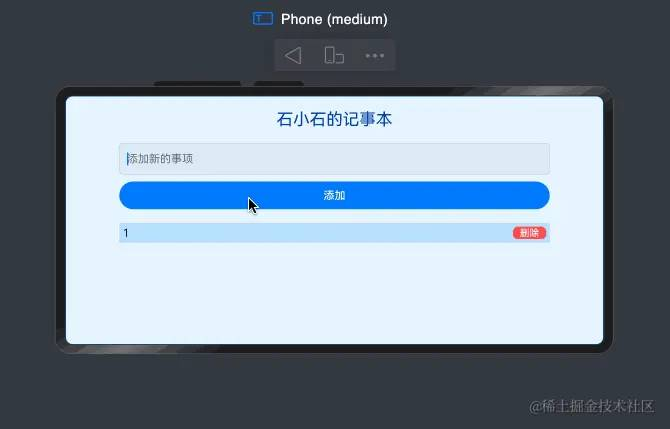
总结
本教程借助原生ArkTS结合ArkUI组件实现了一个简单的欢迎页及记事本页。现在,我们在梳理一下文中用到的一些知识点
借助ArkUI组件,我们可以快速实现页面布局,添加按钮等输入框。组件的基础用法如下
Row() { Button() { Text('你好,鸿蒙') .fontSize(22) .fontColor('#fff') .fontWeight(FontWeight.Bold) }}.width('100%') .height('100%').backgroundColor('#d4380d').alignItems(VerticalAlign.Center).justifyContent(FlexAlign.Center)具体的参数可参考ArkUI文档。
在main_pages.json文件中的“src”下配置路由“pages/Second”。
{ "src": [ "pages/Index", "pages/Second" ]}代码中实现点击跳转
Button() { }.onClick(() => { router.pushUrl({ url: 'pages/Second' })})语法同Typescript
添加、删除事件
@State notes: string[] = [];@State newNote: string = '';addNote() { if (this.newNote.trim() !== '') { this.notes.push(this.newNote) this.newNote = '' }}deleteNote(index: number) { this.notes.splice(index, 1);}Button('添加').onClick(()=> this.addNote())Row(){ Text(item).fontColor('#001d66') Button('删除') .onClick(()=>this.deleteNote(index))} OK,本节教程到这里就结束了!欢迎大家关注本专栏:鸿蒙开发实践-基础入门,下次更新不迷路哈!
下篇文章预告:
Arkts的语法特性及使用