
包阅导读总结
1.
关键词:React、TailwindCSS、TypeScript、Counter Button、State
2.
总结:本文主要介绍如何使用 React、TailwindCSS 和 TypeScript 构建一个计数器按钮,包括项目设置的前提条件、创建组件、样式设置以及添加状态和处理错误等内容。
3.
主要内容:
– 如何构建计数器按钮
– 前提条件
– 熟悉 JavaScript、CSS、HTML、命令行等
– 安装 Node 和选择代码编辑器
– 项目设置
– 使用 Next.js 进行本地 React 项目设置
– 执行相关命令创建项目
– 初始状态
– 删除样板代码,添加项目标题
– 创建并渲染按钮组件
– 样式设置
– 改进按钮样式
– 解释 Tailwind 的作用
– 添加状态
– 导入 useState 钩子
– 处理 Next.js 的组件错误
– 评估 JavaScript 在 JSX 中的使用
思维导图: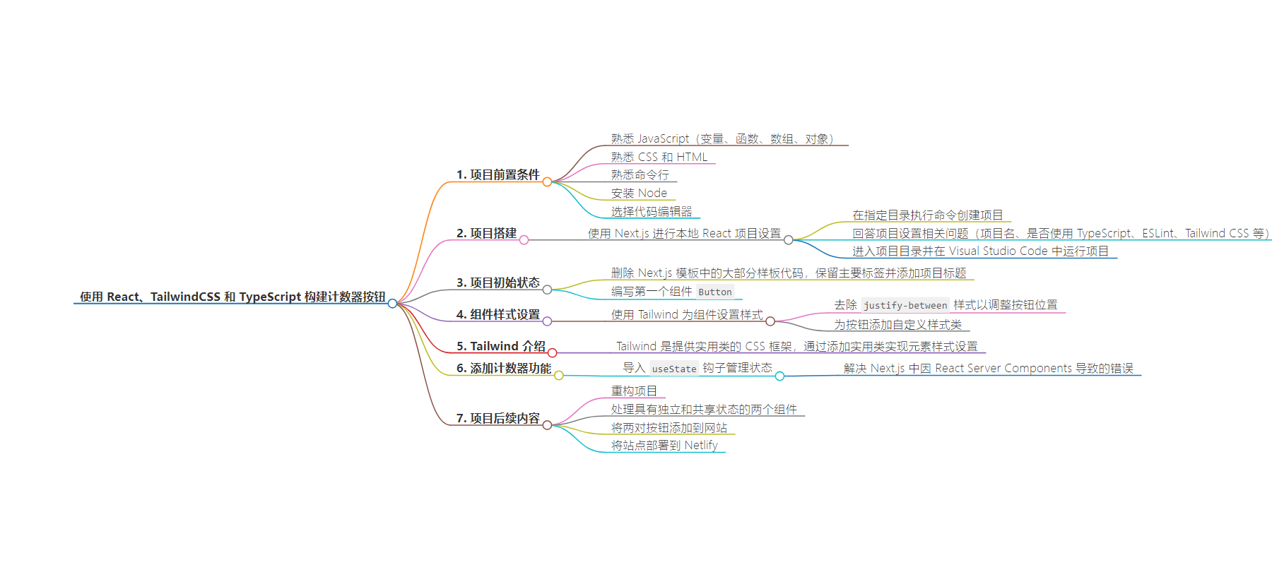
文章地址:https://www.freecodecamp.org/news/build-a-counter-button-with-react/
文章来源:freecodecamp.org
作者:Devin Lane
发布时间:2024/7/10 14:41
语言:英文
总字数:4913字
预计阅读时间:20分钟
评分:88分
标签:React,Tailwind CSS,TypeScript,Web 开发,JavaScript
以下为原文内容
本内容来源于用户推荐转载,旨在分享知识与观点,如有侵权请联系删除 联系邮箱 media@ilingban.com
How can you keep track of the number of times a user clicks a button? How are the hearts on Instagram or the likes on Facebook counted?
In this tutorial, we will build a button that tracks the number of times a button has been clicked. Along the way, you will learn some fundamental concepts in React such as components, JSX, passing props between components, and managing state with hooks. You will also get small introductions to Tailwind and TypeScript.
This tutorial builds upon examples and concepts outlined in the “Learn” section of the React documentation, which you can find here.
Prerequisites
- Basic familiarity with JavaScript, such as working with variables, functions, arrays, and objects.
- Basic familiarity with CSS and HTML.
- Basic familiarity with the command line.
- Node installed.
- A code editor of your choice (I’ll be using Visual Studio Code here)
Table of Contents
- How to Build the Counter Button
- How to Refactor the Project
- Two Components with Independent and Shared State
- How to Add Both Pairs of Buttons to our Website
- How to Deploy the Site to Netlify
Chapter 1: How to Build the Counter Button
What is React?
Before we dive in, let’s define React. React is a JavaScript library for creating user interfaces out of pieces called components. Components are JavaScript functions that can receive and display data interactively to your users.
Project setup
We’re going to use Next.js for our local React setup.
Within the directory you’d like to store this project, open your terminal and execute the following command:
npx create-next-app@latestName your project however you like, and answer the commands as follows:
What is your project named? react-counter-buttonWould you like to use TypeScript? YesWould you like to use ESLint? YesWould you like to use Tailwind CSS? YesWould you like to use `src/` directory? NoWould you like to use App Router? (recommended) YesWould you like to customize the default import alias (@/*)? NoNow let’s cd into our project directory
cd react-counter-buttonAnd run the project in Visual Studio Code:
code .Note: if you don’t have the code command in your PATH, you can press ⇧⌘P (Ctrl+Shift+P on Windows/Linux) and type in ‘Shell Command: Install ‘code’ command in PATH’. Alternatively, you can drag the folder onto the Visual Studio Code icon in MacOS. Or, within Visual Studio Code, you can select File -> Open, and find “react-counter-button”, or the name of your project.
In your terminal run:
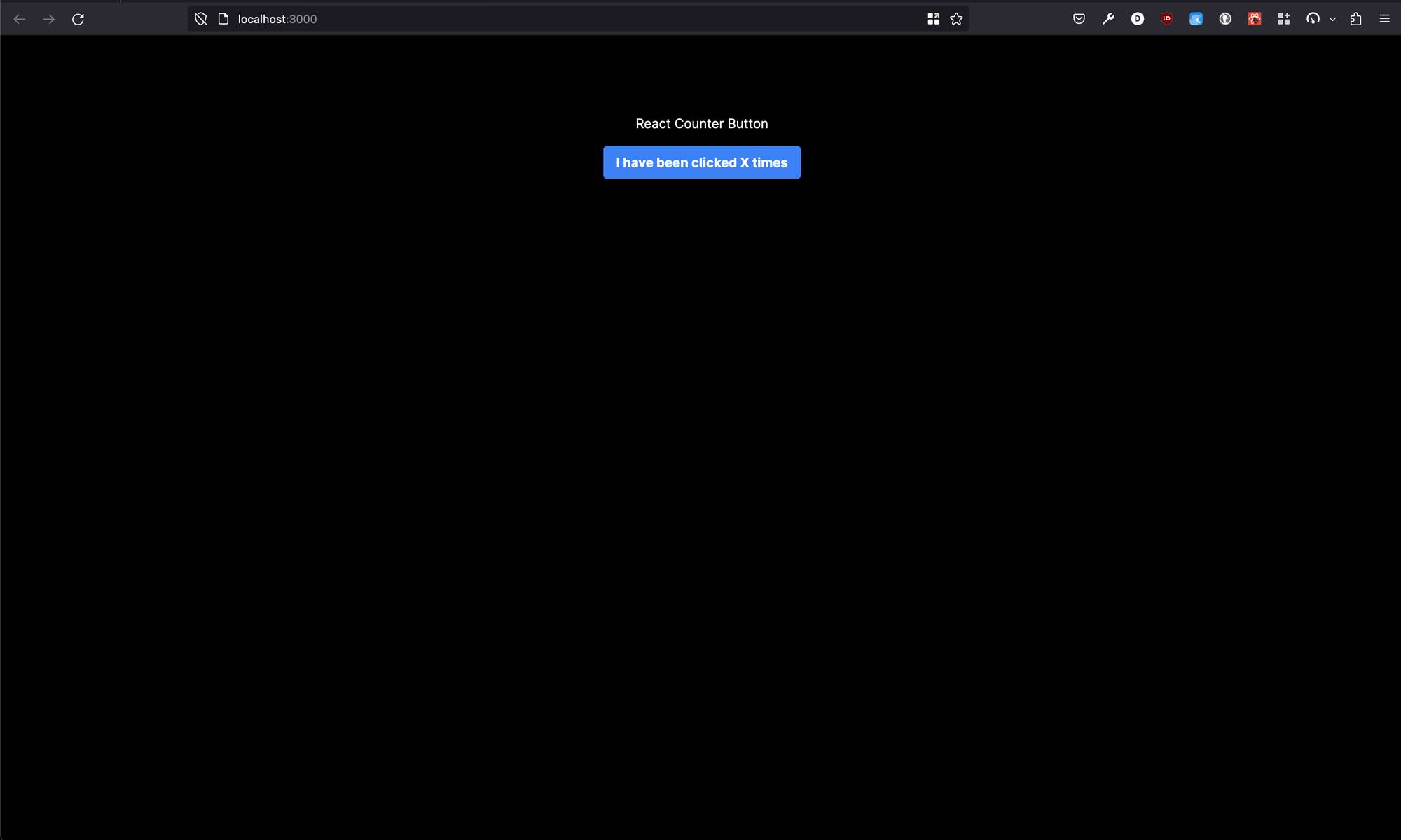
npm run devOpen your browser to localhost:3000 and you should see the following page:
 Next.js boilerplate
We now have the project up and running. Back over in our code editor, we can begin the work.
Remove boilerplate
In app/page.tsx, let’s delete most of the boilerplate code except the two main tags. Then let’s add a title for our project in an h1 tag in between the main tags. Our code should look like this:
export default function Home() { return ( <main className="flex min-h-screen flex-col items-center justify-between p-24"> <h1>React Counter Button</h1> </main> );}Here’s what we should now see:
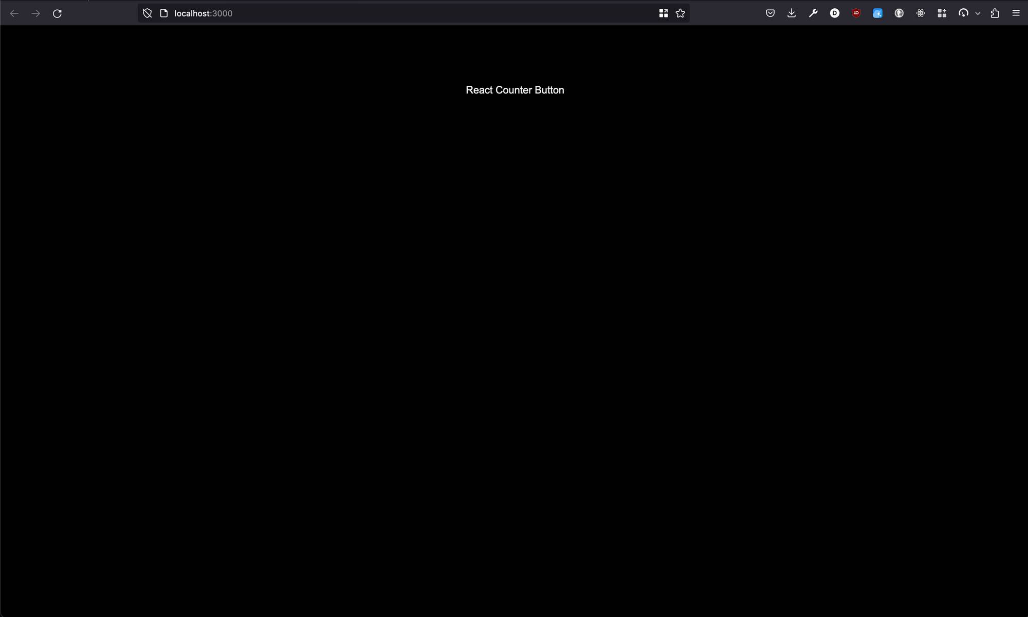 Initial state of our project
Writing our first component
Let’s create our first component. A React component is a function that returns markup. Below and outside of the scope of our Home function, let’s write the following:
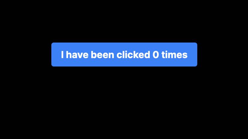
function Button() { return <button>I have been clicked X times</button>;}Here we have a function Button that returns some markup in JSX. JSX looks a lot like HTML, but it can display dynamic content, and has stricter rules than HTML. You can learn more about JSX in the React docs here.
The Button function must be uppercase to be recognized as a valid React component. This contrasts it with an HTML tag, which is lower case.
You’ll notice that we still see no change on our webpage – we need to render this component in order to see it on the screen.
We can use our Button component as if it were an HTML tag we created. If we nest the Button component within the Home component, we should see it on the screen:
export default function Home() { return ( <main className="flex min-h-screen flex-col items-center justify-between p-24"> <h1>React Counter Button</h1> <Button /> </main> );}function Button() { return <button>I have been clicked X times</button>;}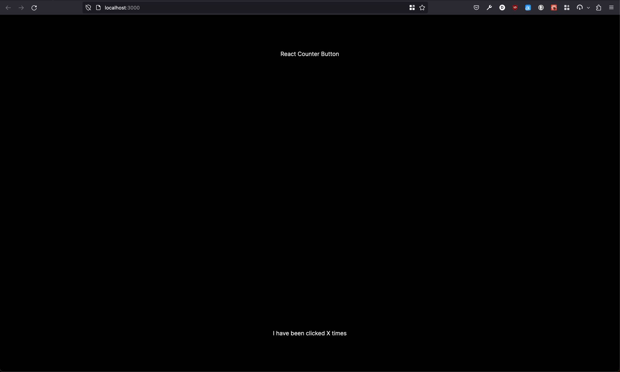 Rendering the
 Button component (with less than ideal CSS)
Styling our first component with Tailwind
You’ll notice the button is on the bottom of the screen. This is because the styles on main include justify-between in the flex-col direction. If we remove justify-between we should see this:
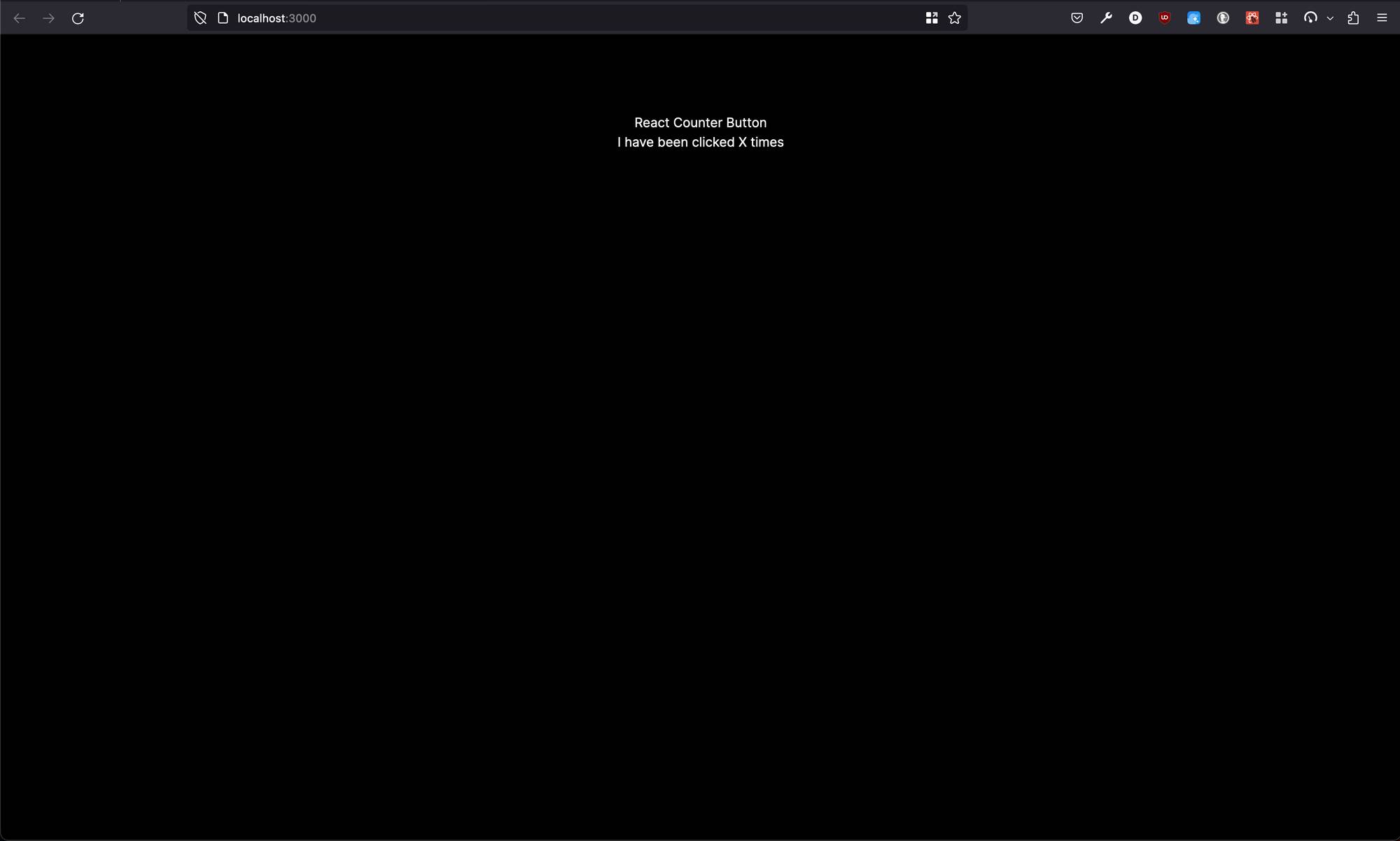 Improving the CSS of the initial state of our application
You can read more about aligning items in a flexbox from MDN here.
You’ll also notice that the button is un-styled. This is because Tailwind removes default styling on buttons as a part of their “preflight” styles. If you’re curious to see where these styles come from, you can open node_modules/tailwindcss/src/css/preflight.css and check out ~line 193 (permalink on GitHub here):
button,[type='button'],[type='reset'],[type='submit'] { -webkit-appearance: button; background-color: transparent; background-image: none; }We’re not going to change the styles within node_modules – instead we’ll add our own styling to the Button component. One of the benefits of Tailwind is that our CSS is co-located with our JavaScript, making quick changes to styles easier than opening a separate stylesheet file.
Let’s make the following changes:
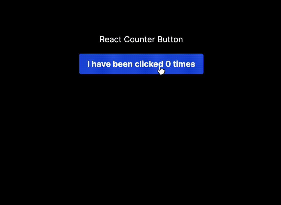
export default function Home() { return ( <main className="flex min-h-screen flex-col items-center p-24 gap-4"> <h1>React Counter Button</h1> <Button /> </main> );}function Button() { return ( <button className="bg-blue-500 hover:bg-blue-700 rounded text-white font-bold px-4 py-2"> I have been clicked X times </button> );}We’ve added styles to our button, and we’ve also added a gap-4 to our main parent flex box to provide a space between the h1 and the button. (You can read more about the CSS property “gap” in the MDN here.) We should now see this:
 Viewing our styled
 Button component
Wait, but what is Tailwind?
Now that we’ve styled our button component and spaced the items out, let’s reflect on what Tailwind is, and what it provided for us. Tailwind is a CSS framework that provides a set of “utility” classes that we can use to style each element.
But what is a utility class? You’ll see that to style our button, we added classes such as bg-blue-500 – which corresponds to setting the CSS background-color property to blue, and rounded – which corresponds to border-radius: 0.25rem.
Each class is defined according to its utility: changing the background color, the border radius, and so on. Through adding these utility classes to our elements, we arrive at our desired styles.
Tailwind sits in contrast to other frameworks, such as Bootstrap, that provide predefined classes for elements such as buttons. In Bootstrap, we would add a class of btn to achieve a styled button. And of course, with standard CSS we would likely add a custom class (perhaps called button) to our element and create CSS rulesets in a separate stylesheet.
Returning to our project, so far we’ve set up a React project using Next.js, created our first React component, and styled our button using Tailwind. How do we introduce the counter functionality?
How to add state
In order to display the number of times a button has been clicked, we need to use an event handler, and we need a way to manage state.
State is component-specific memory. In our example, this is how the button will remember how many times it has been clicked. Using a special React function “hook”, we trigger a re-render and retain the data across renders – the [useState](https://react.dev/reference/react/useState) hook is provided by React for this purpose.
At the top of our page.tsx, let’s import useState:
import { useState } from "react"
and within our Button component, let’s add the following:
function Button() { const [count, setCount] = useState(0) return ( <button className="bg-blue-500 hover:bg-blue-700 rounded py-2 px-4 text-white font-bold"> I have been clicked X times </button> );}Let’s unpack what we have here:
- We’re using the destructuring assignment to get the values of
countand the functionsetCountfromuseState. The convention is to name these two valuessomethingandsetSomething, though we could name them anything. - The argument to
useStateis the initial value of our state variable. Here we’ve set it to 0. countis our current state.setCountis the function that updates our state and triggers a re-render.
However, if you click save you’ll see the following error in your terminal and in your browser:
You're importing a component that needs useState. It only works in a Client Component but none of its parents are marked with "use client", so they're Server Components by default.Learn more: https://nextjs.org/docs/getting-started/react-essentials ╭─[/[...your project path]/src/app/page.tsx:1:1] 1 │ import { useState } from "react"; · ──────── 2 │ 3 │ export default function Home() { 4 │ return ( ╰────Maybe one of these should be marked as a client entry with "use client": ./src/app/page.tsxThis is due to Next.js’s use of React Server Components, which you can learn more about here. React Server Components is a large topic, but the bottom line is that, by default, components are Server Components in Next.js and useState only works in a Client Component. If we write the "use client" directive at the top of our page.tsx, we resolve the error.
How to Evaluate JavaScript within JSX
If we click the button, we still don’t see the numbers update. This is because we need a way to interpolate (or evaluate) JavaScript within our JSX markup. Enter the curly braces: {}.
We can use curly braces to “escape” into JavaScript from within JSX markup. This way we can evaluate JavaScript expressions (such as adding to a counter) and dynamically display data in our components. Here’s what we’ll do:
function MyButton() { const [count, setCount] = useState(0); return ( <button className="bg-blue-500 hover:bg-blue-700 rounded py-2 px-4 text-white font-bold"> I have been clicked {count} times </button> );}We have added {count} to evaluate the value of count from useState within our button. We should see the following:
 Displaying data in JSX with curly braces {}
We see a 0 – this comes from the count variable that we destructured from our useState hook, which we initially set to 0. We’ve successfully interpolated the JavaScript within our JSX markup!
Event handling
You’ll notice that if we click the button, still nothing happens. How do we get the number to increment when we click it?
For this, we’ll make use of an event handler function as well as the setter function (which we named setCount) that we get from useState:
function MyButton() { const [count, setCount] = useState(0); function handleClick() { setCount(count + 1); } return ( <button className="bg-blue-500 hover:bg-blue-700 rounded py-2 px-4 text-white font-bold"> I have been clicked {count} times </button> );}What we’ve done here is add a function handleClick to update the state of the count variable. The convention is to name event handler functions handle followed by the name of your event (for example, handleClick).
[setCount](https://react.dev/reference/react/useState#setstate) is a special set function returned by useState that will update the state of the count variable to whatever we pass in as an argument. For example, we could call setCount(2), and it would update count to 2. setCount(7) would set it to 7, and so on.
We are calling setCount(count + 1), which evaluates to setCount(0 + 1), because the initial value of count is 0. Upon the next click, count will be 1, so we’d be calling setCount(1 + 1), and the next click would call setCount(2 + 1) and so on.
This allows us to update the counter with every click. But, if you click, you’ll notice that still nothing happens – why? Perhaps take a moment to try to figure this out for yourself before reading on to help the concept stick even better.
How to Pass an Event Handler as a Prop to Your JSX
Looking at our code, there is no relationship between the user clicking the button, and the handleClick function. We need to pass the handleClick event handler to the onClick property on the button! Let’s add that here:
function MyButton() { const [count, setCount] = useState(0); function handleClick() { setCount(count + 1); } return ( <button onClick={handleClick} className="bg-blue-500 hover:bg-blue-700 rounded py-2 px-4 text-white font-bold" > I have been clicked {count} times </button> );}Notice how we haven’t said onClick={handleClick()}. We aren’t calling the function ourselves here – we are instead passing it down. This is an important distinction, as React calls the function for us when the user clicks the button, instead of it firing immediately.
You can learn more about passing props to components in the React docs here.
Our working project
Try it out now, the button works!
You now have a button that updates its count when you click it. This shows usage of interpolating JavaScript within JSX using curly braces, creating your own component and nesting it within other components, using state and hooks within React, as well as working with Next.js and Tailwind. Congratulations!
 Our working project
Here would be a good point to commit our changes using Git. You can close the current terminal process by pressing ctrl + c, and then type in git add ., followed by git commit -m "counter button" or some other message that is meaningful.
Chapter 2: How to Refactor the Project
Moving our component to another file
As our project sits, all the code is within app/page.tsx. What if we wanted to add another component, or several? Over time, our page.tsx would get large and difficult to read.
Instead, we can break our components up into their own files to help with readability as well as modularity (reusing the component in multiple different places).
Let’s start by creating a folder components at the root of our project to store our components. Inside components, create a file called button.tsx. Then, within app/page.tsx cut (copy and then delete) the entire Button function component and paste it within components/button.tsx.
components/button.tsx should look like this:
function Button() { const [count, setCount] = useState(0); function handleClick() { setCount(count + 1); } return ( <button onClick={handleClick} className="bg-blue-500 hover:bg-blue-700 rounded text-white font-bold px-4 py-2" > I have been clicked {count} times </button> );}Fix the useState import error
You’ll likely notice in your code editor that useState(0) has red squiggly lines underneath it. In Visual Studio Code, if you hover over it, you will see an error that says:
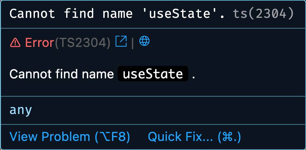 Error: cannot find name ‘useState’
Why is this? We are using useState but we have not imported the module from React. Adding import { useState } from "react"; to the top of our button.tsx file will fix this error.
If you look at the beginning of the function, you’ll see that Button() is underlined with white lines in Visual Studio Code. Hovering over it will show this error. Reflect on why this might be the case – we’ll address this later.
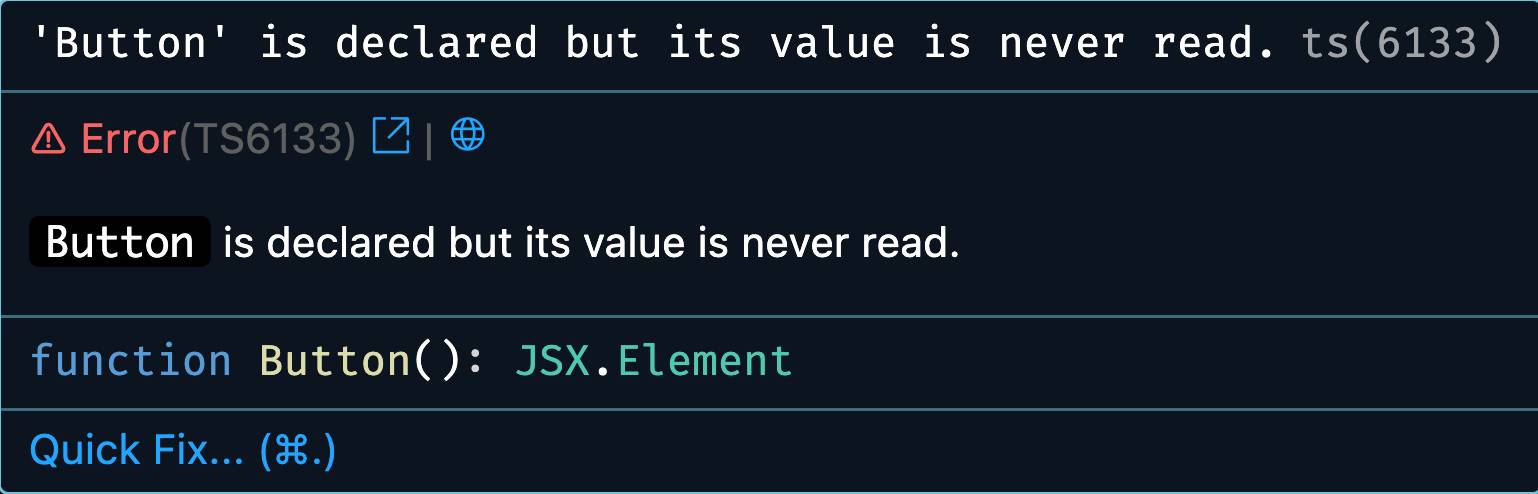 Error: ‘Button’ is declared but its value is never read
Importing and Exporting Components
Let’s return to app/page.tsx . You’ll see two errors here: one on import { useState } from "react"; and another on <Button />.
Let’s address the useState error first. We used useState within our Button component, but now that we’ve moved that component to its own file, we no longer it. Deleting it will solve our error. You can use cmd (ctrl on Windows) + shift + k to delete the entire line in Visual Studio Code.
If you’ve saved your app/page.tsx you will see this error in the console:
⨯ app/page.tsx (7:14) @ Button ⨯ ReferenceError: Button is not defined at Home (./app/page.tsx:19:89)digest: "2129895745" 5 | <main className="flex min-h-screen flex-col items-center p-24 gap-4"> 6 | <h1>React Counter Button</h1>> 7 | <Button /> | ^ 8 | </main> 9 | ); 10 | } GET / 500 in 87msWhy wouldn’t Button be defined? The issue is that within our app/page.tsx we have no way to access the Button component over in components/button.tsx. We solve this by exporting and importing the appropriate module.
Within components/button.tsx, at the beginning of our function declaration, let’s add the keywords export default. The file will look like this now:
import { useState } from "react";export default function Button() { const [count, setCount] = useState(0); function handleClick() { setCount(count + 1); } return ( <button onClick={handleClick} className="bg-blue-500 hover:bg-blue-700 rounded text-white font-bold px-4 py-2" > I have been clicked {count} times </button> );}You’ll notice that our earlier error of 'Button' is declared but its value is never read has gone away, because now the value is being read as a default export.
But what have we done here? What is an export, or a default export? Exporting and importing allows us to modularize JavaScript components into their own sections and use them in others.
There are two types: default exports, and named exports. Each file can have multiple named exports but only one default export. You can read more about importing and exporting components the React documentation here.
Now that we have exported the component from components/button.tsx, we have to import it within app/page.tsx. Visual Studio Code can help with “intellisense” suggestions: at the top of your file if you start typing “Button”, it will suggest the correct import with the correct filepath:
import Button from "@/components/button";
Within Next.js we can use this @/ syntax to reference the root of the project. This is a convenience added in case our import is several file layers deep. You can read the examples of the @/ syntax in the Next.js documentation here.
You’ll see that our errors have disappeared and the project still works! We haven’t added any new features but we have successfully refactored our code to make it more modular, readable, and maintainable.
Here let’s follow the same steps to commit our changes, adding a message such as refactor: move button to its own file.
Chapter 3: Two Components with Independent and Shared State
Two Components with Independent State
What if we wanted to have two buttons that can count independently of each other? This will showcase the beauty of React and component-based development implementation will be simpler than building the button from scratch entirely again.
Within app/page.tsx we can simply add another <Button />. You can focus your cursor on <Button /> and press option + shift + ↓ to create another <Button />:
"use client";import Button from "@/components/button";export default function Home() { return ( <main className="flex min-h-screen flex-col items-center p-24 gap-4"> <h1>React Counter Button</h1> <Button /> <Button /> </main> );}You should now see two button counters with their own independent state:
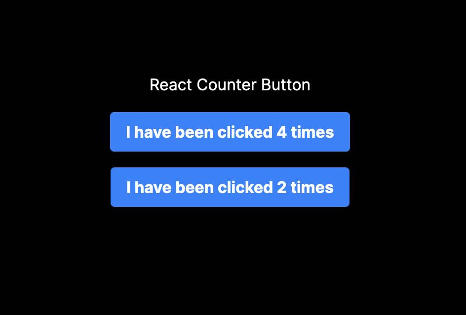 Two buttons with independent state
Component-based design with React makes re-using parts of your application easy. Easy win.
Two Components with Shared State
What if we wanted the buttons to share their state and update together? You’ll notice that as we click each button, they separately increment.
In order for the buttons to share their state, we will need to move their state from each individual components “upward” to their common parent component (in this case, the Home function in app/page.tsx). You’ll also hear this referred to as “lifting state up“.
Cut the counting logic from components/button.tsx and paste it into app/page.tsx within the body of the Home function. We will also need our useState import at the top of the file:
"use client";import { useState } from "react";import Button from "@/components/button";export default function Home() { const [count, setCount] = useState(0); function handleClick() { setCount(count + 1); } return ( <main className="flex min-h-screen flex-col items-center p-24 gap-4"> <h1>React Counter Button</h1> <Button /> <Button /> </main> );}Passing Props Down to a Component
Now that we have our state in the parent component of each button (Home), we can pass this state down via props to the Button component. We will want to pass down both the event handler handleClick as well as the count variable we wish to display:
"use client";import { useState } from "react";import Button from "@/components/button";export default function Home() { const [count, setCount] = useState(0); function handleClick() { setCount(count + 1); } return ( <main className="flex min-h-screen flex-col items-center p-24 gap-4"> <h1>React Counter Button</h1> <Button count={count} onClick={handleClick} /> <Button count={count} onClick={handleClick} /> </main> );}The count from useState is passed to the count prop, and the function handleClick is passed to the onClick prop, both on the Button component. In JSX, we can define our own props (which might remind you of HTML attributes) so that we can pass data from one component to another.
You might see some errors related to TypeScript at this point – we will come back to these later.
Read Props in Your Child Component
Now that we have passed the data as props to our component, we need to adjust our Button component to read the props from its parent component. Within components/button.tsx:
export default function Button({ count, onClick }) { return ( <button onClick={onClick} className="bg-blue-500 hover:bg-blue-700 rounded text-white font-bold px-4 py-2" > I have been clicked {count} times </button> );}React function components accept a single props object as an argument. Here we destructure the props that we want to pass into our Button component. In other words, we are taking count, and onClick from the props object directly, as an argument to Button.
If you save your file you’ll see that this now works: you have two buttons with shared state:
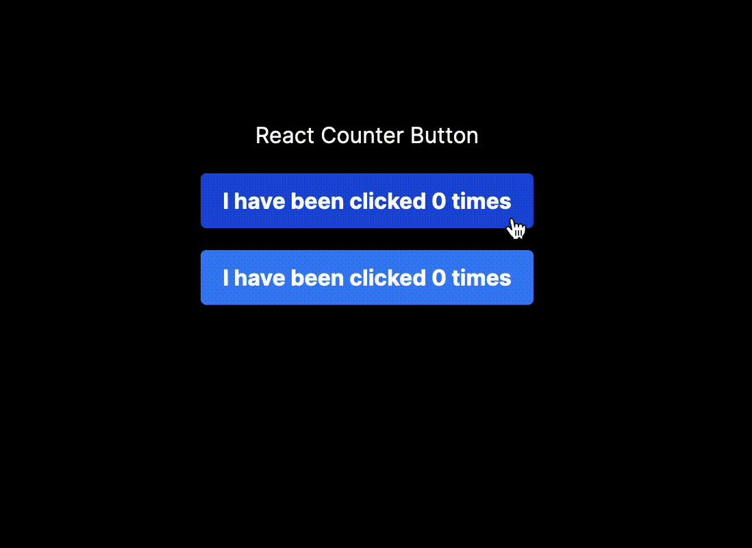 Two buttons with shared state
But why did we pass onClick and not handleClick to the Button component? Isn’t handleClick what we want to run when we click the button?
Within the Home component in app/page.tsx, we define handleClick and pass it down as a prop to the Button component. Within the Button component’s body in components/button.tsx we read the prop onClick, not the event handler handleClick itself. So when the Button component fires, it calls the onClick prop, which sits “up” the component tree inside Home, where it then calls handleClick, updates the count, and then passes that state back down to both Button components.
Tiny Crash Course in TypeScript
If you check components/button.tsx you will see the following errors for both the count and onClick props you are reading into Button:
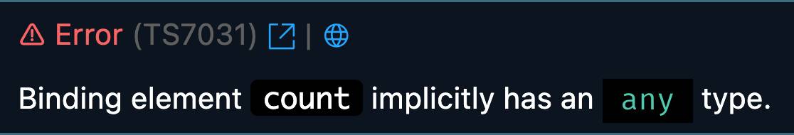 Binding element ‘count’ implicitly has an ‘any’ type.
(You can get these “pretty” TypeScript syntax-highlighted errors with the Visual Studio Code extension here).
What do these errors mean, and what is TypeScript? TypeScript is a superset of JavaScript that adds types to JavaScript. These can help ensure that our program works as we intend. Examples of types are number, boolean, and string. This error is telling us that we haven’t defined a type for the props count or onClick.
So what will the type of count be? If we consider the result of count, the answers could be 1, 2, 3, and so on. These are all numbers, so we will assign the type number to count.
The onClick prop is a function that doesn’t take any arguments or return any value – we use it for its side effect of updating setCount. So we assign it the type () => void.
We create an interface where we define the types for our ButtonProps, and then read this interface into our component:
interface ButtonProps { count: number; onClick: () => void;}export default function Button({ count, onClick }: ButtonProps) { return ( <button onClick={onClick} className="bg-blue-500 hover:bg-blue-700 rounded text-white font-bold px-4 py-2" > I have been clicked {count} times </button> );}The errors are gone and there you have it: a tiny intro to TypeScript!
Here let’s make another commit with a message such as buttons with shared state.
Chapter 4: How to Add Both Pairs of Buttons to Our Site
Let’s showcase both our buttons with shared and independent state, and deploy the application.
Let’s rename our button.tsx to button-shared-state.tsx. Let’s also rename the function, the interface, the import within app/page.tsx, as well as the component in app/page.tsx. And let’s switch these to named exports using a function expression using const instead of a function declaration:
interface ButtonSharedStateProps { count: number; onClick: () => void;}export const ButtonSharedState = ({ count, onClick,}: ButtonSharedStateProps) => { return ( <button onClick={onClick} className="bg-blue-500 hover:bg-blue-700 rounded text-white font-bold px-4 py-2" > I have been clicked {count} times </button> );};"use client";import { useState } from "react";import { ButtonSharedState } from "@/components/button-shared-state";export default function Home() { const [count, setCount] = useState(0); function handleClick() { setCount(count + 1); } return ( <main className="flex min-h-screen flex-col items-center p-24 gap-4"> <h1>React Counter Button</h1> <ButtonSharedState count={count} onClick={handleClick} /> <ButtonSharedState count={count} onClick={handleClick} /> </main> );}Now let’s create a file components/button-independent-state.tsx:
"use client";import { useState } from "react";export const ButtonIndependentState = () => { const [count, setCount] = useState(0); function handleClick() { setCount(count + 1); } return ( <button className="bg-blue-500 hover:bg-blue-700 rounded text-white font-bold py-2 px-4" onClick={handleClick} > I have been clicked {count} times </button> );};What we’ve done here is similar to our logic in the beginning of this guide: we’ve located the state within the button component itself, so that each implementation of the button component creates and tracks its own independent state.
Let’s import ButtonIndependentState into app/page.tsx:
"use client";import { useState } from "react";import { ButtonSharedState } from "@/components/button-shared-state";import { ButtonIndependentState } from "@/components/button-independent-state";export default function Home() { const [count, setCount] = useState(0); function handleClick() { setCount(count + 1); } return ( <main className="flex min-h-screen flex-col items-center p-24 gap-4"> <h1 className="text-3xl font-bold">React Counter Buttons</h1> <h2 className="text-xl">Buttons with shared state</h2> <ButtonSharedState count={count} onClick={handleClick} /> <ButtonSharedState count={count} onClick={handleClick} /> <h2 className="text-xl">Buttons with independent state</h2> <ButtonIndependentState /> <ButtonIndependentState /> </main> );}We have now showcased a set of buttons that have independent state, as well as buttons that have shared state. We added a tiny bit of CSS to make things look nicer as well.
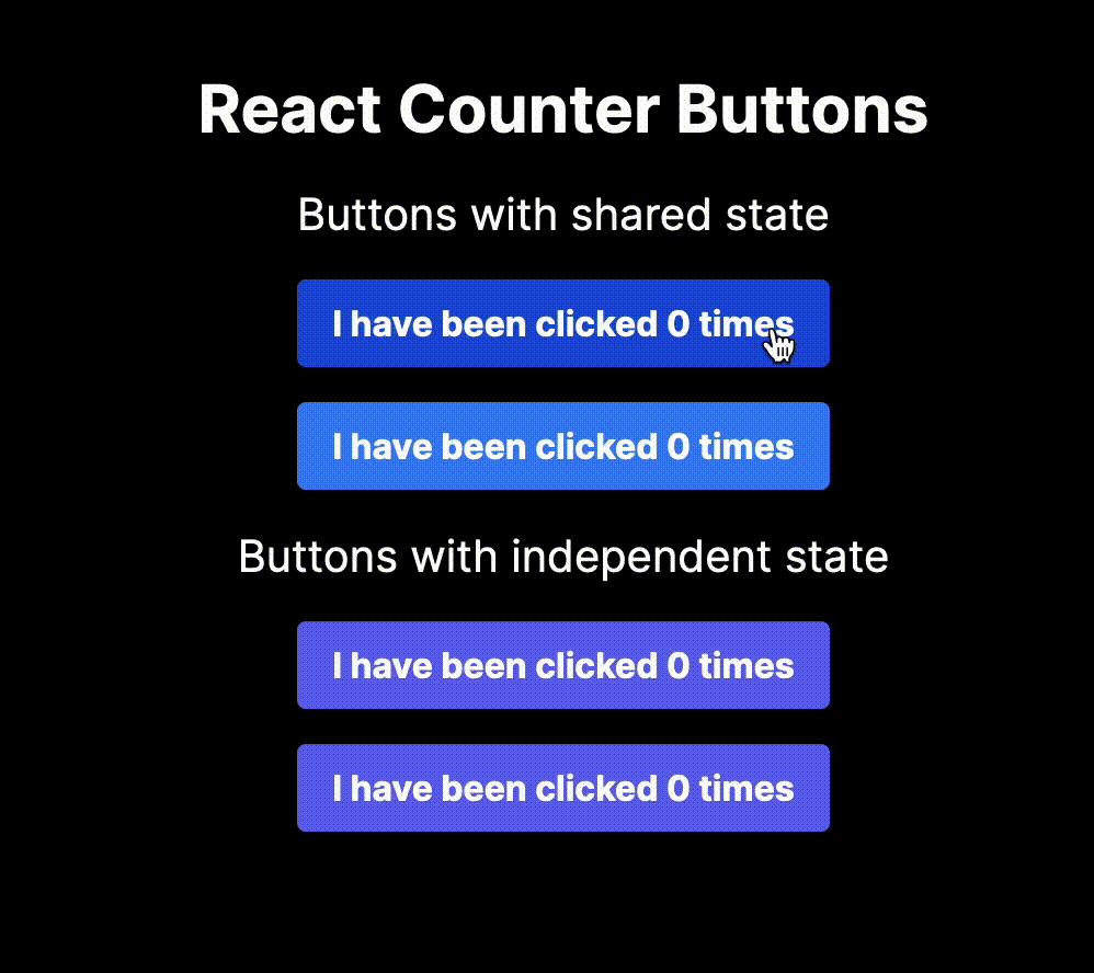 Our finished project
Here let’s add another commit with a message such as buttons with both shared and independent state.
Chapter 5: How to Deploy the Site to Netlify
Publish to GitHub
Let’s deploy our application to the world to show it off. We are going to push our code to GitHub, and then deploy it to Netlify.
The first step is push our code to GitHub. If you don’t have a GitHub account, create one first. In Visual Studio Code, you can push to GitHub from the command palette: open up the command palette by pressing ⇧⌘P , then type in publish to GitHub, and select publish to public GitHub repository.
Open your GitHub account and verify that the project has successfully been uploaded.
Deploy to Netlify
Once you’ve uploaded your project to GitHub, you can now deploy it to Netlify. Open up the Netlify website, and log in (or create an account if you don’t have one).
Click add new site, and then import an existing project. When asked Let’s deploy your project with…, select GitHub.
Select the name of your repository from the list, then give the site a name under site name. You can leave the rest of the settings at their defaults and then click deploy [your site name].
If the project builds successfully, you will have a live link of your work!
Concluding Thoughts and Next Steps
In this project, you have learned fundamental concepts in React such as creating a functional component, importing and exporting modules, interpolating JavaScript within JSX using curly braces, working with state, and using React hooks.
You’ve also seen an introduction to using utility-based CSS techniques with Tailwind CSS, and you’ve gotten a tiny introduction into adding types to your JavaScript with TypeScript. Finally, you learned how to deploy your project to Netlify via GitHub.
Where can you go from here? One idea for expanding the project could be to create a “ticker”: a counter that could be incremented and decremented (you would have one button that increases the number of the counter, and one that decreases it).
In the name of learning, one effective method for solidifying the concepts you’ve learned here would be to start a project completely fresh, and see if you can build everything in this tutorial without checking the tutorial. As you need to check in, you will identify which concepts benefit from further study and practice.
If you’d like to stay in touch, you can:
Please post about what you’ve made along with any questions or feedback you might have.
Happy coding!