
包阅导读总结
1. 关键词:Popovers、抽屉式弹窗、CSS、JavaScript、前端
2. 总结:本文主要探讨了利用 popover 属性实现从屏幕底部滑出的抽屉式弹窗,介绍了其设计实现方式、无需锚点定位 API 的进度增强,以及在不同场景下的优势和应用。
3. 主要内容:
– Popovers 的创新应用
– 将工具提示设计为抽屉式弹窗
– 从屏幕底部滑出的交互方式
– 实现方式
– 利用 CSS 和 JavaScript
– 处理不同浏览器的支持情况
– 具体代码和示例
– 相关的 CSS 样式代码
– HTML 结构和元素设置
– 关键帧动画实现滑入效果
– 应用场景和优势
– 提供即时信息、节省空间等
– 适应不同设备,增强用户体验
思维导图: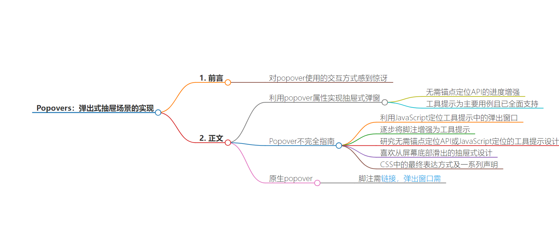
文章地址:https://mp.weixin.qq.com/s/Ux5EDloQpl7v-fn4ptTvjQ
文章来源:mp.weixin.qq.com
作者:飘飘
发布时间:2024/7/4 0:00
语言:中文
总字数:2218字
预计阅读时间:9分钟
评分:83分
标签:Web Development,CSS,JavaScript,UI/UX,Popover
以下为原文内容
本内容来源于用户推荐转载,旨在分享知识与观点,如有侵权请联系删除 联系邮箱 media@ilingban.com
前言
被这个 popover 使用的交互方式服了,还能这么用。本文主要探讨了如何利用 popover 属性将工具提示设计为从屏幕底部滑出的抽屉式弹窗,并通过 CSS 和 JavaScript 实现无需锚点定位 API 的进度增强。今日前端早读课文章由 @飘飘翻译分享。
正文从这开始~~
我仍然对 popover 属性有些着迷。这个不起眼的 HTML 属性只需花费很少的精力,就能产生易于访问且设计友好的抽屉式弹窗 UI/UX 效果。我认为,”工具提示” 通常是这一功能的最主要用例,现在这一功能已得到全面支持。
【第3279期】Popover 不完全指南
首先,我们来看看如何在工具提示中使用弹出窗口。由于锚点定位 API 还没有得到广泛的支持,因此我们利用 JavaScript 来进行定位。
其次,我们尝试如何逐步将脚注增强为工具提示。这种技术最终会检查浏览器是否同时支持弹出窗口和锚点定位,如果支持,就会做原生弹出窗口,否则就会退回到普通脚注,这完全没有问题。
这一次,我们将研究一种完全不需要锚点定位 API 或任何 JavaScript 定位的工具提示设计。将让工具提示从屏幕底部滑出。
Closed = Footnote; Open = Drawer
这种基于抽屉的弹出式窗口的设计不需要在页面上以脚注的形式显示内容。这种设计我很喜欢。在 CSS 中,最终的表达方式是这样的:
 /* Display as a footnote */
 [popover] {
   display: list-item;
   ...

   /* Display as a drawer */
   &:popover-open {
     position: fixed;
     ...

   }
 }
这最终需要一系列声明来迫使内容适应这两种布局。这就是 CSS。
【第2960期】原生 popover 终于要来了!
在链接 / 按钮级别实现渐进增强
脚注是作为备选的,需要<a>链接才能跳转到脚注。而弹出窗口则需要<button>才能工作。因此,我们实际上需要将两者紧挨着显示:
 <a class="footnote-anchor" href="#ref_1"><sup>1</sup></a>
 <button popovertarget="ref_1">1</button>
你可以选择任何一种方式,但在这里,我们将默认隐藏锚链接,只有在不支持弹出式窗口时才显示它们:
 .footnote-anchor {
   display: none;
 }
 html.no-popovers {
   .footnote-anchor {
     display: inline;
   }
   [popovertarget] {
     display: none;
   }
 }
我们通过以下代码实现了 no-popovers 类:
 if (!HTMLElement.prototype.hasOwnProperty("popover")) {
   document.documentElement.classList.add("no-popovers");
 }
滑动门
抽屉从屏幕底部滑出的诀窍是:
-
抽屉固定位置
-
从页面上移开,高度与抽屉本身相同
-
当打开时,这些内容会显示在页面上
大体上是这样的
 [popover] {
   ...

   &:popover-open {
     z-index: 1;
     position: fixed;
     inset: auto;
     bottom: 0;
     left: 0;
     margin: 0;
     width: 100vi;
     padding: 2rem;
     background: lavender;
     box-shadow: 0 -1rem 5rem oklch(0% 0 0 / 0.33);

     animation: slide-open 0.2s;

     /* Make sure the popup isnt screen-covering */
     max-block-size: 50dvh;
     overflow: auto;
   }
}我之前想的是用@starting-style和过渡效果来实现抽屉的滑入效果,但事实证明你可以只设置打开状态的起始样式,就像我们在这里需要的那样。幸运的是,我们只需调用一个简单的关键帧动画就能实现这一功能:
 @keyframes slide-open {
   0% {
     transform: translate(0, 100%);
   }
   100% {
     transform: translate(0, 0);
   }
 }
在移动设备上尤其出色,但在桌面端也同样美观。
这个抽屉在移动屏幕上似乎更合适。我认为将弹出窗口放在按钮旁边可能不会有太大帮助,抽屉会更好。
但即使在更大的屏幕上,效果也还算不错。我们可以稍微多花点心思,将元素稍微宽松地居中排列,这不会有什么坏处。
DEMO 代码
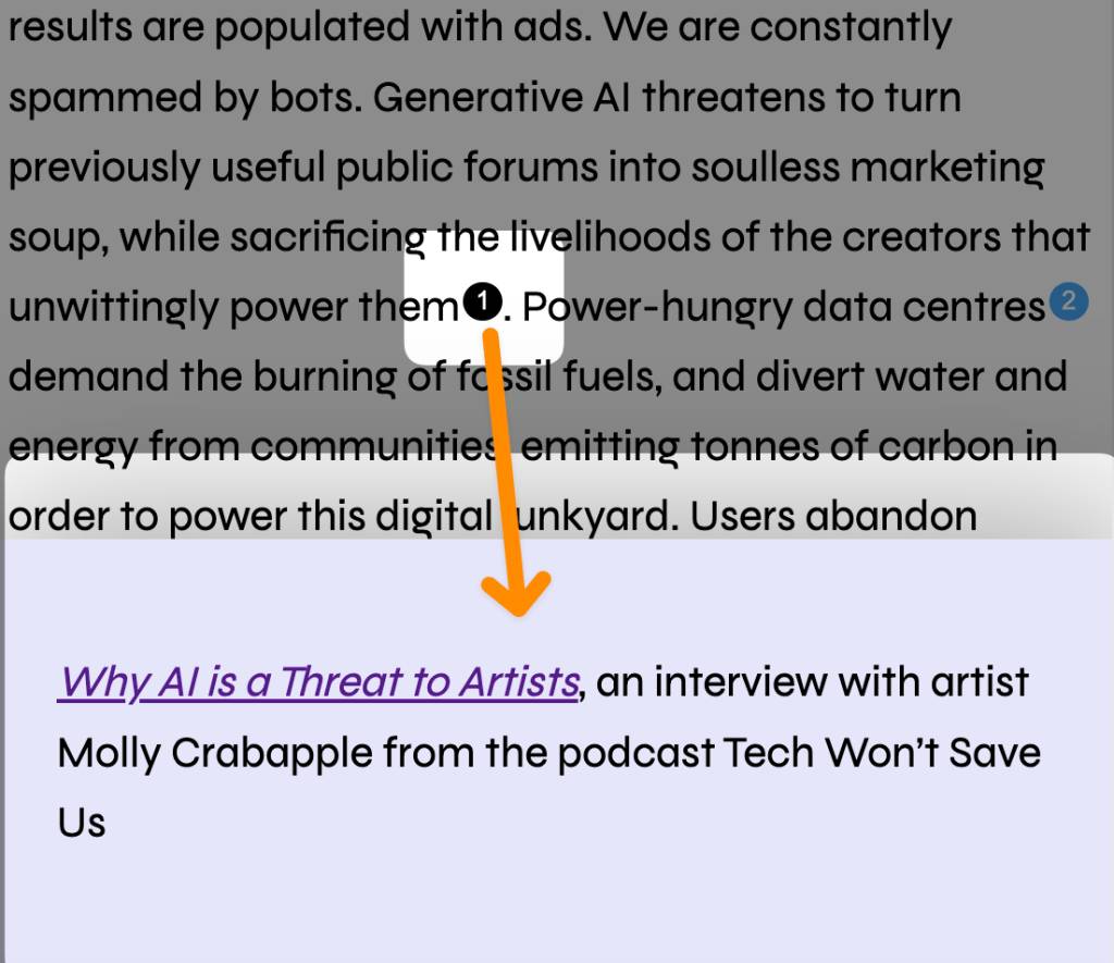
 <!--Excerpt from https://humanewebmanifesto.com/-->

 <main>
   <article class="content">
     <p>The web is becoming hostile to humans. Users are tracked and their privacy is routinely violated. Search results are populated with ads. We are
 constantly spammed by bots. Generative AI threatens to turn previously useful public forums into soulless marketing soup, while sacrificing the livelihoods of
 the creators that unwittingly power them<a class="footnote-anchor" href="#ref_1"><sup>1</sup></a><button popovertarget="ref_1">1</button>. Power-hungry data
 centres<a class="footnote-anchor" href="#ref_2"><sup>2</sup></a><button popovertarget="ref_2">2</button> demand the burning of fossil fuels, and divert water
 and energy from communities, emitting tonnes of carbon in order to power this digital junkyard. Users abandon hostile websites that take too long to load on
 low-powered devices, or are forced to upgrade, as the pile of electronic waste grows<a class="footnote-anchor" href="#ref_3"><sup>3</sup></a><button
 popovertarget="ref_3">3</button></p>

     <p>We need a web <strong>by and for humans</strong>.</p>

     <p>Lorem ipsum dolor sit amet consectetur adipisicing elit. Dolorem natus veritatis placeat temporibus aperiam? Sed, quos in, quisquam dolor aut ad eaque
 amet odit laboriosam doloremque nulla beatae. Ratione, consequuntur!</p>
     <p>Aut nulla quaerat officia maiores aliquid? Earum, maiores. Eligendi, cum! Quaerat ipsam labore, neque sunt expedita facere recusandae quam nemo veniam
 nesciunt quae magnam perspiciatis corporis voluptate saepe eaque sapiente!</p>
     <p>Sapiente voluptatum officiis quisquam voluptatem soluta asperiores laboriosam quae velit sit, repellat, id error beatae neque architecto expedita
 voluptates? Sint aliquid fugit adipisci officia minima, fuga ab maiores cum a!</p>
   </article>

   <hr />

   <ol class="references">
     <li id="ref_1" popover>
       <p><cite><a href="https://techwontsave.us/episode/174_why_ai_is_a_threat_to_artists_w_molly_crabapple">Why AI is a Threat to Artists</a></cite>, an
 interview with artist Molly Crabapple from the podcast Tech Won’t Save Us</p>
     </li>

     <li id="ref_2" popover>
       <p><cite><a href="https://www.theguardian.com/world/2024/feb/15/power-grab-hidden-costs-of-ireland-datacentre-boom">Power grab: the hidden costs of
 Ireland’s datacentre boom</a></cite>, from The Guardian</p>
     </li>

     <li id="ref_3" popover>
       <p><cite><a href="https://gerrymcgovern.com/world-wide-waste/">World Wide Waste</a></cite>, book by Gerry McGovern</p>
     </li>
   </ol>
 </main>
.footnote-anchor {
display: none;
}
html.no-popovers {
.footnote-anchor {
display: inline;
}
[popovertarget] {
display: none;
}
}
[popovertarget] {
background: #42a5f5;
color: white;
width: 1.2rem;
height: 1.2rem;
border-radius: 50%;
display: inline-grid;
place-items: center;
text-align: center;
font-size: 60%;
margin-inline-start: 0.1rem;
inset-block-end: 0.33rem;
position: relative;
border: 0;
padding: 0.1rem;
&:hover,
&:focus {
background: black;
}
}
/* Display as a footnote */
[popover] {
display: list-item;
position: relative;
border: 0;
padding: 0;
width: auto;
overflow: visible;
p {
max-width: 50ch;
text-wrap: balance;
}
/* Display as a drawer */
&:popover-open {
z-index: 1;
position: fixed;
display: grid;
place-items: center;
inset: auto;
bottom: 0;
left: 0;
margin: 0;
width: 100vi;
padding: 2rem;
background: lavender;
box-shadow: 0 -1rem 5rem oklch(0% 0 0 / 0.33);
animation: slide-open 0.2s;
/* Make sure the popup isn't screen-covering */
max-block-size: 50dvh;
overflow: auto;
&::marker {
content: "";
}
}
}
@keyframes slide-open {
0% {
transform: translate(0, 100%);
}
100% {
transform: translate(0, 0);
}
}
@layer base {
*,
*::before,
*::after {
box-sizing: border-box;
}
body {
font-family: "Syne", sans-serif;
line-height: 1.6;
font-size: 1.35rem;
}
main {
max-width: 55ch;
margin: 0 auto;
padding-bottom: 50dvh; /* ensure a popup can't cover up the button that opened it */
}
} if (!HTMLElement.prototype.hasOwnProperty("popover")) {
document.documentElement.classList.add("no-popovers");
}Same List Progressive-Enhanced Footnotes as a Drawer:https://codepen.io/chriscoyier/pen/VwOXBPZ
在什么情况下需要将脚注转化为弹出框?
将脚注转化为弹出框(popover)通常在以下情况下是有益的:
-
提供即时信息:当用户需要即时查看与当前内容相关的额外信息时,使用弹出框可以快速提供这些信息而不打断用户的阅读流程。
-
节省空间:在屏幕空间有限的情况下,通过将详细信息放入弹出框中,可以避免页面过于拥挤,保持界面的整洁和简洁。
-
增强用户体验:弹出框可以通过交互式的内容展示,提升用户体验,尤其是在移动设备上,用户可以通过点击来查看或隐藏详细信息。
-
避免页面跳转:如果脚注需要链接到其他页面或部分,使用弹出框可以避免用户离开当前页面,减少加载时间和点击次数。
-
提供交互功能:弹出框可以包含交互元素,如表单或按钮,允许用户在不离开当前视图的情况下进行操作。
-
适应不同设备:在不同尺寸的设备上,弹出框可以通过响应式设计调整其显示方式,以确保在各种设备上都能提供良好的用户体验。
-
强调重要性:对于特别重要或需要强调的信息,通过弹出框可以更加突出地呈现给用户,从而提高信息的可见性和关注度。
-
引导用户注意:在用户需要执行特定操作或做出决策时,弹出框可以用来引导用户的注意力,确保他们不会忽略关键步骤或警告。
在设计弹出框时,应确保它们的使用是恰当的,不会干扰用户的主要任务,并且在可访问性方面得到妥善处理,以便所有用户都能获得良好的体验。
关于本文
译者:@飘飘
作者:@CHRIS COYIER
原文:https://frontendmasters.com/blog/popovers-work-pretty-nicely-as-slide-out-drawers/

这期前端早读课
对你有帮助,帮”赞“一下,
期待下一期,帮”在看” 一下 。