
包阅导读总结
1. `Headless UI v2.1`、`transition API`、`multi-dialog support`、`styles`、`React`
2. Headless UI v2.1 for React 发布,简化了过渡 API,支持多对话框渲染。新增过渡属性和数据属性,可更轻松定义元素过渡样式。已更新 Tailwind UI 以使用新过渡 API,且现有 API 仍兼容。还介绍了同时渲染多个对话框的情况,可通过安装最新版本使用。
3.
– Headless UI v2.1 发布
– 简化过渡 API
– 为内置组件添加新过渡属性
– 增加各过渡阶段的数据属性
– 支持同时渲染多个对话框
– 介绍相关应用场景
– 说明对话框关闭顺序的确定方式
– 更新 Tailwind UI 并保留旧 API 兼容性
– 安装最新版本即可使用,遇到问题可在 GitHub 反馈
思维导图: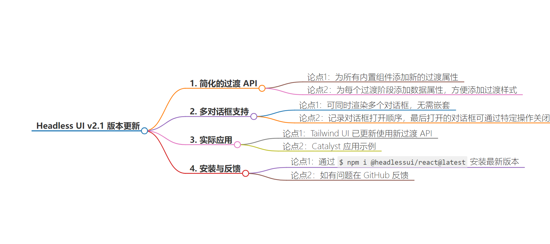
文章地址:https://tailwindcss.com/blog/2024-06-21-headless-ui-v2-1
文章来源:tailwindcss.com
作者:Tailwind CSS Blog
发布时间:2024/6/21 15:00
语言:英文
总字数:574字
预计阅读时间:3分钟
评分:90分
标签:React,Tailwind CSS,UI开发,过渡效果,对话框
以下为原文内容
本内容来源于用户推荐转载,旨在分享知识与观点,如有侵权请联系删除 联系邮箱 media@ilingban.com
We just released Headless UI v2.1 for React, which dramatically simplifies our transition APIs and adds support for rendering multiple dialogs as siblings.
We’ve made transitions way easier in v2.1 by adding a new transition prop to all of the built-in components you might want to transition, and adding data attributes for each transition stage so you can add transition styles by just throwing some classes on the target element:
import { Menu, MenuButton, MenuItem, MenuItems } from '@headlessui/react'function Example() { return ( <Menu> <MenuButton>My account</MenuButton> <MenuItems transition className={` transition ease-out data-[closed]:scale-95 data-[closed]:opacity-0 data-[enter]:duration-200 data-[leave]:duration-300 `} > {} </MenuItems> </Menu> )}There are four data attributes you can use to target the different stages of your transitions:
data-closed: The styles the element should transition from when entering and to when leaving.data-enter: Styles to apply while the element is entering, like a duration or easing curve.data-leave: Styles to apply while the element is leaving, like a duration or easing curve.data-transition: Styles to apply while the element is entering or leaving, useful for sharing values between both stages.
You can even stack these attributes to use different closed styles for entering and leaving. For example this dialog slides in from the left, but slides out to the right:
import { Dialog } from '@headlessui/react'import { useState } from 'react'function Example() { let [isOpen, setIsOpen] = useState(false) return ( <> <button onClick={() => setIsOpen(true)}>Open dialog</button> <Dialog open={isOpen} onClose={() => setIsOpen(false)} transition className={` transition ease-out duration-300 data-[closed]:opacity-0 data-[closed]:data-[enter]:-translate-x-8 data-[closed]:data-[leave]:translate-x-8 `} > {} </Dialog> </> )}And for transitioning regular HTML elements or other components, you can still use the <Transition> component but with the new data attribute APIs:
import { Transition } from '@headlessui/react'import { useState } from 'react'function Example() { const [isShowing, setIsShowing] = useState(false) return ( <> <button onClick={() => setIsShowing((isShowing) => !isShowing)}>Toggle</button> <Transition show={isShowing}> <div className="transition duration-300 data-[closed]:opacity-0"> I will fade in and out </div> </Transition> </> )}We’ve already updated all of Tailwind UI to use this new transition API and the code is a lot simpler and lighter. Take a look at the Modal Dialog, Dropdown, Slide-over, Flyout Menu, or Select Menu components for more examples.
All of the existing APIs continue to work for backwards compatibility, but this new approach is what we’re going to recommend going forward.
Check out the updated Transition component documentation to learn more.
In Headless UI v2.1 you can finally render multiple dialogs at the same time without nesting one inside the other.
This can be really helpful when two unrelated parts of your application need to show a dialog at the same time — for example maybe you already have some sort of confirmation dialog open but another part of your app detects that you’ve lost network connectivity or your session has timed-out and needs to throw up a new dialog on top.
Here’s what something like that might look like with Catalyst, the application UI kit we’ve been working on recently:
We keep track of the order in which each dialog is opened, and whichever one was opened last is the one that will close when you press escape or click outside the dialog.
To start using this stuff today, just install the latest version of Headless UI:
$ npm i @headlessui/react@latestIf you run into any issues, let us know on GitHub!