
包阅导读总结
1. 关键词:Responsive Web Design、Breakpoints、Screen Sizes、User Experience、Media Queries
2. 总结:本文介绍了响应式网页设计中断点的使用,包括其重要性、常见范围、选择时的考虑因素、基本结构和高级技术,强调断点能使网站适应不同设备和屏幕尺寸,以提供良好用户体验。
3. 主要内容:
– 什么是响应式网页设计(RWD)
– 确保网页在多种设备和屏幕尺寸上呈现良好
– 运用流体网格、灵活图像和 CSS 媒体查询
– 断点在 RWD 中的重要性
– 确保设备兼容性
– 优化用户体验
– 实现设计的流动性
– 内容优先排序
– 性能优化
– 利于 SEO
– 响应式设计的常见断点范围(2024)
– 超小屏幕(手机):0 – 576px
– 小屏幕(平板):577 – 768px
– 中屏幕(大平板):769 – 1024px
– 大屏幕(桌面):1025 – 1440px
– 超大屏幕(大桌面):1441px 及以上
– 选择合适断点的因素
– 目标受众和设备
– 内容复杂度
– 设计要求
– 分析设备使用统计
– 基本的媒体查询结构
– 语法和常见媒体类型、特征
– 使用 min-width 和 max-width 定义断点
– 示例和多个断点的设置
– 高级断点技术
– 容器查询(适应内容宽度)
– 灵活单位(ems、rems)用于响应式布局
思维导图: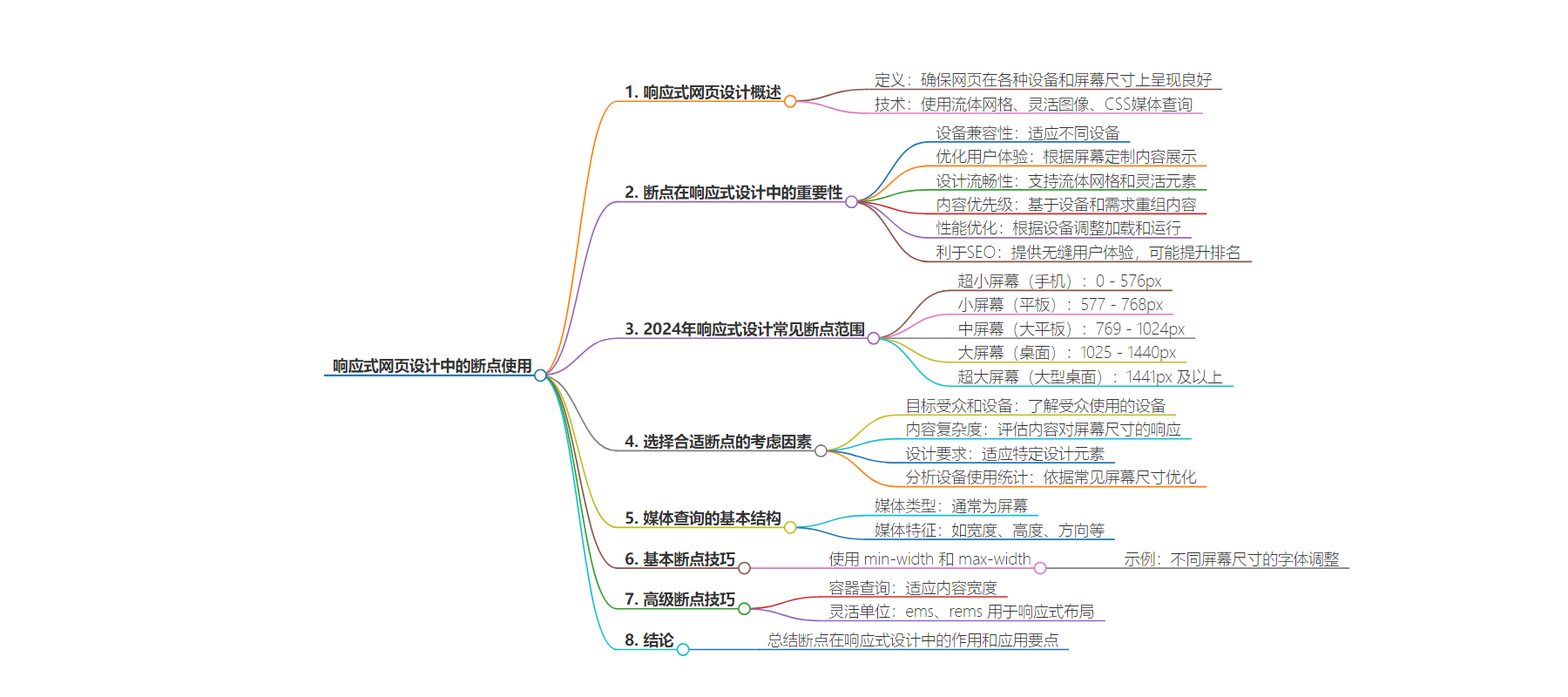
文章地址:https://www.freecodecamp.org/news/breakpoints-for-responsive-web-design/
文章来源:freecodecamp.org
作者:Joan Ayebola
发布时间:2024/6/24 18:03
语言:英文
总字数:2070字
预计阅读时间:9分钟
评分:91分
标签:响应式设计,网页设计
以下为原文内容
本内容来源于用户推荐转载,旨在分享知识与观点,如有侵权请联系删除 联系邮箱 media@ilingban.com
Breakpoints are fundamental to the concept of responsive web design. They enable websites to adapt seamlessly across different devices and screen sizes.
Breakpoints mark the points at which a website’s layout and content should change to ensure optimal user experience on devices ranging from smartphones and tablets to desktop computers.
It’s really important for today’s web designers to know how breakpoints work and use them smartly. This helps them create websites that work well on all kinds of devices and are easy for people to use.
In this article, we’ll explore breakpoints in detail: why they matter, how to use them effectively, and their role in making websites adjust smoothly to different screen sizes.
Table of Contents
- What is Responsive Web Design?
- Why are Breakpoints Important in RWD?
- Common Breakpoint Ranges for Responsive Design (2024)
- Factors to Consider When Choosing the Right Breakpoints for Your Project
- Basic Structure of a Media Query
- Advanced Breakpoint Techniques
- Conclusion
What is Responsive Web Design (RWD)?
Responsive Web Design (RWD) is an approach to web design that ensures web pages render well on a variety of devices and window or screen sizes.
It involves using fluid grids, flexible images, and CSS media queries to automatically adapt the layout and content of a website to the device’s screen size and orientation.
The goal of responsive web design is to provide an optimal viewing and interaction experience, ensuring easy reading and navigation with minimal resizing, panning, and scrolling across a wide range of devices, from desktop computers to mobile phones.
Why are Breakpoints Important in RWD?
Breakpoints are important in Responsive Web Design (RWD) because they define specific points where a website’s layout and content should adapt to different screen sizes and devices.
Here’s why they are crucial:
Device Compatibility
Breakpoints enable websites to adjust their design and layout to ensure compatibility with various devices like smartphones, tablets, laptops, and desktops. This adaptability ensures that users have a consistent and optimized experience regardless of the device they use.
Optimal User Experience
Designers can use breakpoints to tailor the presentation of content, navigation, and functionality based on screen size. This customization enhances user experience by ensuring content is readable, accessible, and easy to interact with across devices.
Fluidity in Design
Instead of creating fixed-width designs that may not scale well, breakpoints allow for fluid grids and flexible elements. This approach ensures that the design remains visually appealing and functional, regardless of the screen dimensions.
Content Prioritization
With breakpoints, designers can prioritize and reorganize content based on device capabilities and user needs. This ensures that essential information remains accessible and prominent, enhancing usability and engagement.
Performance Optimization
Breakpoints make websites load faster and work better on different devices by adjusting how they look and work based on each device’s size and type. This is crucial for retaining user interest and reducing bounce rates, particularly on mobile devices with slower internet connections.
SEO Friendliness
Responsive websites with well-implemented breakpoints provide a seamless user experience across devices. Search engines value responsive design because it improves accessibility and usability, potentially leading to better search engine rankings.
Common Breakpoint Ranges for Responsive Design (2024)
In 2024, responsive web design commonly employs a mobile-first approach, ensuring websites are designed to function and look good on smaller screens before scaling up.
Here are the typical breakpoint ranges used for different screen sizes:
Extra Small Screens (Mobile):
- Range: Up to 576px viewport width
- Description: Targets smartphones and small mobile devices in portrait mode.
Small Screens (Tablets):
- Range: 577px to 768px viewport width
- Description: Includes larger smartphones and smaller tablets in portrait mode.
Medium Screens (Large Tablets):
- Range: 769px to 1024px viewport width
- Description: Targets larger tablets and smaller desktop screens in landscape mode.
Large Screens (Desktops):
- Range: 1025px to 1440px viewport width
- Description: Targets standard desktop screens and larger laptops.
Extra Large Screens (Large Desktops):
- Range: 1441px and above viewport width
- Description: Includes large desktop monitors and wide-screen displays.
@media only screen and (max-width: 576px) { .container { width: 100%; }}@media only screen and (min-width: 577px) and (max-width: 768px) { .container { width: 80%; }}@media only screen and (min-width: 769px) and (max-width: 1024px) { .container { width: 70%; }}@media only screen and (min-width: 1025px) and (max-width: 1440px) { .container { width: 60%; }}@media only screen and (min-width: 1441px) { .container { width: 50%; }}In this example:
- Each media query targets a specific range of viewport widths to adjust the layout and styling of the
.containerelement accordingly. - The percentages used for
widthin the examples demonstrate how designers can progressively adjust content presentation to optimize user experience across various devices and screen sizes.
Factors to Consider When Choosing the Right Breakpoints for Your Project
Choosing the right breakpoints for your project involves considering several factors:
Target Audience and Devices
Understand the devices your target audience uses. This includes screen sizes of smartphones, tablets, laptops, and desktops. Prioritize breakpoints that align with these devices to ensure a seamless user experience.
Content Complexity
Evaluate how your content responds to different screen sizes. Complex layouts may require additional breakpoints to maintain readability and usability across devices.
Design Requirements
Your design specifications play an important role. Consider breakpoints that accommodate specific design elements such as navigation menus, images, forms, and grids. Ensure that these elements adapt well to different screen sizes.
Analyzing Device Usage Statistics
Use analytics to determine the most common screen sizes among your audience. Focus on breakpoints that optimize user experience on these prevalent devices.
Implementing breakpoints with media queries is essential for creating responsive web designs that adapt to different screen sizes and devices.
A media query allows you to apply CSS styles based on certain conditions, such as screen width, height, device orientation, etc. The basic syntax of a media query is:
@media media-type and (media-feature) { }Where:
media-typespecifies the type of media, typicallyscreenfor devices with screens.media-featuredefines the condition, such aswidth,min-width,max-width,orientation, and so on.
Now let’s talk about how you can structure and use media queries effectively.
Using min-width and max-width for Breakpoints
The most common approach to defining breakpoints is using min-width and max-width media features.
min-width: Specifies the minimum width at which the styles should apply. It targets screens wider than the specified width.
Example:
@media screen and (min-width: 768px) { }max-width: Specifies the maximum width at which the styles should apply. It targets screens narrower than the specified width.
Example:
@media screen and (max-width: 1024px) { }To create a responsive design that adapts to various devices, you typically define multiple breakpoints to cover different screen sizes:
Small Screens (Mobile Phones):
@media screen and (max-width: 576px) { }Medium Screens (Tablets):
@media screen and (min-width: 577px) and (max-width: 992px) { }Large Screens (Desktops and Laptops):
@media screen and (min-width: 993px) { }Extra Large Screens (Large Desktops and Monitors):
@media screen and (min-width: 1200px) { }Here’s an example of how you might implement media queries for a responsive layout:
body { font-size: 16px;}@media screen and (max-width: 576px) { body { font-size: 14px; }}@media screen and (min-width: 577px) and (max-width: 992px) { body { font-size: 16px; }}@media screen and (min-width: 993px) { body { font-size: 18px; }}@media screen and (min-width: 1200px) { body { font-size: 20px; }}In this example:
- Font sizes adjust based on the screen size to ensure readability and optimal user experience.
- Each media query targets specific ranges of screen widths using
min-widthandmax-width. - Adjustments in font size are used here for demonstration purposes, but you can apply any CSS styles needed for your design.
Advanced Breakpoint Techniques
Implementing advanced breakpoint techniques enhances the responsiveness and adaptability of your web designs.
Here are several techniques you can use:
1. Container Queries (Adapting to Content Width)
Container queries allow elements to respond not to the viewport size but to their own container’s dimensions. This is particularly useful when you want elements to adapt based on their parent container’s width rather than the overall screen width.
Example using a hypothetical container query syntax (not currently natively supported, but evolving in standards like CSS Houdini):
.container { }@container (min-width: 600px) { .container { }}Container queries are highly anticipated as they provide more granular control over responsive design within individual components or sections.
2. Flexible Units (ems, rems) for Responsive Layouts
Flexible units like em (relative to the font-size of the element) and rem (relative to the font-size of the root element) are essential for creating scalable and responsive layouts.
Using em and rem:
emunits scale relative to their parent element’s font size. This can be useful for creating modular designs where elements resize proportionally.remunits are relative to the root element (html), providing a consistent base for scaling across the entire document.
body { font-size: 16px; }h1 { font-size: 2rem; }p { font-size: 1.5rem; }@media screen and (max-width: 768px) { body { font-size: 14px; }}3. Using CSS Grid and Flexbox for Responsive Design
CSS Grid and Flexbox are powerful layout tools that offer flexible and responsive design options.
CSS Grid: Ideal for two-dimensional layouts, allowing precise control over rows and columns. Grids can adapt to different screen sizes with media queries or grid-auto-flow properties.
Example of responsive grid layout:
.container { display: grid; grid-template-columns: repeat(auto-fit, minmax(250px, 1fr)); grid-gap: 20px;}@media screen and (max-width: 768px) { .container { grid-template-columns: 1fr; }}Flexbox: Best for simpler one-dimensional layouts or aligning items within a container. It’s great for navigation bars, sidebars, and elements within a grid cell.
Example of responsive Flexbox layout:
.container { display: flex; justify-content: space-between;}@media screen and (max-width: 768px) { .container { flex-direction: column; }}- Container Queries are evolving and promise more precise control over responsive design elements based on their container’s size.
- Flexible Units (
em,rem) allow scalable and accessible typography and layout proportions across various screen sizes. - CSS Grid and Flexbox provide robust layout options for creating responsive designs that adapt to different devices and viewport sizes.
Conclusion
In conclusion, breakpoints play a pivotal role in crafting a responsive web design that adapts seamlessly across different devices and screen sizes.
The flexibility offered by media queries, utilizing min-width and max-width to define breakpoints, allows for precise control over how content and layouts respond to varying viewport dimensions.
Advanced techniques like container queries (as they evolve), flexible units (em, rem), and leveraging CSS Grid and Flexbox further enhance the adaptability and scalability of designs.
In essence, breakpoints are not just technical specifications but critical decisions that impact user interaction and satisfaction.
Connect with me on LinkedIn.