包阅导读总结
1. 关键词:网站设计、设计趋势、交互性、August 2024、创新
2. 总结:本文介绍了 2024 年 8 月的三个网站设计趋势,包括页面顶部排版、AR/VR 体验、液体图像,强调了这些趋势中的交互元素及创新之处,可为设计提供灵感。
3. 主要内容:
– 3 个重要的设计趋势
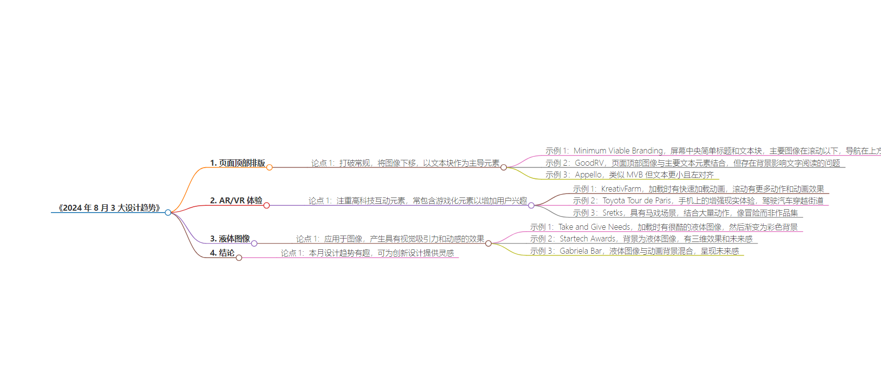
– 页面顶部排版
– 改变传统布局,将文字块作为主导元素置于顶部
– 文字位置多样,但主页滚动前大多文字可读
– 举例:Minimum Viable Branding、GoodRV、Appello
– AR/VR 体验
– 注重高科技互动元素,常有游戏化成分增加用户兴趣
– 即使无实际活动,也能通过动作等吸引用户
– 举例:KreativFarm、Toyota Tour de Paris、Sretks
– 液体图像
– 应用于图片,产生超现实效果和动感
– 图像写实又抽象,有类似水或玻璃的感觉
– 举例:Take and Give Needs、Startech Awards、Gabriela Bar
– 结论
– 本月设计趋势有趣且具启发性,希望能激发新的设计尝试
思维导图:
文章地址:https://www.webdesignerdepot.com/design-trends-august-2024/
文章来源:webdesignerdepot.com
作者:Web Designer Depot
发布时间:2024/7/29 12:30
语言:英文
总字数:903字
预计阅读时间:4分钟
评分:88分
标签:网站设计,交互性,排版,增强现实/虚拟现实,液体图像
以下为原文内容
本内容来源于用户推荐转载,旨在分享知识与观点,如有侵权请联系删除 联系邮箱 media@ilingban.com
3 Essential Design Trends, August 2024
There’s something new to learn with each of this month’s featured website design trends. Let’s dig in!
As all the youngsters prepare to go back to school, you can tackle some learning too with these website design trends. Each trend this month incorporates interactivity elements to help sway website visitors into action quickly.
Here’s what’s trending in design this month:
1. Top of Page Typography
Hero header images and text elements can be found on almost every website. We’ve generally seen a configuration with the text element down screen, often in the center or to the left.
This website design trend changes all that, pushing the imagery down the page while focusing on a text block as the dominant element in the hero area.
This can work well when it comes to ensuring users know exactly what the design is about. However, it takes excellent copywriting skills to pull this off effectively. Where words are always important, this design treatment makes the text even more vital.
With this trend, text elements may appear in different placements, above or on top of images or video, or in concert with other components. The main commonality is that most, if not all, of the text is readable above the scroll on the homepage.
Each of these examples goes about this trend in a slightly different manner.
Minimum Viable Branding has a simple headline and text block in the center of the screen above the scroll. You get a hint of the main image, but it primarily appears below the scroll. The only other element high on the screen is the navigation.
GoodRV combines images with the primary text element at the top of the page. This treatment has some challenges, as some of the words are difficult to read, depending on the image in the background. With a little more styling, this problem could be resolved to make better use of this website design trend.
Appello takes an approach similar to MVB but uses smaller text and left alignments – true signals that this treatment is made for reading with innate importance.
2. AR/VR Experiences
Interactivity – real or perceived – is becoming a big part of website design projects. Many of these projects may start on the (desktop) web and lead users to a mobile-based experience, such as the Toyota Paris promotion.
What’s most interesting here is that all of the design focuses on a high-tech interactive element. Augmented and virtual reality experiences often include an element of gamification to increase user interest.
These experiences can also be perceived even if there isn’t an activity to perform. This might include fast action, a click-through storyline, or other motion to help explain the content.
KreativFarm takes the latter approach. As the website loads, you get a lot of quick-loading animation that scrolls through quickly to help create user engagement. The scroll continues with additional motion and animated effects to create a consistent story.
Toyota Tour de Paris is a fully augmented reality experience on your mobile device that creates a downtown scene as you drive a car through the streets of the Olympic city. The gamification aspect keeps people coming back while promoting the car brand and its vehicles, which you select in different levels to drive.
Sretks is a portfolio site with a circus-like scene that combines a lot of movement. It feels more like an adventure and less like a portfolio.
3. Liquid Images
Liquid animation is a website design trend that we’ve highlighted in the past, and the concept is now being applied to images. The result is a surreal-looking element that has a lot of visual interest and even a feeling of motion, even though the image is still.
Designers using this trend use images that are both realistic and abstract but with a water- or glass-like feel that almost feels reflective. They are often colorful images that help draw the eye to the image on the screen.
Some of these designs mix in animation to create further interest. Depending on the image, this can be quite effective or sometimes can feel overwhelming. You’ll want to play with multiple options if you mix and match effects to ensure that you have an aesthetic that works well.
Take and Give Needsloads with a super cool liquid image that makes you wish it was on the screen just a few seconds longer. It then fades to a beautiful, colorful background. This entire design takes an alternative approach that’s kind of fun to dig into.
Startech Awards is an interactive experience with a liquid image – space goggles, maybe? – in the background. The result is a three-dimensional background effect with a futuristic feel that makes you want to jump into the content.
Gabriela Bar mixes a liquid image with an animated background for a fully futuristic look that matches the AI theme of the website. The design marries the liquid image and motion seamlessly.
Conclusion
This month’s design trends are a lot of fun and a good source of inspiration if you are looking to try something new. Whether you want to change up an existing design or create a brand new site, we hope these design trends leave you feeling like you learned something new that you may want to try.
Carrie Cousins
Carrie Cousins is a freelance writer with more than 10 years of experience in the communications industry, including writing for print and online publications, and design and editing. You can connect with Carrie on Twitter
@carriecousins
.
